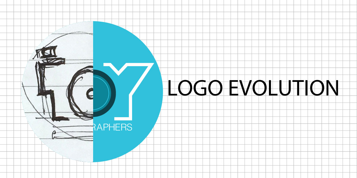
I have been following enthusiastically all the posts regarding the recently concluded Oregon Toy Safari. I was very happy to see the T-shirts with the Toy Photographers logo on it and I thought maybe now might be a good time to share the evolution of the logo.
Back in January, Shelly and I were chatting on Facebook (something I enjoy, btw!) and she found out I was a graphic designer and at the same time, this website was undergoing a revamp. The time was just right for the website to incorporate a new logo and when Shelly asked if I could cook up a logo for the site, I was happy to contribute.
The Initial Design Process
Once I got the brief, the first thought was how best to represent visually toys of different IPs. This became quite a bit overwhelming because of the sheer range of toys out there! That problem got stuck in my head for a couple of days. I tried couple of ideas of creating a character out of the word TOY. Eventually, the solution was to ditch the idea and use typography and play on the word TOY. However, this kind of gave it a cliched feel, – colorful text position in a playful manner. As my client always remind me – “It’s so predictable.” So much for that idea. And at this stage, I realized I had not been focusing a lot on the photography aspect of the logo. I guess it was more fun to work on the word TOY. 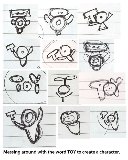
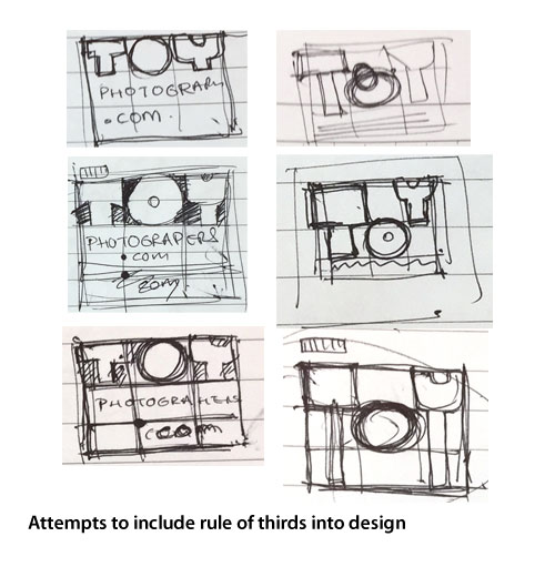
At one stage, I decided to incorporate the rule of thirds into the design. However, the layout looked pretty clunky and thick.
Think Simple
I started to explore toy companies’ logo and look at their design rationale. I do this occasionally in my day job, looking at existing concepts and ideas for inspiration and then use that as a springboard to start working on the problem at hand. Though sometimes, this can lead you into a rabbit hole and cause more problems and headache! It was right about this time, I kind of gave up and I looked at the word TOYPHOTOGRAPHERS.COM again.
The funniest thing happened next. After all that searching and cracking my head, I simply scribbled the letter “Y”, right before the word “GRAPHERS”. Sometimes, overthinking is not good and the solution is right in front of you. I was so happy, I literally bent my arm backwards to give myself a pat on the back, thinking aloud YOU ARE A GENIUS!

I eagerly sent an email to Shelly to share this design. Because of the need to use the logo on different platforms, we decided maybe a wide logo might not be such a good idea. It was back to the drawing board again!
By the end of the whole brainstorming process, I had doodled 5 pages worth of ideas.
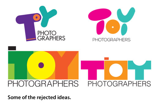
Below are some of the rejected ideas that received a finished treatment:
The Final Design
Right about this time, I had to travel to Malaysia to help out a friend with a project. I didn’t really have much to for this particular project and it gave me time to think about the logo. Ideas have been swimming in my head on and off and I would suddenly wake up to doodle in some concept whenever an idea popped into my head. I shared with my friend the doodles I had done so far and he gave me some suggestions. When the final artwork was almost done, Shelly, Brett and I tweaked it a bit and arrived at the final version we see now.
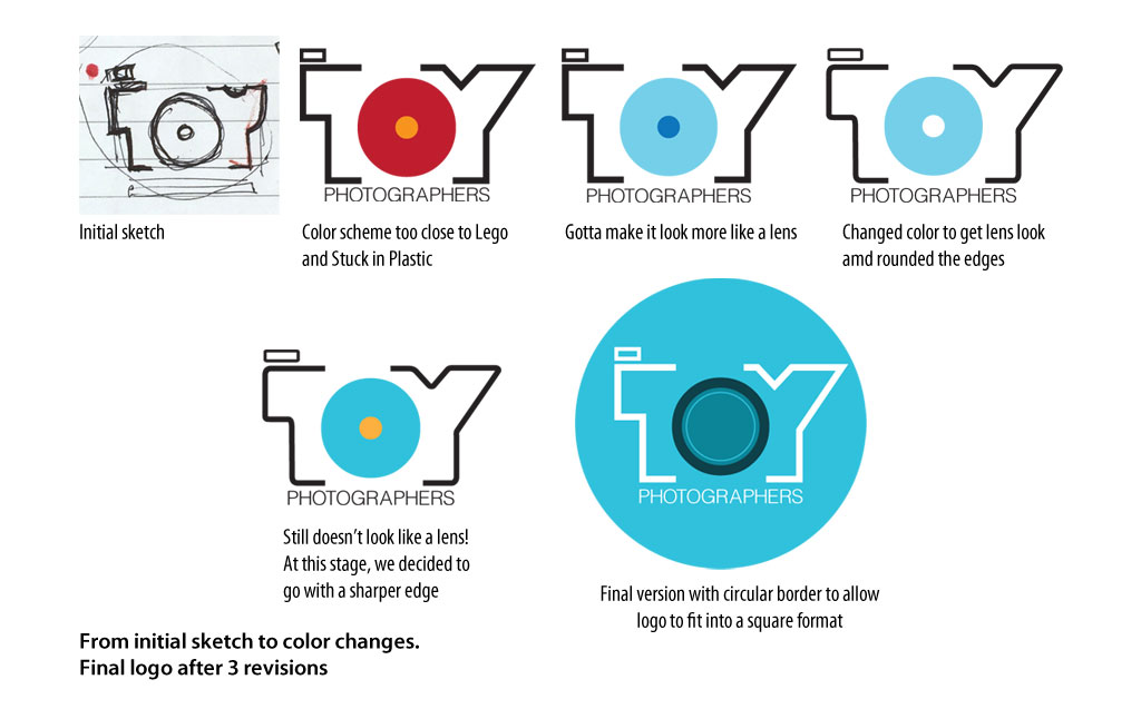
Although I could not make it out to Oregon for this year’s toy safari, at least a little part of me made it in the form of the logo on the T-shirts! Couldn’t be happier!


It’s such a brilliant logo Sunny. I have been sporting my t-shirt over here in Australia and is has sparked a couple of conversations already (maybe we’ll get a couple of converts).
Thanks for showing all the thought and hard work that goes in to the design process.
Thank you Tony! I love wearing that T-shirt out too! It was a pretty fun little project to keep the mind active! I hope some random stranger DOES come up to you and ask about the T-shirt!
So interesting to read the process of designing the logo. I love this design. It speaks volume for this community. But I also like seeing that process as I am going through a rebrand of my own blog and a logo is part of that.
Thank you Kristy and good luck with your own logo design!
Brilliant work, Sunny (and Shelly and Brett)! The final logo is incredible and really does the blog and group justice.
Thanks Mitchel! It was a pretty fun experience, esp the doodling part and deadline was pretty loose.
Sunny we’re so lucky to have you as a member of our community; you’re so talented! Thank you for lending us that talent and creating this amazing logo! You’re one in a million my friend!!
Thank you Shelly! Happy to be part of this community and also to call you my friend!
As Shelly says, we’re super lucky to have you!
I know I was privy to this whole process, but seeing it all put together here really makes me appreciate all you did for us, and appreciate your amazing talent.
I wear my Toy Photographers t-shirt with a little more pride, knowing that you designed the logo printed on it!
Thanks again mate.
Thank you Brett! It was my pleasure to contribute to the group!
Brilliant job, and so fun to see the “behind the scenes” (something many of us enjoy in this community). So glad you got to represent at the Safari, even if you didn’t get a chance to be there!
Thank you Teddi! Happy to share the thought process and what might have been, with regards to those rejected ideas.
What talent and I look at the logo in new light now, knowing the journey it took to get here. The careful consideration and thought is truly indicative of the respect for the art toy photographers make!
Thank you Janan. Getting to the final version was half the fun!
I love it, Sunny! Thanks for sharing the evolution process – makes me appreciate the final logo even more!
Thank you, Leila! Very happy to have contributed to the group!
Very nice logo.. Well done.. 🙂
Thanks!!