It’s no secret that I love moss. But when summer has withered my ‘go to’ photography setting, it’s time to embrace the dry, scorched scraps.
I came back from my summer vacation shocked by the parched, arid paddocks around our house. The harsh landscape was jarring compared to the rainforests and waterfalls I’d spent my holiday exploring. Sunburnt browns and seared oranges now painted our once verdant pastures.
We’ve tackled the changing seasons and their influence on our photos before. I thought the changing seasons didn’t change my photos, but Shelly confessed to having seasonal infectious disorder, and James contracted the disorder too in autumn.
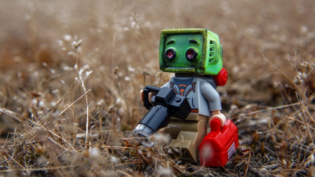
Last week I offered to take a photo for Shelly of @krash_override’s ‘TV Head’ kustom (hers hadn’t arrived) to promote the 2018 Toy Photographers meet-up.
I didn’t have the time to drive to the beach. And even if I did, it was a holiday long weekend and our beaches would’ve been besieged by holidaymakers.
2018 Toy Photographers meet-up
I searched our property for any moss that might have escaped the summer’s baking sun. No, all obliterated by the solar sniper. I combed the neighbouring bushland in the hope that the trees had glanced the sniper’s aim. No luck.
With no moss, no sand (if only James had shared his sand secrets earlier), and no time, I had to improvise with what I had. And what I had was scorched paddocks of dry grass.
Dead leaves and the dirty ground
When I know you’re not around
White Stripes – Dead Leaves and the Dirty Ground
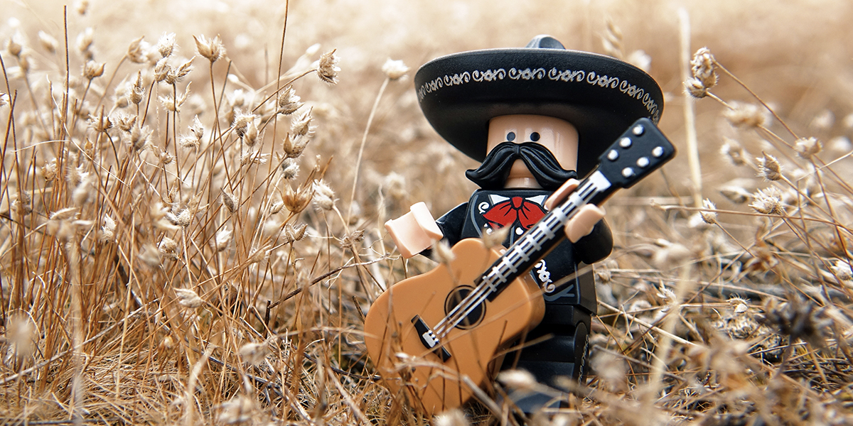
I’ve never really liked shooting on grass. It always feels out of proportion. That’s why I like moss. However, exploring our seared paddocks I found little swathes of dried grasses, delicate enough that a LEGO Minifigure didn’t appear dwarfed.
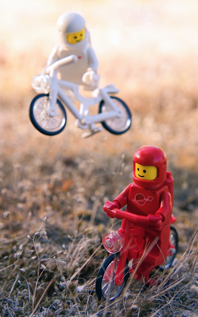
There’s always one show off!
As well as avoiding shooting toys on grass, I’ve tended to avoid shooting on dry tones, unless I’m at the beach. For me there’s something too harsh about the colour palette of the dry. Autumn is my least favourite season for that reason too. The autumnal tones of orange, yellow and beige signify the coming of winter. Their short-lived display announces the approaching dormancy. Plus, despite being a LEGO fan, I’ve never liked the colour yellow!
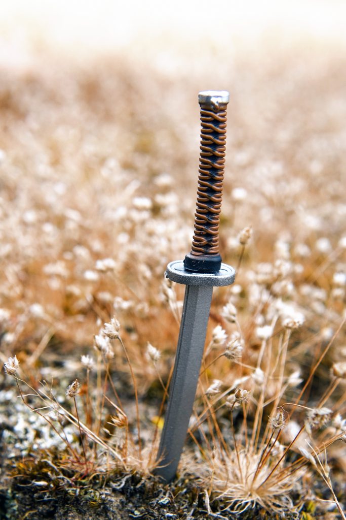
The Sword
I thought it was worth waiting
You’re caught up in my head
Wet sides from time to time
But mostly I’m just dry
PJ Harvey – Dry
But, after being forced to use these dry palettes, I’ve now come to understand them. I’ve even come to appreciate what they provide. Yes, they are harsh. And yes, they are barren and stark. But that gives them an austere beauty that my beloved fertile, verdant moss could never do.
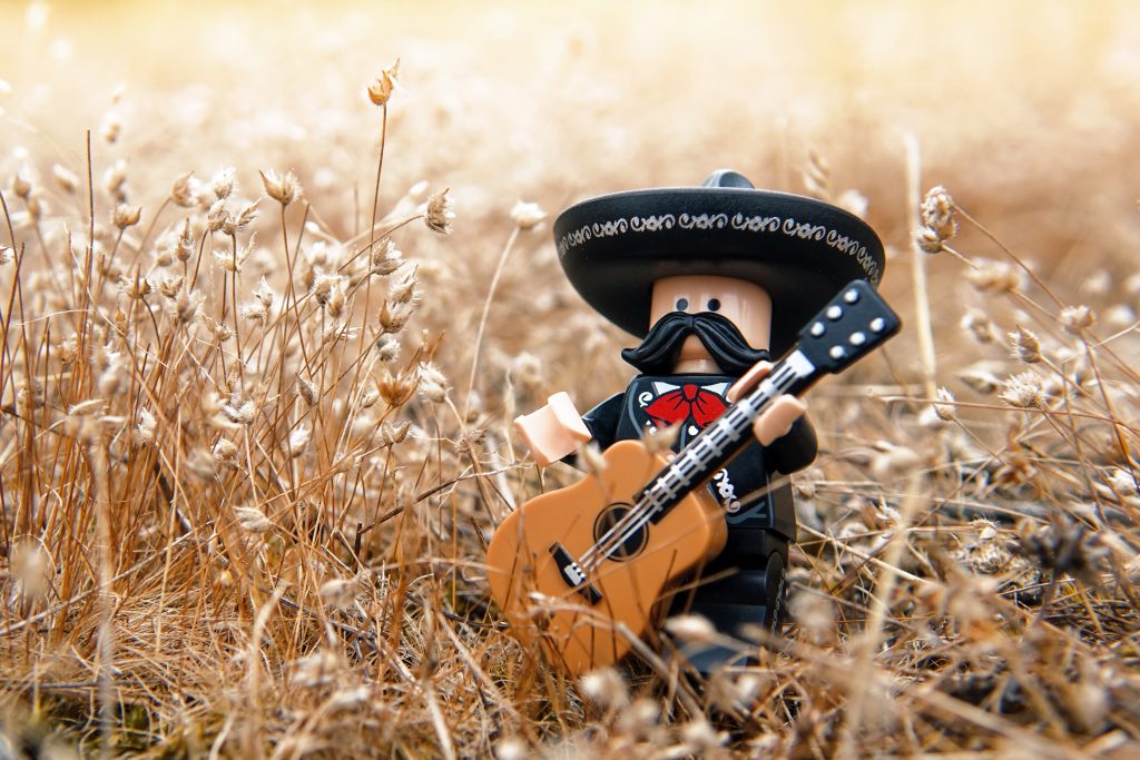
Mari-parched-i
I’ll never like yellow.
But I now like the dry, burnt tones of the Australian summer that I’d rejected up until last week.
– Brett
Are there palettes or settings you avoid in your toy photography? Or perhaps there is something you once avoided, but have recently embraced like me? I’d love to hear about it in the comments.
If you like what we’re doing we invite you to support the blog by purchasing our book that celebrates our first year A Year in the Life of Toy Photographers, 2017. The book is available for purchase as either an eBook or as a physical copy.
If you’ve made through all my blathering and ended up here, you should sign up to our weekly email round up where you’ll get a recap of all the babbling from the week. And while you’re doing things, you should definitely join our G+ Community where we hold monthly contests with prizes and lots of other cool stuff too.
![AI is ruining toy photography [a personal viewpoint]](https://toyphotographers.com/wp-content/uploads/2026/03/Together-As-One-Ultra-Magnus-revealed-scaled-500x383.jpg)


As i live in the UK, dried moss is non-existant! Lol! Year round green moss that i need to utilise more!
I envy your moss situation. Although I don’t envy the rain that’s needed to keep it going all year round! I expect to see some mossy loveliness from you soon.
I can relate to all that dry, brown grass since I live in Texas. You took some amazing photos with it Brett! My favorite is the two Spacemen riding their bikes 🙂
Lynn
Thanks Lynn. Being “forced” to shoot with the dried summer landscape really made me appreciate it. And yes, I think the Texas summer is comparable to ours.
Brett – the moss may be dried up, but you didn’t miss a beat. In fact I quite enjoy the change of color palette. Plus the detail in some of the dead moss is really beautiful. That sword is perfectly color coordinated with its surroundings. Way to make the best of the situation!
Thanks Shelly. Thanks to your request for the Kustom photo, I now love these tones and the harsh summer palette. And the dead moss and grass really do have have lovely features. Something I’ve overlooked for far too long!
just like Matt, here I have moss all year long [now it’s covered by the snow], but I see that dried moss gave You opportunity to shot one of your best shots! Maybe You don’t like dry tones and yellow, but it seems You feel really good with them. I think that’s because You’re great photographer and You can manage every conditions.
I don’t have colours or palettes, I avoid. Now I’m in experimenting mode, so I rush headlong on everything 🙂
Thank you Tomek! I do get jealous when I hear about snow. Not the cold weather that goes with it, but shooting toys in real snow is something I’d love to experience. As my withered, dry paddocks show, we never experience snow. But a white palette is something I’d love to experiment with!
I don’t have an issue with any colour, either positive or negative. However, I am right with you on grass. I have tried so many times to make it work, but I can never get the right ‘feel’. I’ll have to try to find some moss close to me.
Yes, grass used to frustrate me no end! That was until I discovered moss. It’s the perfect scale for toys!