Subtle differences in angle, light, pose, and crop can make a huge difference in the emotion and story conveyed by your photo.
During a photo shoot it can be hard to tell which picture will work out best once I see it full-size on my phone or computer screen. Because of this, I usually shoot more than one of any given scene. It’s a hard balance to judge. Too few shots, and I may find that there isn’t one that satisfies me. Too many shots, and I may be overwhelmed by too many options.
To illustrate the subtle elements I consider when selecting photos from a shoot, I’m using some pictures I took this past winter as examples. Where I live in the Sierra Foothills of Northern California, we get snow every other year or so. It rarely lasts the day, as the sun comes out or the air warms enough to turn snow to rain, so we make the most of it while it lasts.
The Obvious: Get Rid of the Poor Shots
A rejected photo: Not in focus, not well-composed, and snow where it doesn’t belong!
Usually it’s easy to cull the shots that are out of focus or poorly composed. That’s the first step. But once that’s done, I often have a handful of decent photos of the same subject to choose from. Deciding which one to “keep” (to edit and/or post on Instagram) depends on a number of factors. Your factors may be different than my factors, so be sure to chime in with your selection process in the comments!
Decide the Purpose of the Picture
Before I know what photo works best, I need to know what I want to say with the picture. Many of my photos start with a vague gut feeling: “This with that would look cute.” “Let’s show this figure on a hike in the beauty of nature.” But once I have several photos to choose from, I can refine the purpose of the photo. In comparing different shots, I ask myself:
- What emotion do I want to evoke with the photo?
- Where do I want the viewer to focus?
- Am I going for “artistic merit” or storytelling—or both?
-

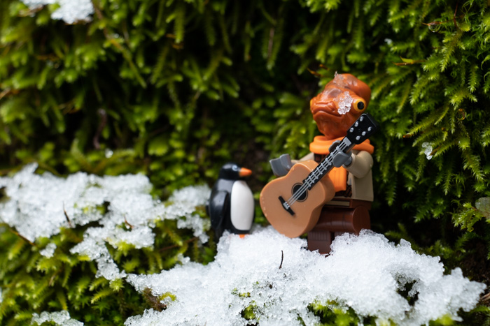
- Here Killer Moth is obviously in too deep, and the mottled forest in the background is visually and artistically pretty.
-

- In this photo, Killer Moth looks like he’s struggling, with disturbed snow, and a tilt to his head conveying frustration. The background is plain and stark, putting the focus entirely on the figure.
-

- I selected this photo, because I liked the artistic bokeh in the upper background, and the tilt of Killer Moth made his struggle more dynamic than the other photos.
Any one of the above photos would have been “okay”. As the artist, we have choices and interpretations we bring to our selections. Maybe you would have chosen a different one of these three photos for different reasons. But when it’s just you and all the photos on your camera, someone else doesn’t get to choose which one gets posted. You do. And that’s part of what defines you as an artist, and what will define your body of work.
Photo Elements to Weigh When Selecting a “Keeper”
Once I know what I’m trying to convey or what emotion I’m trying to evoke, some of the elements that affect my choices are as follows.
- White space / negative space around the central subject: Does it need cropping?
- Depth of field / focal point: How does it affect the viewer’s understanding of the context? What does it tell the viewer to pay attention to?
- Where is the horizon line (what is the camera angle in relation to the subject)?
- How does the camera angle affect the relationships between the subjects? Where are the eyes of the subject?
- How does the background frame the foreground? Are there any distracting elements?
A Walk Through My Selection Process


Let’s look at these three photos and apply the above questions, one photo at a time.
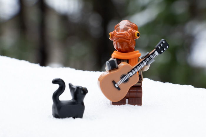
Photo Element Analysis: There’s a lot of wasted space around the subjects, so this version needs cropping. Akchu is in focus, but the cat is not. Akchu is facing the camera, which puts his attention on the viewer. This makes it seem he is ignoring the cat. The cat is below the snow line, and the spacing tells us the camera is above the subject. Viewing a subject from above subconsciously minimizes them, which puts emotional distance between the viewer and the subject. We’re “looking down” on them, viewing a scene without being in it. Some lighter blotches of out-of-focus forest in the background are behind Akchu’s head. This creates noise for the eye and distracts from the details of his face.
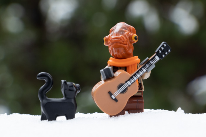
Photo Element Analysis: This one is better. The subjects are framed symmetrically within the boundaries of the photo. They are closer to being at the same focal distance so the cat is almost in focus. The snow line (which functions almost like a horizon line here) is level and feels stable. The background has a beautiful bokeh effect, and none of the forest mottling is distracting from the outline of Akchu’s head. The camera angle is just about eye-level with Akchu. This gives a feeling of being in the story, not just seeing it from above. Akchu looks like he might be turning his attention to the cat, so the story could be that of a cat interrupting a musician, or attracting his attention.

Photo Element Analysis: I selected this photo for Instagram because I like showing Akchu attracting various creatures with his music. I try to show that he’s always glad to see them (even when it’s a spider or an alligator!). Both the cat and Akchu are in excellent focus, and the background isn’t distracting. The subjects are embedded in the snow just a little better (instead of almost perching on top of it, as in the second photo), but we’re still at a good eye-level with Akchu. This gives the viewer the feeling that he’s looking right at them. It’s almost like he’s saying, “Would you like to join my friend the cat and listen to a song?”
How Do You Select Your Photos?
I almost didn’t write about this subject, because it seems almost too obvious, too simple. All of us make these choices (consciously or unconsciously) every time we take photos and pick something to share online. I’m not doing anything “special” that other photographers couldn’t figure out for themselves.
Still, sometimes we do something without realizing why it works. Sometimes we feel unsatisfied with our photos without knowing why they don’t seem to capture what we wanted to convey. Things like camera angle, focal depth, and the subtleties of posing are little adjustments, but can make a huge difference in the “feel” of the photo and how it comes across.
I’m sure I’ve missed some important elements to consider when looking through your photos. Please chime in, fellow toy photographers, and share the things you look for when you’re taking your shots and making your selections!

Gimli and his coffee generated a lot of comments from my Facebook friends, many of whom love both coffee and Tolkien books. I’m sure it helped that he’s looking directly into the eyes of the viewer, surrounded by inhospitable weather, as if to say, “I can face anything now that I have my coffee.”
NOTE: The shots above are posted to my @mightysmallstories Instagram account. I decided to move my LEGO photography to its own home at the beginning of the year, and it’s been working out well.

![AI is ruining toy photography [a personal viewpoint]](https://toyphotographers.com/wp-content/uploads/2026/03/Together-As-One-Ultra-Magnus-revealed-scaled-500x383.jpg)
Teddy, I do it very similar to you. In the end, most of the time (if things are going well ?) you get one picture. My last 2 questions are always: Does this picture tell a story? Does it have the chance to arouse emotions? If I do not clearly answer these questions with yes, the picture ends up always (almost always … because exceptions rule) in the wastebasket.
Great reading, thanks ??