One thing I like about toy photography: the little surprises. Change a few details, play with the light, and get a totally different picture.
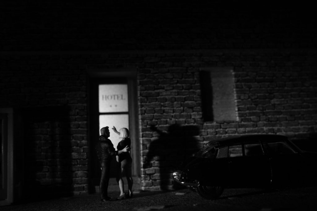
It so happened with these pictures. The idea was to have the young woman direct the man (the detective) towards the hotel: “The person you’re asking about? I just saw her entering this hotel,” she might say.
I used the same figures, the same house front with the hotel door, the telephone booth to the left, and an old Citroen parked somewhere to the right of the entrance in all of them (well, almost). They were the same sets and details I had used in some other scenes which were closely related to this one (see the six image narrative here).

All I did was moving the camera and the light. I introduced a bit of background on the left side of the first picture and turned the camera away from the car…
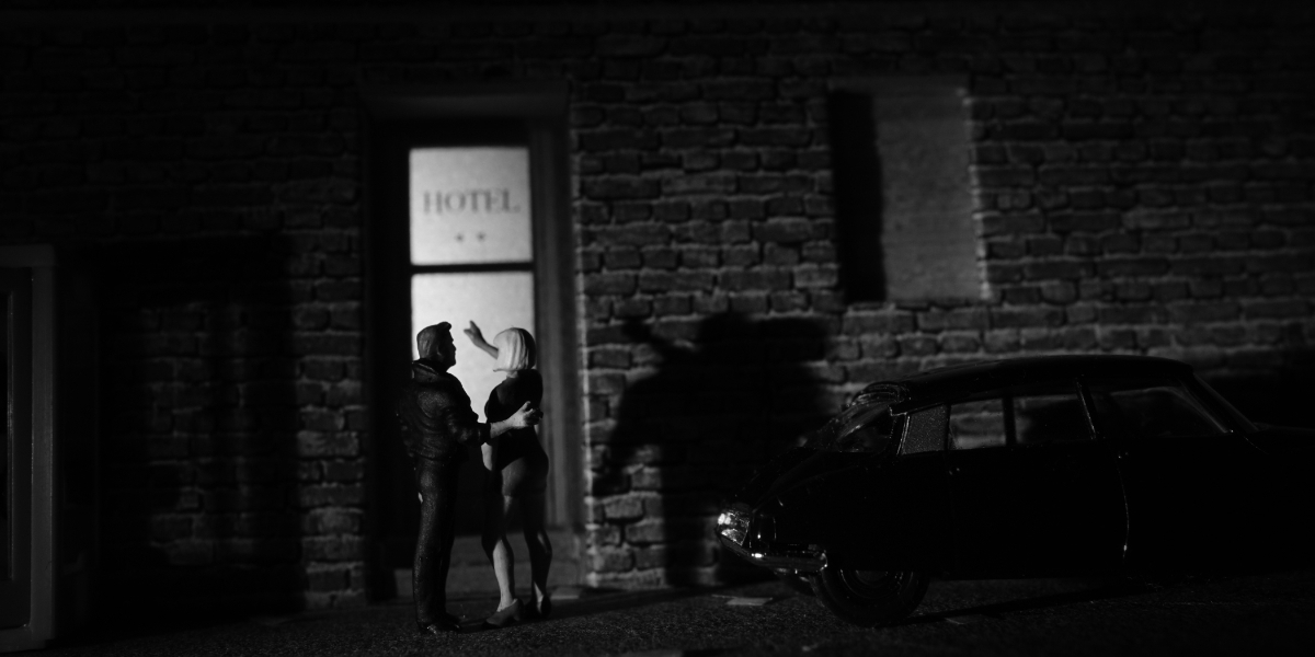
…you see here, in the second picture. Also. I took the second picture from slightly further below, and I moved up closer to the couple.
I like the second picture better than the first one, because with the low angle, the slant of the camera (“Dutch angle”) and the light – a car’s headlights? – it has a sense of immediacy and drama the first one lacks. The shadows and the car seem to add mystery. In comparison, the first one looks more detached to me, as if someone had simply wanted to record the scene. It just did not resonate with my narrative.
Also, I like the way no. 2 articulates the two figures; the way they stand there and interact really appeals to me!
So why didn’t I stick with the second one either? The reason was simple enough: I see a small town scene in the second one while the setting is quite urban in all the other pictures in this series. The impression that this might be Dijon rather than Paris (just to name two places) might be evoked by the look of the wall, the shutters on the windows and the lighting, i.e. the overhead darkness.
This was the ultimate reason for rejecting the picture.
What now?
Whenever I feel like I’ve arrived at an impasse, I try for something entirely different. In this case I had everything set up and giving it another shot did not require much more additional work. So as an alternative I tried to make the kind of image I so much like in graphic novels: stark contrasts that focus the beholder’s attention on the action itself.
This also answered to the idea that this picture should be completely different from the first four pictures. I wanted something more direct, abrupt and punchy.
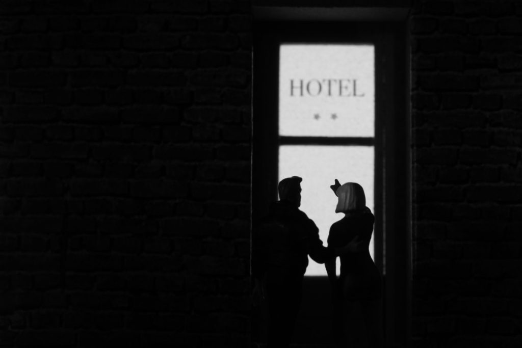
So I stripped away the telephone booth and the car and mainly illuminated the scene with the light falling through the hotel’s glass door. There is one take with and one without the slight highlight on the woman’s hair. I picked the highlighted version because it seems less “flat” and it shows this is not one of the two female main characters who both have longer, darker hair. (Or is she one of the two, wearing a wig? In a mystery you never really know.)
Although the no. 2 picture conveys more atmosphere – it’s probably a good “Stand alone” picture – I prefer this one for the narrative. In my eyes, it possesses great graphic qualities, and it leaves no doubt she is heading the detective in a certain direction.
… What about you? Do you shoot alternative takes? Do you feel you have to do something radical once you’re not quite satisfied with a picture? And how do you decide which of your photos are going to be published?


![AI is ruining toy photography [a personal viewpoint]](https://toyphotographers.com/wp-content/uploads/2026/03/Together-As-One-Ultra-Magnus-revealed-scaled-500x383.jpg)
Thank You for this great post Tobias.
Usually, when I take a picture, I try to be faithful to the vision that previously appeared in my head. It’s some kind of atavism, attachment to the first thought. But when it turns out that during the photoshoot my original vision, for various reasons, is impossible to achieve or not so attractive, I take alternative shots and then it often happens that these photos “worked out” during the photoshoot are better than the basic idea.
When it comes to make a decision it’s hard, because usually, when I make setup I try to show as much I can and it’s hard when it turns out that the most stripped down version is the best one 🙂 But then I try to be honest with myself and post the ‘best’ one, altough the the criteria are very fluid and hazy 😉
Thanks, Tomasz – I am glad you liked it.
“It turns out that the most stripped down version is the best one…” – no surprise! In my exeprience, it’s almost always like that. So I always make a stripped down picture, showing only the essentials, for good measure.
“The criteria are very fluid and hazy…” – same here! I think it is largely a gut decision.
P.S.
Where did You find such cute and detailed DS? Is it Hot Wheels?
There are a couple of them around (in H0 or 1/87 scale) – this one is made by Busch, you’ll find the model here: https://www.busch-model.info/000005665.3?number=000005665.3 I picked it for the rather elaborate details, and the finish is pretty cool, too. What scale are Hot Wheels, by the way?