For me, the hardest part of being a creative, is making choices. Choices are very difficult for me. Decisiveness is not one of my strengths; I like to keep my options open until the very last minute.
When I’m presented with a variety of excellent photographs to choose from while editing I tend to freeze. I hesitate to choose that final image because I know whatever I choose, there will be no turning back. I’m not one of those artists that’s able to look through old work or the desk top trash can and create amazing new work. I’m sure I’m only hurting myself, but what artist isn’t their own worst enemy?
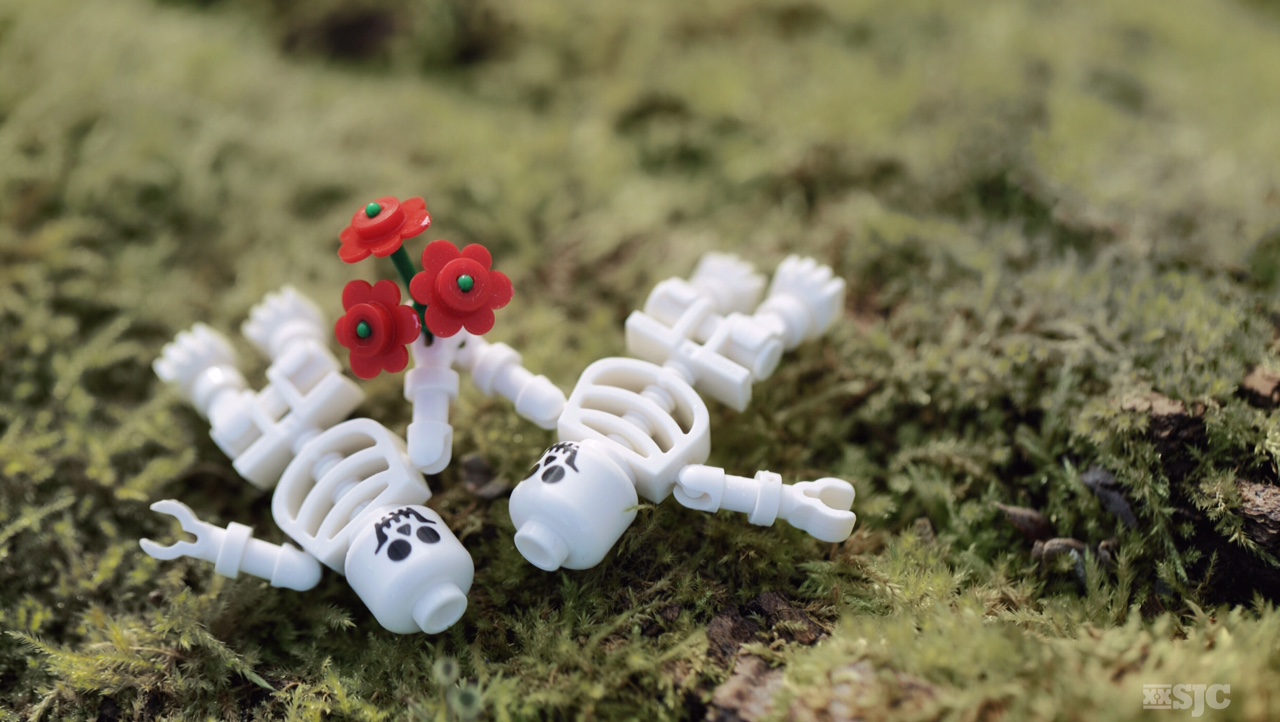
I’m going to show you a series of photos of two skeletons I created for Valentine’s Day. I wanted to express a love that is still growing, even in death. I feel each one of these photos is a winner in its own way. As an exercise in making choices, I would like to know which one you would have chosen?
Which one is your favorite and why?
~ Shelly
ps – This is also a very good demonstration of why I rarely never use a tri-pod.


![AI is ruining toy photography [a personal viewpoint]](https://toyphotographers.com/wp-content/uploads/2026/03/Together-As-One-Ultra-Magnus-revealed-scaled-500x383.jpg)


#3 is absolutely amazing. I love the position and the focus on the flowers. For me it’s similar to #5 picture; I prefer these instead of the others because the position, as I said before, is rare and the colors are less marked.
#3 is probably my favorite. I was worried that there was not a good of the skeletons and it would not read well. This is why I went with the view straight down. I do like how the background on #3 isolates the flowers and they ‘pop’.
Yes, for this I love it.
Anyway, every picture is amazing. 😉
I think #2 is my favourite, because it looks like the figures are staring lovingly at each other, and you get a bit more of their faces than in #1. I like the zoomed out view in #4 too, but they’re not facing each other. They’re all amazing shots though, I can see why you would have trouble choosing one! I think this is a really interesting post and I’ll definitely be checking back to see what other people’s thoughts are!
I was continuously balancing the angle of the torsos and the position f the faces. I couldn’t get them both the way I wanted at the same time. I think some combination of #1, #3 and #5 would be the best. I like how being far away in #5 the skeletons look small and vulnerable. Sometimes I like to reveal how small these character are, it makes them seem a little more precious. Does that make sense?
Yes, Im excited to see what others say too! 😀
It was a toss up between #1 and #2 for me. I like how these both have the faces in focus and looking at each other.
Between the two, I’d go with #1 – I feel the angle is better to show them lying down and I like the shallow depth of field and separation you get from the background.
With that said though, if they were looking at each other in #3 I would have gone with that.
More often than not, I choose photos after I’ve packed up and headed home. But when I get a chance to edit, I wish I could merge elements from multiple shots into my final product and often wonder if it’s worth setting everything up and trying again.
Usually I just go with the one that’s “close enough” and tuck the “I wish I had done this instead…” thought in the “ideas to come back to” section of my brain. I really should write them down or sketch them.
Maybe a future blog post? How do you store your ideas?!
Ben, like you, I often get home and see that my image just wasn’t “close enough”. When that happens I keep the set up in my box of active figures and take them out again. I have been known to chase a particular ‘vision’ across an entire year to get the right shot. I like to keep the image i’m chasing front and center so I usually don’t keep a current shot list. Check out this blog post if you want to see an example of this process: http://www.stuckinplastic.com/?s=behind+the+scenes
They’re all great, I like #2 best with #4 a close second. I like how they are looking at each other in #2.
Thanks Margaret fro chiming in . I think the consensus is they really need to be looking at each other to be truly an effective image. This is something I suspected, but wasn’t able to pull off that day. I was probably rushing to get back home, since I only had a short window to work within. I will probably re-shoot this. 😀
Number 3 is the only one that made me pause and study. All of the other ones look like you took a photo of some figures, but number 3 looks like the figures are simply there. I think that it has to do with the perspective. If the figures are on the ground than you need to be on the ground too. The toy perspective needs to be eye level with the toy.
Thats interesting that #3 made you pause and study it. Since i was posting this to social media I knew people would only see it for a 1/2 second so I ended up choosing an image that would be instantly recognizable. Personally I like #3 and it’s abstract nature. While I agree that most of the time you need to be at eye level (or below even) of a toy to give a sense of scale, I have seen many great images that play with point of view. Sometimes a birds eye view can be effective.
“Since i was posting this to social media I knew people would only see it for a 1/2 second so I ended up choosing an image that would be instantly recognizable. ”
That is very interesting. It’s too bad because I feel like on social media, people don’t take the time to see the picture at its full scale… I realized some of my average pictures that look good in thumbnail get more attention that better picture (to my opinion of course) looking less good in thumbnail…
All your 5 pictures are very nice but, #3 is my favorite because you can see their face, the flower, understand the picture well and most importantly to me, because the shot comes from their height and not from above… I don’t like much picture of Lego when it comes from above… They make the Lego look small and remind the simple point of view that you can have when looking at lego on the floor… TMHO, it takes the life out of the lego bricks.
Keep up the very good work Shelly !
Andy when we post photos to social media we have to be aware of who are audience is and how they will view the image. I choose different images to present in galleries than images I post to IG. I post images that I think deserve a longer look to Flickr where I believe the audience is more photographically sophisticated, plus they have the ability to zoom in to see the details. Social media is not a one size fits all platform.
I think you’re right about the point of view. When you look down on the mini figure you are sending a very different message to the viewer than an image that present the figures at ‘eye’ level. When I went with the top down view it was with that in mind. I wanted then to ‘feel’ as dead as possible. Because death is final. Whenever I present the mini figs as only a small part of the composition, I am purposefully trying to show them as small and fragile. Point of view is very important and I’m glad you can see that too.
Thank you so much for being a part of the conversation!
My favorite is #1 because the characters are facing each other, and the eye contact makes the gesture ring true. #2 is almost there. It’s a better angle in many ways but they’re leaning away from each other.
It seems fairly unanimous that eye contact is important to people. Thanks for chiming in Lyn. 🙂
I’m not the one making the choice here, and I agree it’s difficult to make a choice, because it’s so definitive. When I look through the pictures I see different things and different perspectives. And it’s really nice of you to share this process with us. And I really think that by letting us be part of the process you can grow as a photographer, but my experience of sharing different pictures of a scenery and letting people share there opinion always get me to second guess myself and my decision so I think you are really brave doing this 🙂
Totally know what you mean! I will often pick a favorite, and then ask my wife what she thinks. She often picks a different photo than I did, which just makes me rethink the entire process!
Kristina, I might categorize this post closer to stupidity than bravery. It’s always hard to lift the veil and show what goes on behind the scenes. By shining a light on the thought process remove the mystery or create a stronger link to the image, or simply make it easier to dismiss it all as irrelevant. I took 52 photos of this little scene and I stand behind the one I ultimately chose for variety of reasons. My choice and edit is the featured image, it’s not even in the group of 5. Will I reshoot this image? Maybe. I think it could use a little tweaking, but would the effort be of value to me? I guess I would need to know what role this image plays within the larger group, and that I haven’t figured out yet. But either way I enjoyed the challenge of creating a Valentine’s Day image for Mr Gill’s contest. It pushed me to think for a minute 🙂
Great post, Shelly! Glad that I’m not the only one who has a hard time picking a favorite from some particular shoots. Personally I like shot #3 the best, for the same focus reasons stated above by others. All of them are simply fantastic though!
The split consensus here and your own thoughts tell me something else that often happens to me: I’ll like each photo for a different reason! Sometimes I wish I could just blend certain elements from different photos (the pose here, the positioning here, the focus here, etc.) to make the best version.
James, This is why you take all that information and go back out and re-shoot the image. It may be better, it may be worse, but by doing it you have tried your very best. By simply doing your best and trying to get that perfect shot, even if it tales repeated attempts, you will get to an image above your expectations. At the very least you will learn something, which has been my experience. 🙂
Well said, Shelly! That’s definitely something I need to work on. Often I let my impatience get the better of me. I need to get past the feeling that it’s too inconvenient to go back to a location or set up the whole shot again.
So far this year I’ve been working on holding onto a photo for a while before releasing it, and making sure I got the best shot possible (and, gasp!, reshooting if need be) is definitely the next step!
Having had a lot of fun in the 90’s as a kid while playing with classic LEGO skeleton, I’m a big fan of their funny faces. So contrary to almost everyone I feel frustrated not being to see their face on the photos where they are facing each other.
My favorite is definitely #4. I also like that it’s zoomed out and let’s us see more of the moss. My second favorite is #3 because of the point of view.
Yes it seems that the faces are important. As Boris mentioned in the past, the eyes are important. And this is true even in ‘death’. I will see about reshooting the image again with more direct eye contact. Like you #4 is my favorite. That is the one I ultimately went with but with a slightly different crop. Thanks for chiming in!