Are you sure it’s “Dutch?”
If you’ve ever tilted your head to “keep up” with the frame while watching a movie or photo, you’ve come across the Dutch angle shot!
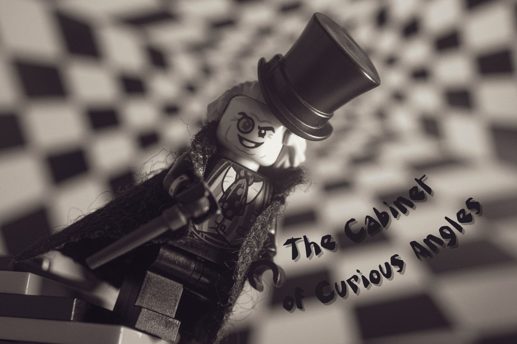
The name of this means of artistic expression, as is often the case, stems from mistake. This method of framing, consisting in tilting the camera axis relative to the horizon or horizontal lines in a given shot, was born in Germany. The creators of German Expressionism in the cinema used this angle to give viewers the impression of madness, as well as anxiety and tension. In this way, they channeled the feeling of anxiety and the havoc in German society caused by the First World War. One of the earliest movies to use the Dutch angle was famous: The Cabinet of Dr. Caligari. In it, not only the camera, but the whole world is tilted.
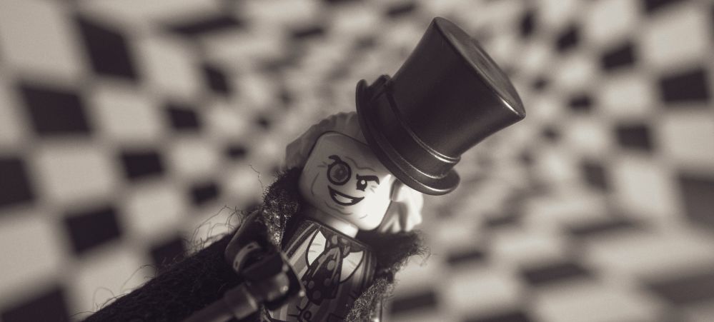
In Hollywood, where some German directors went after the fall of the Weimar Republic, someone apparently mistook “Deutsch” (which means “German” in German) for “Dutch” and thus the Netherlands entered this part of cinema’s history.
Ok, but what’s really bothering us in the “Dutch angle?”
According to Hollywod Lexicon, compositions following horizontal and vertical lines are easier to assimilate for our brain. On the other hand, compositions using Dutch angle convey motion and are harder for brain to process. Hence the feelings of disorientation, being out of rhythm and anxiety. In fact, we rarely see a world skewed so badly, so there is a feeling that something is wrong.

– James Cole, 12 Monkeys
That’s why directors and cinematographers use this angle when they want to get our attention and cause anxiety. So it’s not hard to guess that this technique is often used in thrillers, drama and action movies, and of course horror.
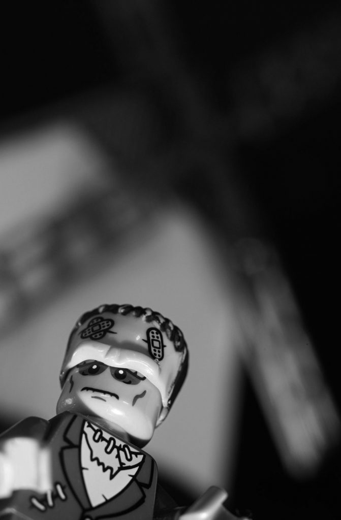
(A Mandela Effect in action. Scene from Frankenstein I remember—and that doesn’t exist in the movie.)
Dutch angle in three steps (on a slippery slope!)
As you can see, the Dutch angle is a useful means of expression, but it’s good to use it consciously.
I think there are three crucial things you should pay attention to before using the Dutch angle:
- Scene selection and mood – Will the Dutch angle somehow enrich the scene, give it additional character and enhance the mood?
- Selection of perspective – Dutch tilt mixed with low angle gives a much stronger effect—the photographed object towers over the viewer (and at the same time the surroundings can also dominate the object), while the Dutch tilt / high angle mix makes the subject seem vulnerable and “in trouble” from the viewer’s perspective.
- Depth of field and framing – In general, the greater the depth of field, the greater the feeling of confusion, because the whole scene is tilted including the background. In the case of shallow depth of field and tight framing, we create the impression of being trapped and claustrophobic, and the viewer enters the subject’s inner world of emotions.
Principle four, which applies to pretty much all techniques like this: overuse of the Dutch angle can make this effect lose its power and become more grotesque than disturbing.
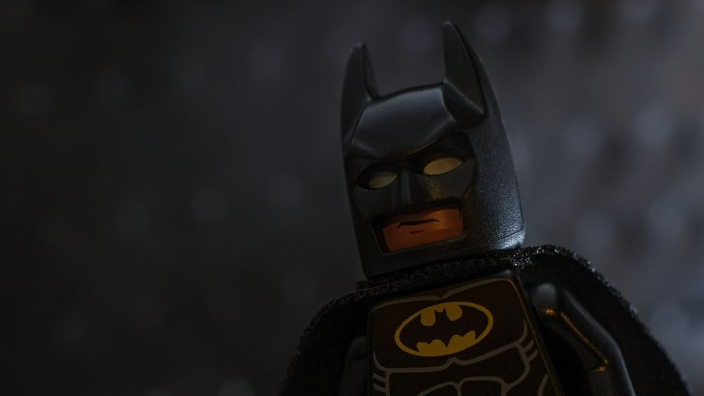
(Batman movies abound in Dutch-angle shots. From the very beginning!)
Let’s Dutch it!
When taking pictures using the Dutch angle, a tripod will be very useful, preferably with a ball head mount. You can freely adjust the tilt angle and freely modify it depending on your needs. All you have to do is to tilt your camera left or right, depending on the composition of your scene. It’s easier to create the unsettling feeling when you use the strong vertical and horizontal lines in the background. You can also use shadows and contrast to enhance the feeling of disorientation. This effect gives a wide range to experiment and look at the scene, literally, from different angle.
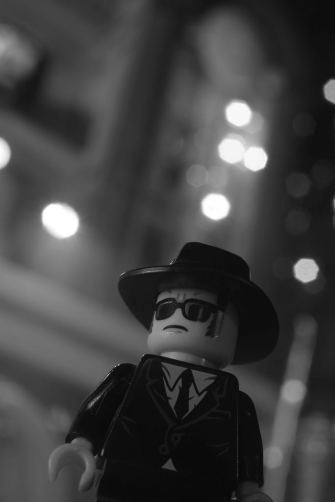
In the case of toy photography, it might be more difficult to achieve this unsettling effect. The plastic figures, no matter how detailed they are, cannot express the emotions we can read from a real human face. And the tilted angle itself might not be enough. But it’s always worth a try!

I also find another issue when trying to shoot using a Dutch angle. While in movies this angle actually makes me feel bit confused, and it works with others’ images, I don’t perceive it that way with my own photos.
This angle serves me mainly (at least in my opinion) to add dynamics to the photo, and sometimes to convey the impression of movement. But not to cause anxiety. Or maybe I’m wrong?
Perhaps this lack of discomfort is caused by the fact that when I look at my own photo, I also see everything that is outside the frame, all that existed behind the scenes. And when look at someone else’s photo/film, I only see the fragment of reality that the creator shows me. So the tilt works.
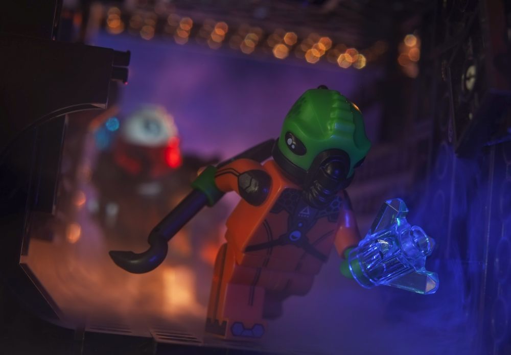
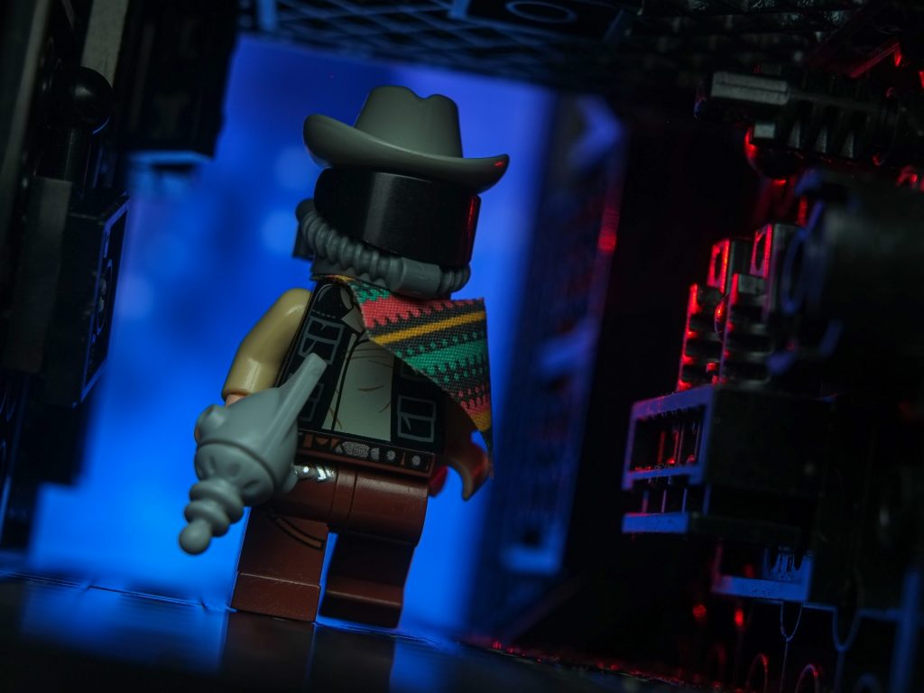
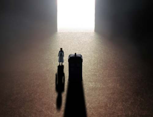
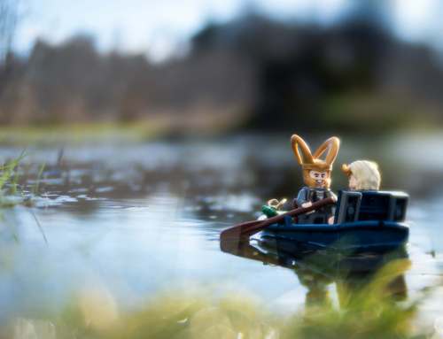
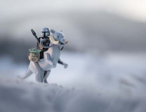
Below I present a few of my Dutch-angle photos in which this angle played a more compositional/dynamic role than a psychological one. Or, again, maybe I’m wrong?
I encourage you to try looking at your toys through a tilted lens!

Goedemorgen! While you’re here, we invite you to sign up to our weekly Toy Photographers email roundup where you’ll get a recap of all the week’s babbling. And while you’re at it, you should definitely join our MeWe community! We hold monthly contests with prizes and lots of other cool stuff. Doei!



Thanks for the article. The Dutch angle certainly adds something to the photo. Also, didn’t they also use this angle in the Batman 60’s TV show? If so, who knew that show was so avant-garde 🙂
Thanks Austin!
And You’re absolutely right, they used that angle in Batman 60’s TV show.
I even posted the link in Batman’s picture caption 🙂
https://dhscomtech.wordpress.com/2012/02/03/camera-framing-shot-lengths/dutch-angle-batman-original/
Thanks for the history of the Dutch angle! I no idea of where it came from and your photos are well done. .
Thank You so much Mary!
I was concerned about the photos, because, like I mentioned I know where and how they were taken, so they lack a bit this magic for me 🙂
I’m glad You enoyed the post. Thank You!
Great article, very informative! Digging last pic, seems like a hidden #Spacecowboysaturday ?
Oh thank You so much Sebastian for these kind words! I’m glad You like the post. And thanks for noticing space cowboy reference. Bullseye! 🙂
It’s not hidden actually, since I used the picture I posted on my IG as the #spacecowboysaturday entry 😉
https://www.instagram.com/p/CPLcE2_pYln/
Thank you so much for this article on the Dutch Angle, my brain is already set into motion trying to figure out the logistics of a scene that I would like to use it on.