I wrote about why I wouldn’t manipulate my photos beyond the simple edit before. I wrote about how the perfectionist in me would still see me in front of my computer hours later if I embarked down this road.
However, I’ve established a middle ground. And this medium is thanks to my old friend, time.
I’ve set the stopwatch. I’ve set a self-imposed constraint of 20-minutes for photo manipulations. Once the countdown stops at zero, Photoshop stops too!
Setting a limit puts a stop to the procrastination, the over finessing, and wasting away hours at the computer. Who’s got the time to spend hours and hours editing one photo? Not me!
Rest your head on me
I’ll smooth it nicely
Rub it better ’til it bleeds
And, and you’ll believe me
P J Harvey – Rub ‘Til It Bleeds
A shot from April this year was the latest to get the 20-minute edit treatment. Another aspect of manipulating photos I’ve found is the original capture has to lend itself to such treatment. Photos need to be shot with what they are going to endure in mind. I’ve found dark backgrounds lend themselves to this treatment better than light. Sure, we can engineer the background colours and tones, but when we’re working to a deadline, the less editing we have to do, the more time we have for the effects we’re wanting to achieve.
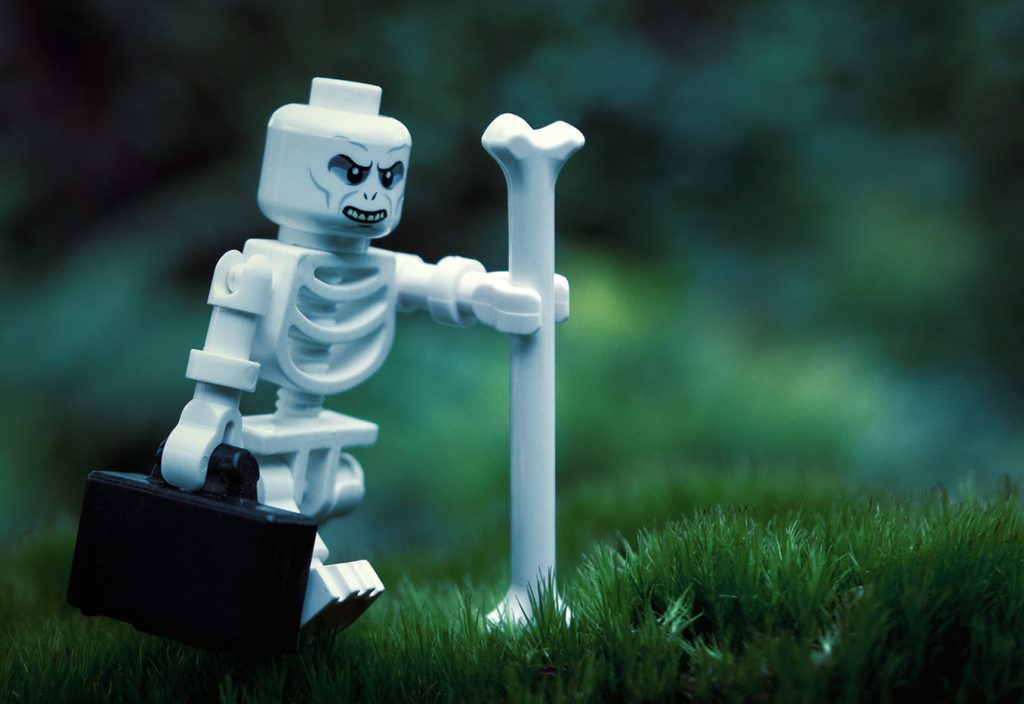
“Monday” Originally shot 30 Apr 2017
A dark background is great, but it often needs a little work in order for the subsequent layers of editing to stand out. By highlighting areas where the following effects will reside, it’ll save us coming back to do it later, if the alarm hasn’t already rung!
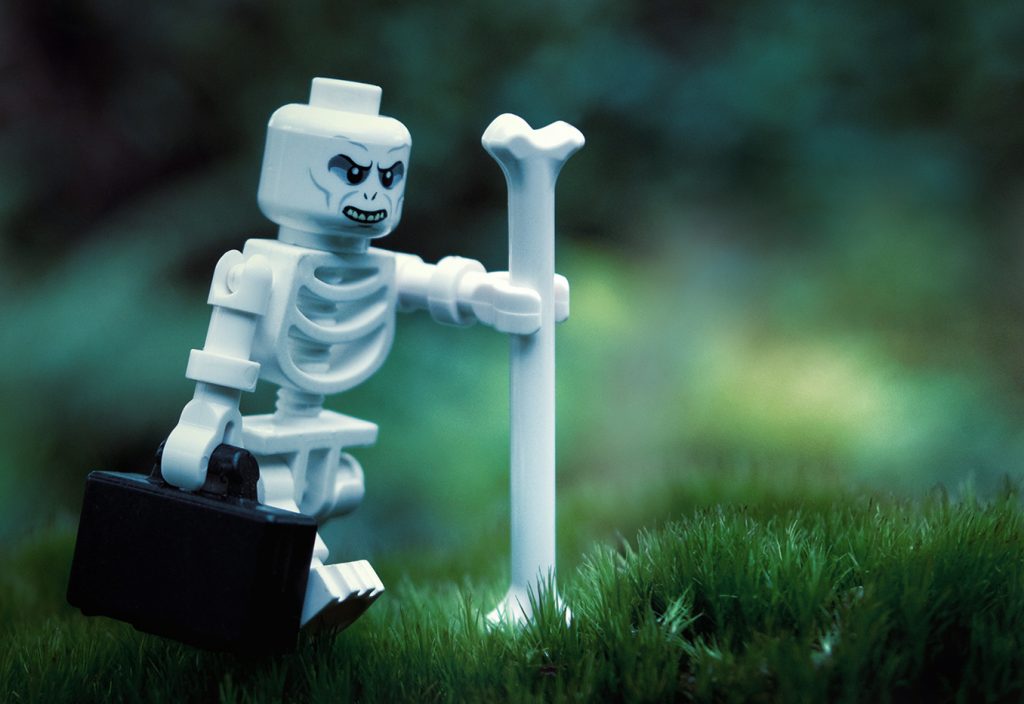
Background Enhancement
With sections of the background lightened, it’s then time to edit pops of colour for the effects to be overlaid upon.
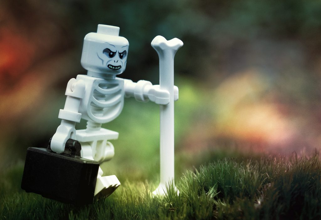
Background Colour Enhancement
Mist and smoke brushes are then used to create these effects, including some feathered erasing to simulate the smoke wafting through the skeleton’s ribs.
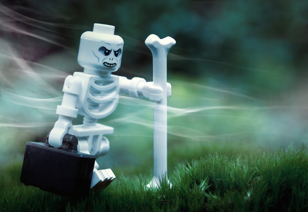
Mist and Smoke Addition
And debris brushes are used to add dust and debris being stirred up with the mist and the smoke.
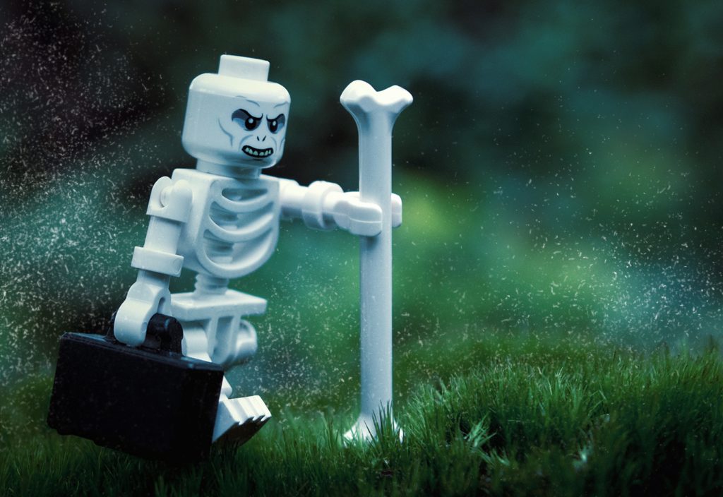
Dust and Debris Addition
But now I gotta listen to a 20 minute story that’s just a rumor
And I’m sorry but this nicotine and caffeine don’t gimme the same rush
NOFX – California Drought
Now that we’ve looked at all the components of the edit, let’s see them as they’re layered upon to the original in the slider below.
[metaslider id=15479]
*puffs* “And here’s the result of the 20 minute edit.” *pants*
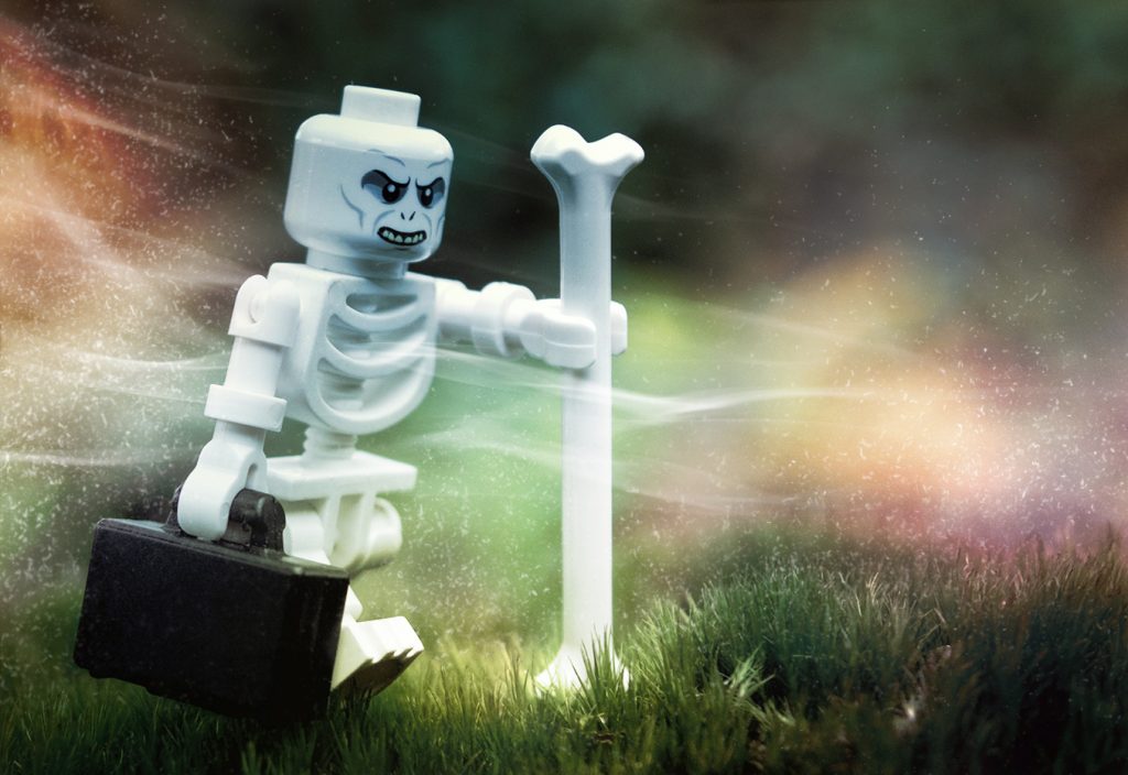
The 20 Minute Edit
Setting a limit to how much time I can spend, I usually end up with something similar to what I would’ve if I’d spent far longer editing. It forces me to focus on the task at hand rather than finessing a blade of grass that no one will ever notice anyway! Spending a fixed time on an edit frees up time for the other things that are demanding some.
– Brett
Have you ever set a time restriction on what you do? Have you limited the number of photos you shoot, or set an alarm when you’re at the computer editing your photos?
If you’ve made through all my blathering and ended up here, you should sign up to our weekly email round up where you’ll get a recap of all the babbling from the week.
And while you’re doing things, you should definitely join our G+ Community where we hold monthly contests with prizes and lots of other cool stuff too.


![AI is ruining toy photography [a personal viewpoint]](https://toyphotographers.com/wp-content/uploads/2026/03/Together-As-One-Ultra-Magnus-revealed-scaled-500x383.jpg)

A very cool edit and setting a time limit is definitely something I should do, I spend way too long in front of photoshop with my Wacom at the end of my arm. I like to get rid of all the dust and imperfections on my minifig photos, I’m obsessive about it… too obsessive.
Setting a time limit might also mean I’ll post more images. Maybe I need a 20 x 3 limit… 20 minutes to conceptualise, 20 minutes to shoot, and 20 minutes to edit. Though my ideas often morph during the shoot. So maybe 10 minutes for concepts, so I can have 30 minutes for shooting. ?
Thanks mate.
Yes, even though this isn’t my normal ‘editing’ process or techniques, setting time limits helps me not waste an afternoon over-finessing. It’s rewarding to revisit my roots, where I cut my digital teeth all those years ago, and find that I haven’t forgotten everything I’d learned!
I’d already adopted the ‘less is more’ mantra when shooting. Selecting one from four to edit is much more efficient than attempting to pick one from fifty! Or more?
I like that you’re already bending your self-imposed rules! 😛
To save time I bypass the bulk of Photoshop and my desktop entirely. I have found it much more intuitive to use my iPhone as my digital darkroom of choice. I use the app Enlight as well as Mextures and I have so many presets that editing doesn’t take more than 5-10 min most days. Enlight is great for removing dust and also exports full-resolution images. This being said, I have also bypassed editing in raw. I just have not seen the benefits of raw. I know there is greater data in the darks and lights of raw but, the Olympus jpeg compression in camera is really well done – so I save time with the portability of editing jpegs. Most my content is being shared online and I have found that 8×10 prints or smaller have no less quality with jpeg than raw edits. If I’m going any larger than an 8×10 then photoshop and raw edits are needed, but so far this hasn’t been needed.
Great edit Brett; although I do like the darkness of the original as I think it fits the scene of the skeleton a bit more. I am fond of minimal to no editing as well.
Cheers Joe.
I prefer the original too. this was more of an exercise in restraint and a test of my memory. It was nice to find that some of learning from years ago has stuck!
I’m a huge fan of ‘editing on the go’ too when I’m away from my laptop. The power in some Apps amazes me, Mextures, photogene4 and Snapseed just to name a few.
Wow, I’m in awe of your photoshop skills 🙂 I wish I could spend only 20 minutes editing but, like Tyroga, I like to remove all the dust and clean up the printing errors – especially since most of my shots are closeups. I try to limit the amount of time I spend on setup and shooting though – otherwise I’d leave the setup on my table for days trying to get one photo that I would never finish 🙂
Wonderful shot and post processing! I really like the mist going through the skeleton 🙂
Thank you Lynn!
Time spent planning, setting up, shooting and editing is always a battle. However, cleaning dust and imperfections is a must. I don’t care how long I take tidying up a shot!
But I know that if I’m ever to manipulate a photo with effects (which is very rarely!) I have to put a limit on my time. Hours could easily be whiled away if I’m not aware of the time spent. Hence the 20 minute countdown clock!
Nice edit! I’m not that fond of the specs of dust, though I do like the fact that some of them seem to light up in a beam of light.
I used to edit a lot and sometimes I still do… but then because of an idea I had beforehand.
In the end I like your original the best; the skeleton moving around in the shimmering light, grinning because of some dark idea.
I never set a time-limit, because I know I won’t stop until I’m happy anyway. The edits I make myself are mostly removal of dust and dirt, a bit of sharpness/ contrast and the lighting settings. In my comics it’s sometimes a bit more because of the requirements of the story.
On the other hand, some photo’s are heavy in edits simply because I want to try out new editing techniques. I usually like the photos directly after the edit, but getting back to them some time later I’m mostly not that fond of them… progressive insight I guess 🙂
Thanks mate.
I’m not a huge fan of heavily editing/manipulating my own photos either!
I like to experiment too, and this was an exercise in that. And it was a little test of my memory to see if I could remember things I learned way back when I was studying and cutting my digital teeth on Photoshop in the early 2000’s. Some of it had stuck in my brain.
And now that I’ve learned that I’ve remembered stuff, it’s back to simply removing imperfections and tidying up some of the settings for me.
That’ll free up some time to revisit my high school maths books to see I’ve remember any of that!
Already in the 2000s! What study did you do?
Whenever I manipulated my photos too much it always remembers me of the old days when I started (as a hobby) creating websites. My first websites would be soooo crowded; flashing thingies, sounds, moving objects, etc… I did it because I could (or thought I could haha). But in hindsight it was so ugly because there was no general idea behind the things I did (as well as no knowledge at all on the conventions of making a good website). Now, as in my photos, there needs to be a general idea, I read up on every adjustment I make and only do the most necessary edits.
Less is more…
Ha! I couldn’t agree more.
I studied web design and digital media. My first websites were horrible too, throwing every bell and whistle I could into them, just like you. My early photo manipulations were the same, throwing everything at them, hours of time, multiple adjustment layers, every effect I knew and some I didn’t. All simply because I could. But I shouldn’t have. I really shouldn’t have!
And just like you, less is more is exactly how I approach web design and photography today.