Sometimes things don’t go the way think they will.
This was certainly the case when it came to writing this post. This is the third monthly post I’ve written for the blog and during that time I can say my way of taking photographs has changed. Planning has never really been my forte—usually I go from one spur of the moment idea to the next, picking up another toy to shoot. But with the Virtual Meet-Up at the beginning of the year and my recent posts, there is now a need to plan, a need for ideas to write about, and for inspirations to adapt into my own photography.
But the story of this post did not go to plan. There were many inspirations, both expected and surprising, when it came to these words and images, with a few twists and turns along the way.
I guess this post started quite a while ago when I picked up the Marvel Legends Logan and Charles Xavier double pack. They are a pair of awesome figures, with great likenesses. I just hadn’t got around to taking any photos of either of them. When I finally got Logan on Blu-Ray a few weeks ago, my interest was peaked. I really, really like the movie. It’s a great character-driven story that crosses different genres and gives its protagonists real-life stakes alongside the fantastical comic book stuff.
Noir or just black (and white)
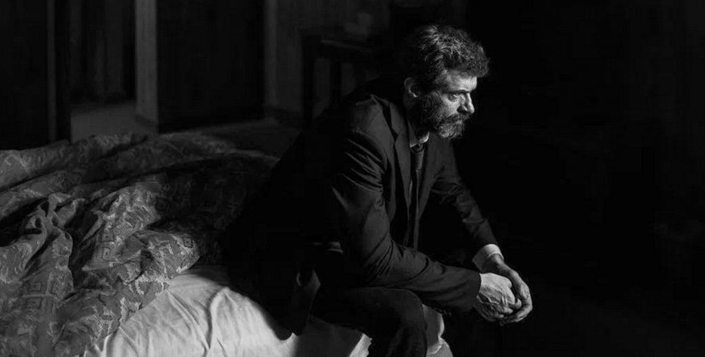
But I was particularly interested by the second disc of the set, which included the “Noir” version of the movie. For anyone who isn’t aware, if you buy the right version, there is an identical cut of the original movie but in black and white rather than colour. For clarification, and in my opinion, the name is somewhat misleading, this movie is about loss, but in the face of that, hope and self sacrifice. It is a far cry from the cynical nature of true film noir, and something doesn’t become an actual noir movie just because it’s in black and white. This sits closer to Mad Max: Fury Road Black & Chrome, an interesting take on an already existing full-colour movie.
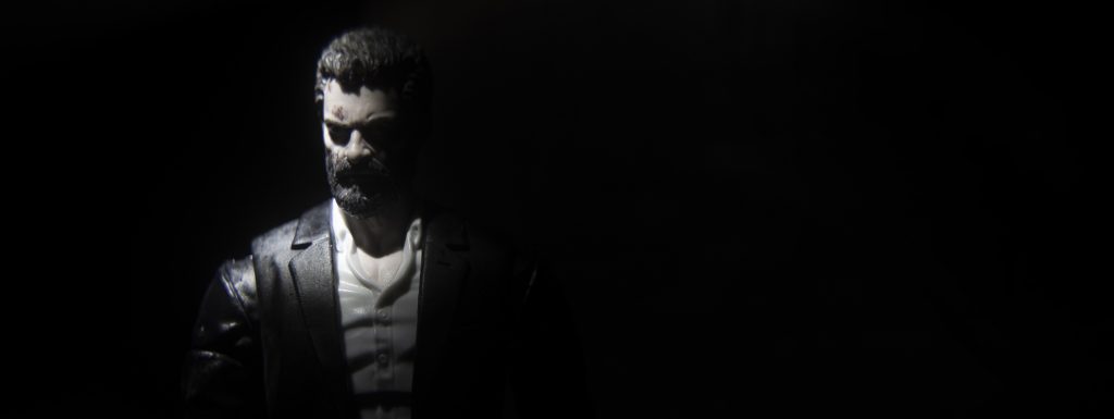
Nevertheless, I pulled my grizzly, aged Hugh Jackman figure out of storage and attempted to capture him with the high contrast, heavy shadowed style that is so associated with the noir genre. To borrow/steal from Wikipedia: “The 1940s and 1950s are generally regarded as the ‘classic period’ of American film noir. Film noir of this era is associated with a low-key, black-and-white visual style that has roots in German Expressionist cinematography.” And to be quite clear, and a bit ironically to my previous point about Logan not being true noir, I chose to retain an amount of colour saturation, even if it is a tiny amount.
I’ve always enjoyed dropping some portraiture into my somewhat eclectic timeline. I love taking photographs that lean on traits like Rembrandt lighting or a chiaroscuro style to create dramatic images with very simple setups. Read more about Rembrandt lighting here and chiaroscuro here. All you really need is a dark room and a spotlight. Personally, I use cheap, zoomable LED torches, but I find it a brilliant way to study the shapes of a figure and learn how to position my lighting to get the right effect. They may not be my most liked or commented on images, but I definitely know they are making me into a better photographer, and love them for it.
When it comes to six-inch figures, the face sculpts are now becoming so good for the size, but if we were to be honest, the paint application isn’t up to the same standard yet. In the past I’ve even gone into re-painting some of the figures I own (looking at you The Force Awakens Black Series figs) to try and improve them. But one thing that will undoubtably improve them in-camera is the lighting. Contrast helps define three-dimensional contours on the face. It moves past the softness often found in the paint and brings definition to the character’s features.
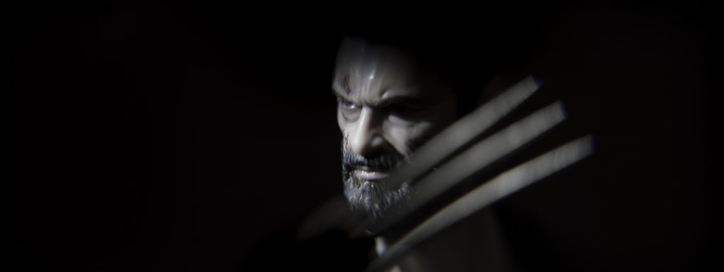
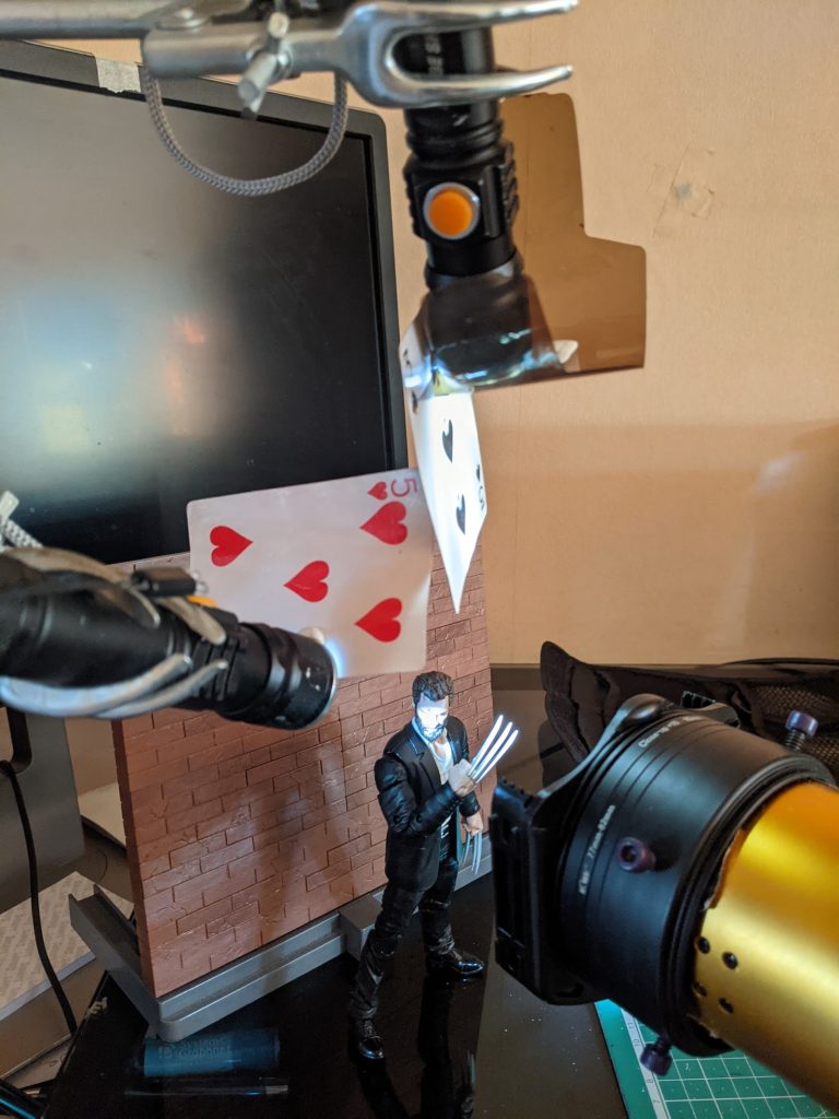
With this particular image, and as you can see in the behind-the-scenes (BTS) image, it was a simple setup of a side light to highlight the contours of his face, and another down light just to catch his claws.
Stop being so negative (about space)
Another influence on many of my photographs, and the way I choose to position my subjects, has been the brilliant cinematography of Tod Campbell for the USA Network (now on Amazon Prime) show Mr. Robot. Check out this article on the show’s cinematography, specifically the framing and use of negative space.
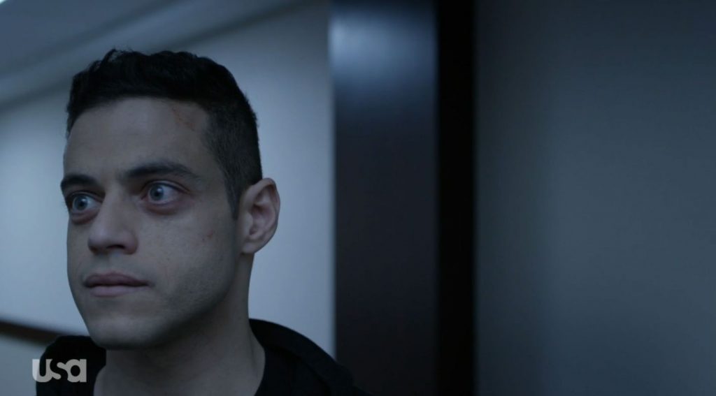
As you can see in the example above, by positioning the subject so close to the side of the frame they become both lost in and scaled by the vast openness of the rest of the image, the weight of that space weighing down upon them. In the show, this is used to great effect to show the unhinged, paranoia-fueled states of many of the characters.
I try to use it myself, not in an unnerving way, but with a sense of gravitas. In the image below, Logan carries the weight of the large body of darkness to his left, literally on his shoulder, yet he hints at looking towards the light, pulling himself into the brightness, even if it’s only a little bit.
I want to break free (from lockdown)
Following my images so far, I wanted to start grounding Logan in some locations, putting him in scenes and not just having him existing in a visual limbo. My inspiration for this came from a video I watched on YouTube ages ago. I follow photographer Sean Tucker’s channel—he takes a wide variety of images, especially street and portrait photography. His channel is a mixture of the usual tech and technique talk, but he also philosophises on lots of the why’s of photography and making art. I love his really considered and complete view of what he does and how he shares it. He’s well worth checking out.
Ironically, while producing very high contrast and noir-like images himself, Sean Tucker is not the individual who inspired me. It was actually this video on his channel where he profiled another photographer, Fiona Lark. She’s mainly a self-portrait photographer and you can find her on her website or @fiona_lark Instagram account. She tends to take her very moody photos out in the wilds of the Lake District.
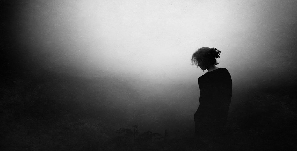
I love the drama and the contrast in Fiona’s images, but also her connection to the space she is in when taking her photos. This gave me lots of ideas for getting outside and recreating dramatic portraits of Logan in the desolate landscapes from the movie. The problem is I don’t live in a hot country with arid landscapes. I live in the suburbs, in a very green country, and there’s a national lockdown happening. So the alternative was to head down the digital diorama route.
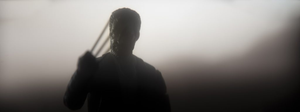
For dioramas you need background pictures though, and a while ago I found Pexels. It’s a free stock photo website that’s great for digital backdrops. With this photo I combined a desert scene with some shallow depth of field and some Atmosphere Aerosol to create a hazy atmosphere. I then positioned an edge light over his right shoulder, to work with, and emphasise particular parts of the wrap around light from the monitor behind the figure.
Build it and they will come (or the toys will be positioned appropriately for dramatic effect)
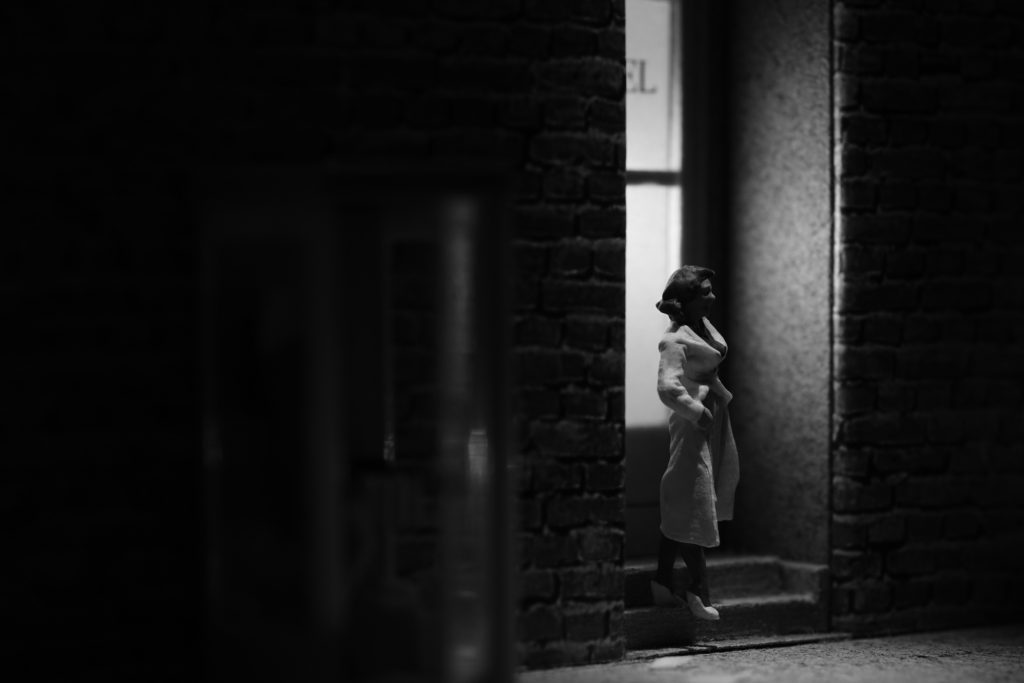
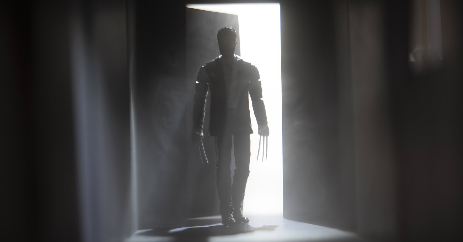
At this point I was searching around for film noir inspiration, and thinking about Tobias M. Schiel’s photography in particular. I was so inspired by his talk in the Virtual Meet-Up back in January. I love the imagery Tobias produces, but it was amazing to see how he constructed such dramatic pictures in such a beautifully simple way. And then I saw this Skyfall clip above and knew I would no longer be taking Logan outside. I was heading inside. Skyfall isn’t considered particularly noir-ish, but if a moody corridor doesn’t say film noir, I don’t know what does. Time to be like Tobias and get building.
It was a very last minute decision to attempt this so I wanted to keep it as simple as possible. I made some rough estimates on size, based on dollhouse measurements, and started cutting. This corridor was a very simple structure with nothing but thick black paper and masking tape—no glue or paint at all. It was really easy to build, taking no more than an hour or two. The only challenge was the scale. In comparison to Tobias’ work with such small-scale figures, working with six-inch figures means fairly large set builds. This corridor ended up just shy of a metre long, though I will say this was somewhat necessary due to my wide-angle anamorphic lens.
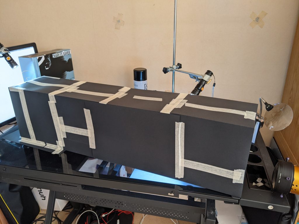
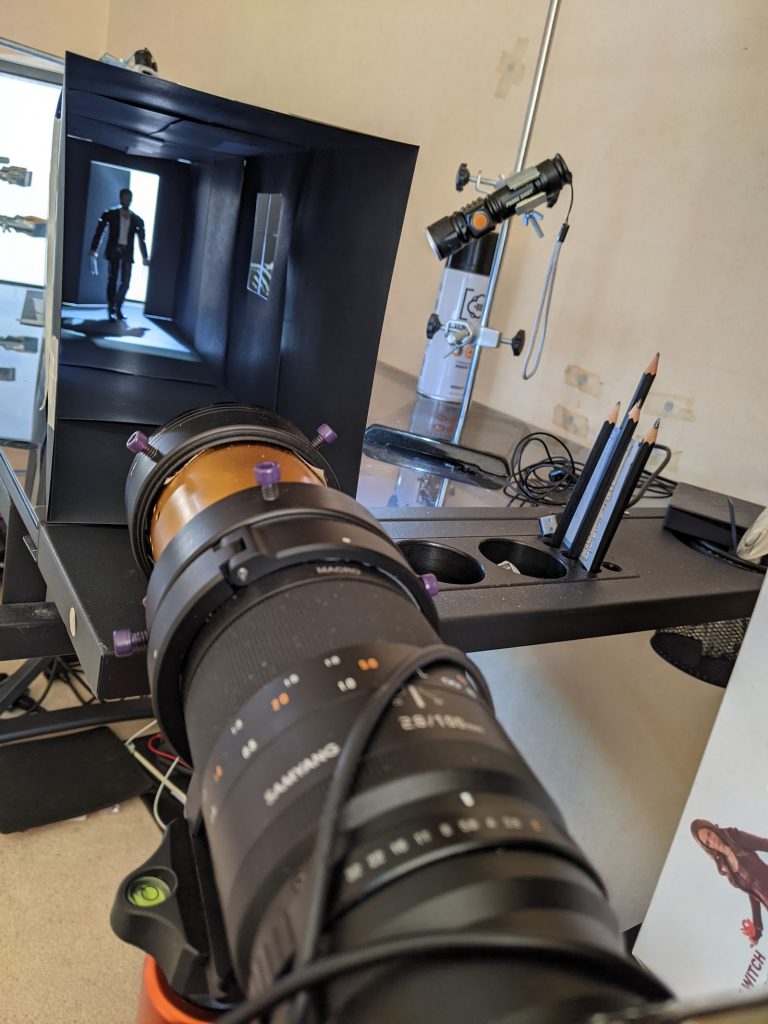
As you can see from these BTS photos, it was a fairly basic structure. I had an open end for the camera, an ajar door cut into the other end for some backlight, and a two-pane window halfway down the corridor to allow for some side light and atmosphere. I attempted to do some set building way back when The Mandalorian originally came out, but I never had the time to finish it to anything like the standard I wanted. This method, on the other hand, was brilliant for a quick result, and when combined with the lighting I used, the rather basic qualities of the set are made somewhat redundant.
The lighting was also very simple, I set my monitor to bright white behind the door and then shone one LED torch through the top of the door opening and another through the window. After that it’s just a case of filling the corridor with aerosol and hey, presto, God light.
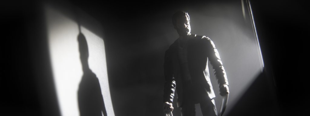
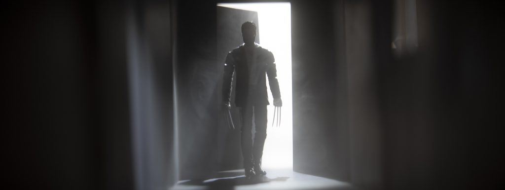
Thank you if you are still with me after this meandering wander through my eclectic thought process. As I mentioned at the beginning, this was certainly not where I expected this post and these photographs to end up when I started. But as the saying goes, it’s about the journey rather than the destination. And in hindsight, I’m very inspired to get into more set building and to watch more true film noir for inspiration.


![AI is ruining toy photography [a personal viewpoint]](https://toyphotographers.com/wp-content/uploads/2026/03/Together-As-One-Ultra-Magnus-revealed-scaled-500x383.jpg)
Tom this is great. I loved following along on your journey to get to the end result.
Thanks Sabrina, a bit of a meandering journey with this one, and certainly not the destination I thought I was aiming for. All part of the fun I suppose ?
Tom, your line of thoughts seems quite familiar to me. Various starting points, trials and errors until you finally develop your own picture – one that seems to leave everything behind it that inspired it. Impressive work! (And needless to say I love it, right?)