By dictionary definition, success is ‘the accomplishment of an aim or purpose (it’s also ‘the attainment of popularity or profit,’ but let’s focus on the first one for now.
I think the path to creative success begins with a pride in your work. Are you creating work that you love, that fills your creative craving? Maybe your work isn’t always your definition of complete perfection, but can you look at your latest image and think ‘this is it, I’m getting it, this is where I need to be?’ If not, why not?
Maybe there’s something wrong, or something missing. Maybe it’s a matter of finding your passion. You’re a toy photographer and you are fascinated by toys. Great, but what else do you love? Whether movies, animals, morning light, combine it with your toy photography and you’re one step closer to creating images you love.
I get so excited about my new images and ideas, and then a few months, weeks, or days later I hate them. A few stick, but some I just wonder what I was ever thinking. Over time, I’ve come to see this as a good thing. I stop myself from deleting them from social media, I instead have chosen to learn from those bad apples.
This can be a good practice when looking at the work of others too. Spend time with an image and ask yourself what you like and don’t like and why. Whether that’s in terms of light, types of toys, realism or lack thereof, meaning, scenery, etc. Then, apply those ideas to your own work.
Overall, you are the scale to measure your own success. It may sound cheesy, but make your art for you, and if other definitions of success follow, then so be it.
With that, it’s time for a tour or my images I hate. I’m not saying these are bad, but they’re ones I’ve developed a bad taste for for one reason or another. These immediately popped to my mind when putting together this post, and when pulling them, a new light was shone on some, and I can’t believe I hated them so much… All in all, here’s what I’ve learned.
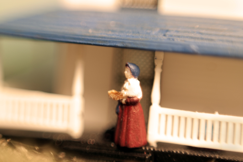
2012 – My first focused toy photographic work. I used a reversed mounted lens and while I got a lot of detail, I hated how little control I had over focusing. Then in post processing the porch railing was so overblown and after all the work it took to get it to a printable image for a class photo critique I was already long past it. That said, this series was about WWII and I’ve continued using war symbolism in my work since.
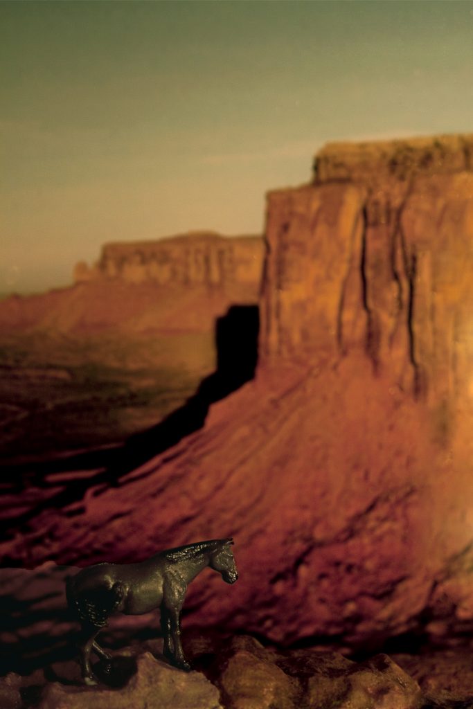
2013 – An image for my final college project. I got an overwhelmingly positive response from others on this one…because of the background. The background is a stock image that you probably even have in your ‘My Pictures’ folder right now. My contributions were the rocks and horse, and after the positive reactions to the beautiful scenery I felt so disingenuous. Using photo backdrops is great, but maybe not where they make the image.

2013 – Perspective is so important, at least to me. And I just can’t get over how I didn’t take the time to make the road fade further into the background.
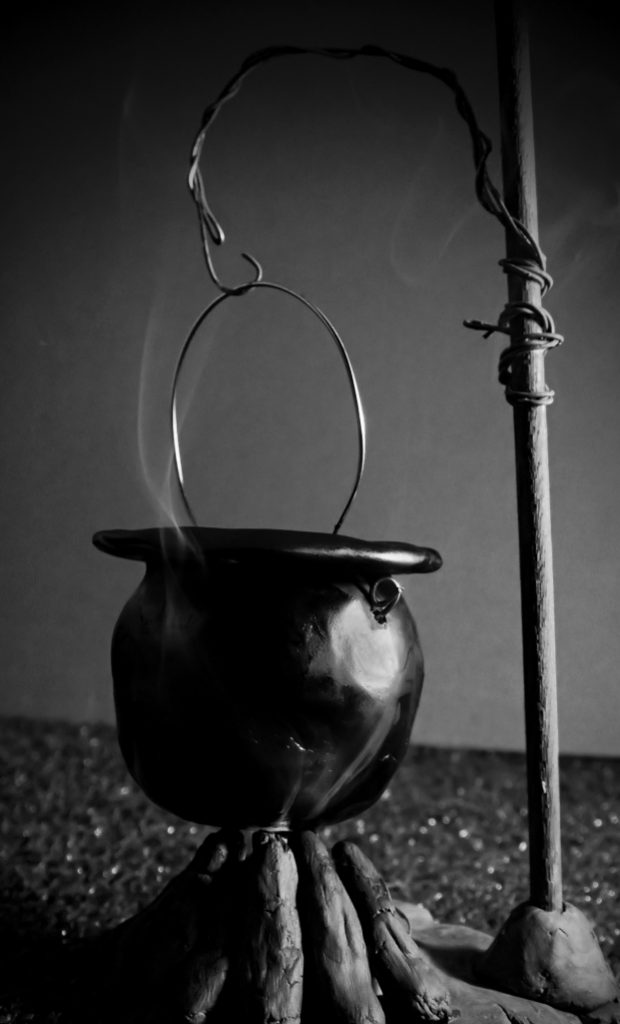
2016 – I hand made everything in this image, that’s great, but I feel like the image became more about the items in it than a new idea in a photograph. I do however like the real smoke effect, and have continued to use similar effects in my work.
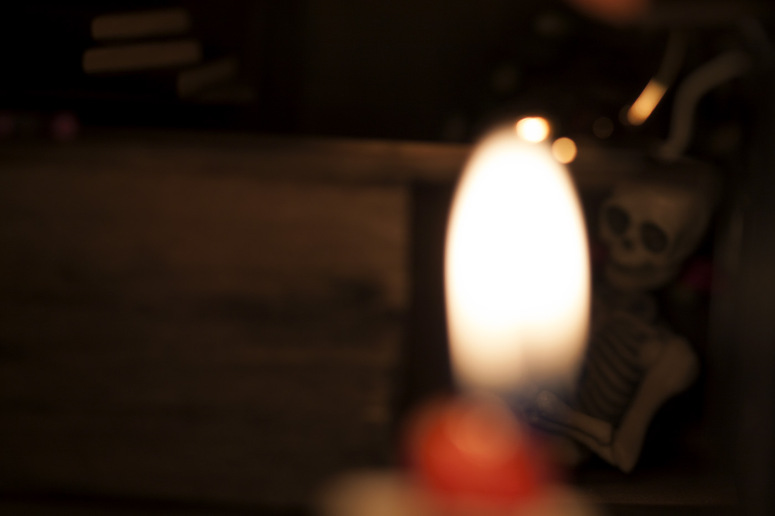
2016 – The overall idea here was to show a skeleton hidden behind a shop counter. However, while you can maybe figure it out when looking at all the images in the series, as a stand alone image I feel it falls flat. In an effort to create mystery, I left out too many needed details.


![AI is ruining toy photography [a personal viewpoint]](https://toyphotographers.com/wp-content/uploads/2026/03/Together-As-One-Ultra-Magnus-revealed-scaled-500x383.jpg)
“I get so excited about my new images and ideas, and then a few months, weeks, or days later I hate them.”
Boy did this resonate with me! I can’t even think of an image that I haven’t loved, hated then loved again. The more I love it in the beginning, the more I tend to loath it later. I don’t trust my own first opinion about anything; especially anything I love right away.
I tend to look for images that I continue to like, weeks, months and years later; those are the keepers.
Fabulous post Jennifer. I really enjoyed the second half when you showed your images and revealed your thought process. As artists I think it’s so important to be able to look at your work with a critical eye. Ok, maybe not too critical since we can also be our own worst enemies.
Thanks so much for sharing!
Thank you so very much. Those few that stick with me hold a special place in my heart. The rest, well maybe I’ll love them again later. SO glad you found your own truth in my words. Thanks for having me.
I find that since I started to wait (sometimes months) before posting a photo online, there are less photos that I’m less happy with. I think looking at them regularly before posting them helps a lot to take some distance to have a better idea of which ones are really bad and which ones are worth to share.
Oh and I really like your definition of success 😉
Thank you.
Awesome point. I post much too quickly to social media. I want to share my excitement in my new image right away. But I notice the same, when I actually wait I become more critical. Sometimes even going back and reshooting something until I get it right. Looking again leads to new discoveries.
I can relate to your love/hate relationship with your images Jennifer. I always try to hold back my high from a (supposedly) successful shoot and to not post my images straight away, but sometimes I don’t and I usually live to regret it. Some images I still love but others…. Well, you know the feeling. I have one in particular that I posted on FB just recently that I have since deleted. While the idea was good the light was all wrong, so back to the drawing board. We are our own worse critics though, so sometimes I have found myself overthinking an image and reshooting only to realise I had it right the first time. It is best to leave an image for a few days then to look at it again with fresh eyes. Sometimes you can actually surprise yourself and think, Yes. Damn, that is a good shot.
Exactly how I feel. I often post much too quickly, and it’s so enlightening those few times I don’t. I’ve been through instagram and deleted quite a few older shots recently. But I sometimes need to remind myself that it’s okay to grow, and non-perfect images can still have merit… I don’t always believe myself thought 😛
One of the issues, I think, is not so much does it still make *you* appreciate the image, but does it make *others* appreciate the image.
For example, the very first one (WWII), it does have some technical issues for sure (blown out areas), that are not technically correct, and you remember the frustrations, and have the mental image of “I can do so much better now”. However as a viewer, looking at something that is intended to be WWII era photography, I didn’t see those issues. The “technical” imperfections measured by todays standard, are what I normally expect from vintage work, so while not technically correct, the imperfections are perfect for the look and feel of the piece. So I think the photo is a success.
This does all underline that we are the worst critics of ourselves.
Dave, thank you. You present a very good point. When sharing our images publicly, I think the opinions of others do come into play as to how successful our work is in this front. And I so love what you’ve said and gathered from an image I’ve deemed for myself unsuccessful.
But I do think it’s important to be happy with your own work in defining your own success and to let the options of others influence you only just a little bit. If you had said you hated an image of mine that I loved, while I hope I’d take your opinion and advice in stride, I shouldn’t necessarily stop making images that fulfill me as a creator.
We are for sure our own worst critics though – sometimes a blessing, mostly a curse.