The Case of the White Mini figure…as in the all white Star Wars mini figure. I think there is something unique and inspiring about these special edition all white figures like the Prototype Boba Fett and now the White Wookie. It’s no secret that I rarely post photos from the Star Wars cannon of LEGO mini figures, yet I love these all white versions.
I adore the white Boba Fett. It was love at first sight! There was something about him that was creatively appealing. Was it his lack of color? Was it his simply black, white and grey color scheme? Maybe it was because this version was never used in the movies so he was free from a back story? Maybe its because he’s Boba Fett!
Whatever the reason I rarely leave home without this fabulous figure. He’s my main Star Wars muse.
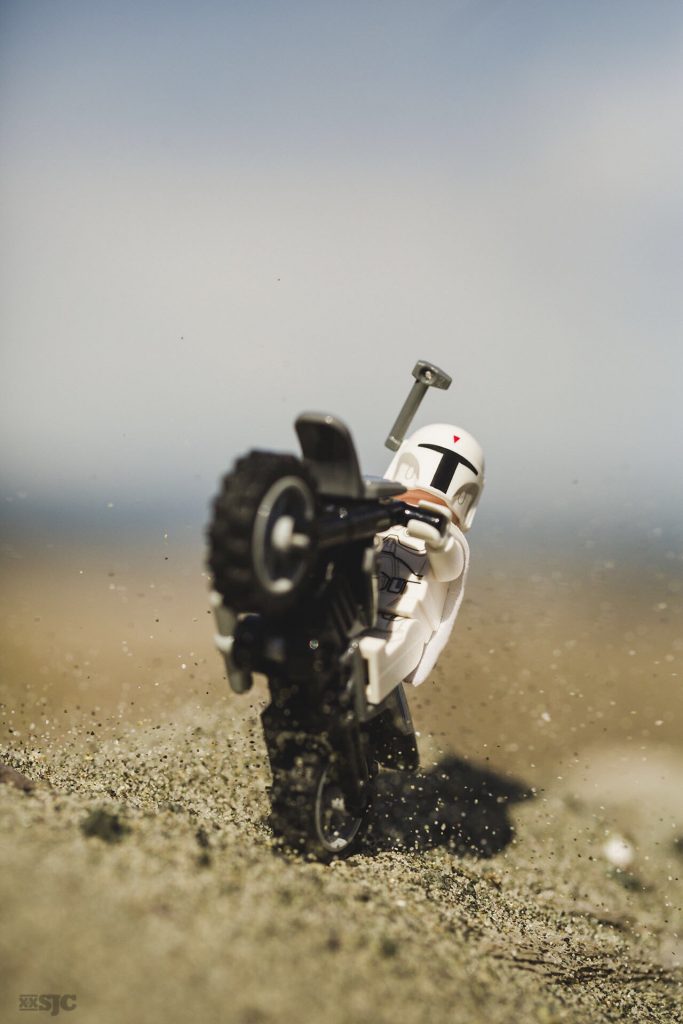
A Need For Speed
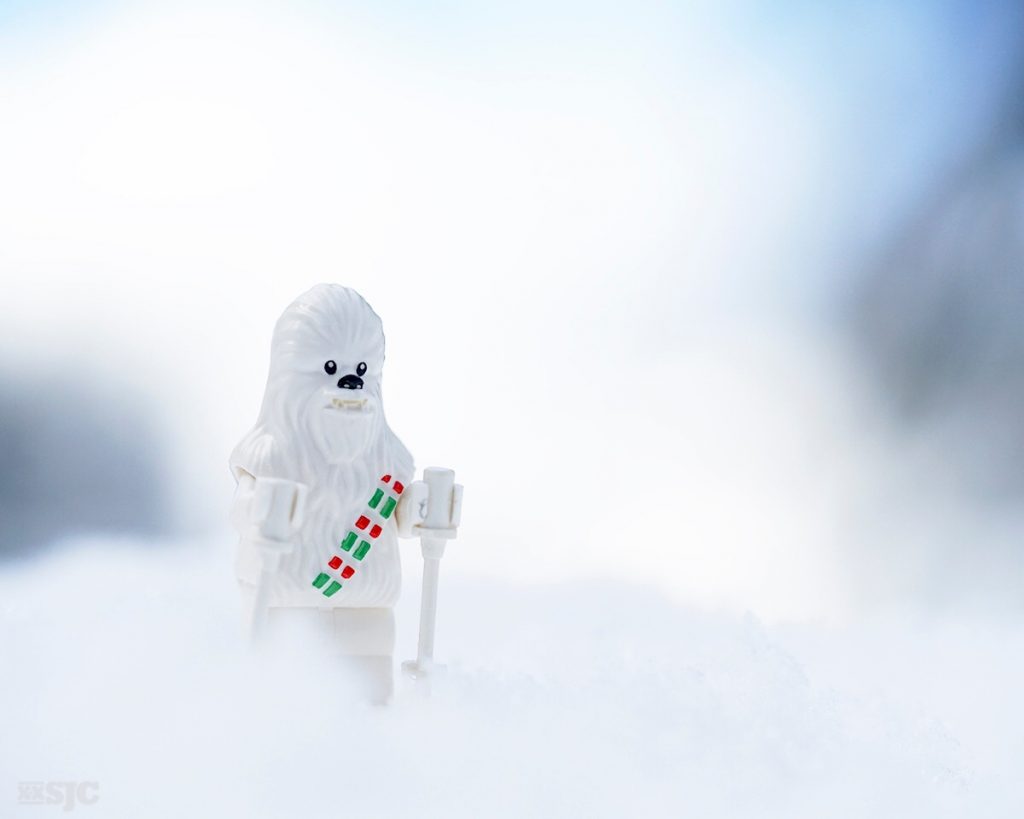
That was until the White Wookie came along!
Who bought the 2016’s LEGO Star Wars Advent calendar just for the White Wookie? I did! There is something very appealing about this white version. I find him to be another wonderful muse that I added to my collection. He’s the perfect winter wonderland companion.
But wait! Maybe I have this all wrong!
My love of white doesn’t stop with the Star Wars special editions. I love the classic white spaceman too! I never leave home without this guy. He’s the quintessential mini figure and still one of my primary muses.
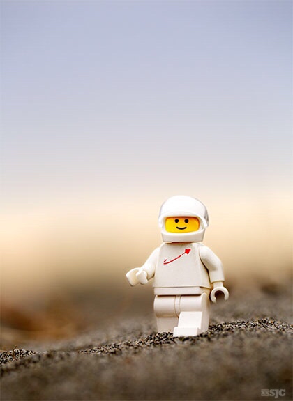
In fact, when I look back through the photos I’ve posted on this blog, I see a lot of images featuring white Chima birds, white rabbits, white Yeti and even a few white Panda Troopers.
- Panda Troopers
- On Golden Pond
- The Power of Music
You may have noticed that I’m also attracted to the LEGO skeletons in all their iterations. I find them to be a simple, yet symbolic muse.
- Until death do us part
- Scavengers
- Winter Fun in the Overworld
Do white Mini FIgures have special powers?
Looking at my own photos I think they might. It doesn’t matter if it’s a special edition Star Wars mini figure or the classic space man – that simplicity of form and color helps the viewer to clearly see your message.
This is not the post I started out to write. Its funny how you can start with one idea and after sketching out your post, you end up veering off in new directions. Whether you think there is a special case to be made for the absence of color or not, I realize the figures I find the most appealing have this in common.
What do you think? Is their power in the simplicity of white?
~ Shelly
A Note About Subscribing: You may have noticed the ‘subscribe’ button in the bottom right corner and wondered what this is all about. Subscribing is an easy way to stay in touch with all the doings on the blog. Through the magic of MailChimp, you will receive a notification of any new post. In addition I will also be sending out weekly roundups to highlight interesting posts or additional items of interest. If you’re interested in staying in touch, this is a great method. Thank you for your support and your time. 🙂







![AI is ruining toy photography [a personal viewpoint]](https://toyphotographers.com/wp-content/uploads/2026/03/Together-As-One-Ultra-Magnus-revealed-scaled-500x383.jpg)

I think it’s something that entirely depends on one’s own vision. Personally I would rather be a supporter of the power of colors, and in particular warm colors. That might be the reason why I find it difficult to take black and white photos. My current experience with permanent snow even confirm it. I find it really challenging having to work with a landscape covered with snow. I can’t wait for the snow to melt to find below it the gorgeous greens and browns of the forests. Even when I look at the photos I’ve taken in January, the snow is never white. Either it includes reflections of the golden sun, or I tweaked the white balance in post-processing so the snow looks blue or even purple.
That said I also bought the Advent Calendar just for Snowbacca. He’s such a great figure 😀 (But still the only photos I’ve taken with him are dominated by colors rather than white)
We are not so different here, I have always been a color photographer. I rarely take black and white photos. I always add yellow to my photos preferring that warm cast to a cool tone. I think its important to realize that snow is never just white – it can so many different hues depending on the light and the location. But both of us bought the advent calendar just for that White Wookie – why? Why are the Storm Troopers so popular? I’ve heard all the reasons and put many of them forth myself – but maybe it’s simply because they’re white and make a nice contrast to the surroundings. Or maybe white is like a blank canvas and we can add our own emotions and stories to these predominantly white figures? There are no answers here – only food for thought and a chance to reflect on why we do what we do. Thanks for joining in the conversation my friend! 🙂
My thoughts are thus:
White makes it generic, and because its generic, you lose some of your assumptions about the character. For example colour Boba Fett is a cold bounty hunter with zero sense of humor, and not to be messed with. Generic Boba Fett? I dunno… maybe he’s on vacation and ready to chill…
Since the assumptions are lowered, it is easier for the viewer to bring their own perspectives into the image. Any time you can bring a viewer into an image, its stronger as a result.
Great comment Dave! I think you’re right, anytime you can engage the audience without any preconceived ideas, you have a better chance of engagement. And as a photographer, isn’t that our goal: to engage with the audience. Thanks so much for going the conversation! 🙂
Great things to think about. I bought to Star Wars calendar for the Wookie too, but I must admit that I haven’t photographed him yet. Your post inspires me to get him out and play with him this week.
I’ve never seen the white boba fett, but something about him does draw you in. Maybe it’s the blank slate, maybe it’s the contrast to his environment. I’m not sure.
I’m also not sure where this comment is going. I keep loosing track of thoughts about this post! There’s also something in my head about the use of white in the tone of photos (such as those beautiful Leia ones that Kristina takes) and the softness it can provide, in contast to the contrast that the white figures of the stormtroopers so often provide on so many photos. I may have to think about this some more! ?
Lizzi lets hope that LEGO is reading this comment thread. Already three people have admitted to buying an expensive Advent calendar for just one figure. They might get ideas! I look forward to seeing what you can create with your White Wookie. If you have any more thoughts to share regarding color free mini figures, the importance of light, the melding of the light and the figure please feel free to add to this thread. I enjoy talking about this crazy hobby in all its minutia. It gets me thinking, making connections and hopefully creating interesting photos. Cheers my friend!
The Winter Wookie rules, period. I actually spotted him at Bricks and Minifigs about a month before the Advent Calendar came out. Had no intention of getting the calendar, had no idea Winter Wookie was in it until Cindy’s brother bought it for us. That’s why I photographed mine early!
Not really sure why I was so drawn to him. I just got so excited to have a Frosted Chewie! haha! I love that you found this white color as one of your subconcious “red threads” though. Fascinating.
True confession. When I saw your White Wookie photo I was instantly jealous so when I got a good deal on an Advent calendar I grabbed it. So you’re the reason I have the wookie in the first place.
One of the reasons I like writing about toy photography is that I can make connections about my work. It wasn’t until I started looking at all the photos I’ve uploaded here, that I saw that particular ‘red thread. Weird that I never noticed earlier. As you say: fascinating!
Thanks, as always, for joining the conversation! 😀
I agree with Dave. Having a white minifigure does pare back the character and associations attached. Almost like a gateway character in television or film, where they are a touch bland or vanilla flavoured so the viewer can easily put themselves in their position; see Harry Potter in the early films, Ned Stark in Game of Thrones or slightly left field, but… Link from The Legend of Zelda games. As said it lets the viewer in and allows them to apply their own perspective.
I also see it as a visual paring back too. Shelly, the details of the sculpt you were able to capture on that winter wookiee would simply not be seen on a regular wookiee minifigure. The colour and printed design would overpower simply overpower it. I use white a lot in my abstract expressionist painting (when I’m not doing toy photography) and find there is a hidden depth within white not normally seen with the use of colour, and the references and baggage it brings. Long live minimalism.
Great comment Tom, thank you! I think its important to have a gateway into your imagery, photography, video game movie…whatever. If the viewer can’t see themselves in your story, then you haven’t connected. Great examples you give from other genres, this really drives the point home. I think there is a magic to white, it holds the key to all the other colors.
Interesting you would bring in minimalism, that’s a topic deserving of its own post! 🙂
Wow! I’d never thought that much about it, but this conversation has really got me thinking about how I approach my mono photography.
I enjoy dabbling in street photography, and even though there’s no real rule these days, I mostly shoot ‘old school’ high(ish) contrast B&W. I like the way that, without colour for distraction, contrast, pattern, form, shape, texture, and space, all take a higher priority in the image.
Like Reiterlied, I love the colours of Lego. For example: I have only just packed away my Mystery Machine (75902) and marvelled at the beautiful blue, green, and orange moldings. I’m yet to share my love of B&W with Toy Photographers, but I might just need to play with this idea you have put into my head.
Yeah! Im glad you see that these creative ramblings can have ramifications beyond toys. When you take that deep dive into the photography world, all this lessons we talk about, all these many topics work for all types of photography. I would love to see how you mix your hobbies or how one will effect the other. 🙂
White is a very interesting color. With painting and solid colors when you mix all the colors you get black. But with light, when you mix all the colors you get white. Bright white light includes all the colors and is how we can see any other color. I guess the absence of pigment to absorb the light and reflect some color back our eyes may have some kind of calming effect. Now that I think of it, I don’t think I have ever seen a bright high key shot that is scary, or creepy, or in general not inviting. Color has a real effect on mood and feeling in a shot, and I think that’s why I am personally drawn more to brightly lit scenes – they just create the happy mood I want.
Joseph, as you say color has a real effect on mood. Its interesting that you bring up that white holds all the colors within its emptiness. I like that analogy. Have you ever tried to create a high key photo in the desert? I would be interested in seeing what that would look like with the special light that is all around you. Heres to creating more happy photos! Thanks for joining the conversation! Shelly
I’ll admit, had I paid better attention, I’d probably have nabbed the calendar just for that figure, too. The all-white ones really do draw the eye.
Ryan if you still want a SW Advent Calendar try Math N Stuff in Seattle. Im sure they still have them. The all white wookie is pretty sweet!
Thank you Shelly, I will try a high key shot in the desert! …I might wait till it warms up a bit though as we have quite a bit of snow and frigid temps… 🙂
What an interesting idea, dear Shelly! 😀
In my opinion, this lack of color can get the special power in the photographer’s hands : you’ve found some remarkable color scheme, Shelly! You are making the unique palette of white when you are playing with these beautiful figures: it’s the unique property of YOUR figures, not Boba Fett’s power 😉 , because you know how to use the light and find the necessary background in the environment in order to make the white color attractive.
P.S. Sorry, Boba Fett, it’s only my point of view! 😀
Have a great day, Shelly!
Kind Regards,
Ann.