Taking a peak behind the scenes is a great way to learn about how other artists get the types of shots they do. To get tips, tricks, and see the madness behind the genius. That’s the goal of this post: to give you all a peak behind the scenes of how I captured one of my own recent shots, Hulk v Deadpool.
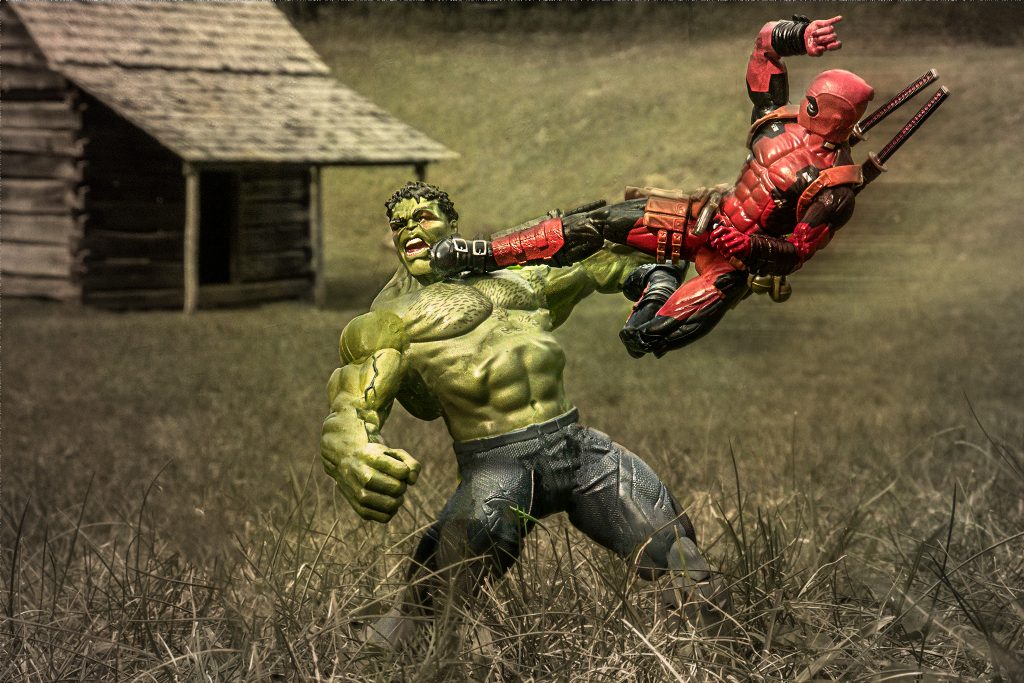
Specifically, this shot:
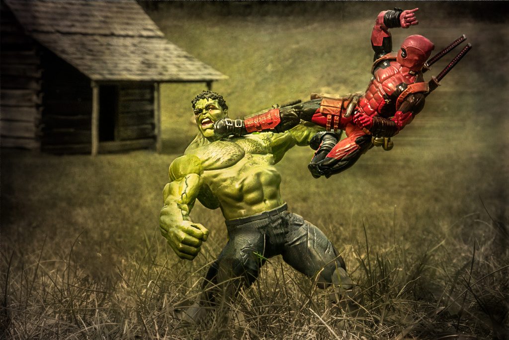
Hulk v Deadpool
Behind The Idea
The idea for this shot came to me while I was playing “Strict Parent” for my son, by supervising the cleaning of his room. While he put away his toys, I picked up his Marvel Legends Iron Man and started posing it (ya know, to pass the time). I eventually put him in a dropkick pose, which I really liked. I filed the pose in my fuzzy brain for later use.
“Later” came the next day when my wife needed some ideas for a location to get a shot (non-toy, sadly) of her own. I recalled a location just up the mountains from our house called Jesse Brown’s Cabin that would be perfect for her needs. So we made plans to go there the very next day.
Since I now had plans for an awesome location, I flushed out my own concept, and decided it was best served with Deadpool getting the drop(-kick) on Hulk.
Behind the Location
Jesse Brown’s Cabin is located around mile marker 270 on the Blue Ridge Parkway. It is a field with an old building, a lonely tree, lots of woods nearby, and it is in the mountains, so it’s the perfect place to be.
It looks like this:
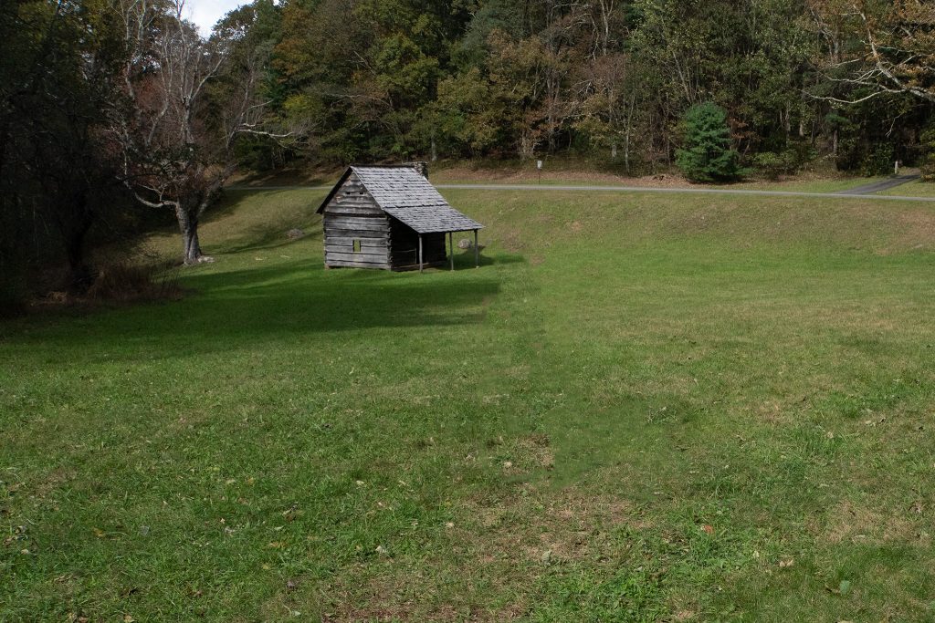
Jesse Brown’s Cabin
When I arrived, and did what I could to help my wife get her shot (my primary goal for the trip), it was time for me to play. So I grabbed my action figures, scouted the scene, and picked a location. The criteria for location selection was three fold:
- The perspective made the figures look life size to the cabin, which was about 100ft from the cabin itself.
- The cabin was at a flattering angle, so it looked good in the frame
- The sun was behind me, and therefore shining on the figures. (Take advantage of free light when you can get it!)
Behind The Setup
Since the shot is an action shot, I needed to find a way to support Deadpool mid-kick. To accomplish this I used a technique I learned from FathersFigures at the Toy Safari in Oregon: 14 gauge black solid-core wire.
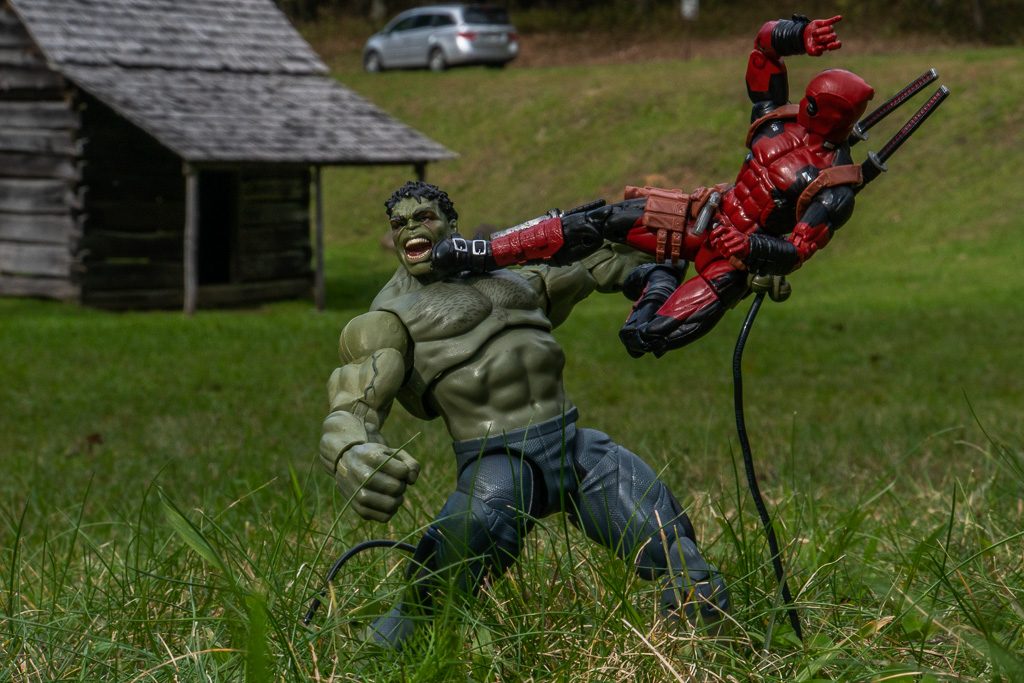
The scene straight out of camera, including unsightly wires.
I got the wire at Lowes and the budget friendly price of $14 for 50ft. I keep a couple lengths about 6-8 inches long in my camera bag for moments such as this. For Hulk I pushed the wire into the seam in his upper back, then created a loop at the ground level, so Hulk is leaning back against the wire, which keeps him from falling over.
Note that I could have saved myself some post-processing if I hid Hulks wire behind his leg, but I didn’t notice that until I got home. An oversight you can hopefully take advantage of!
For Deadpool I slipped the wire behind his utility belt, and jammed the other end into the ground. It took a bit of maneuvering to get the one wire to hold him where I wanted, but I eventually got it.
Along the way I learned a handy tip.
Behind The Handy Tip
I added a small loop to the wire tucked under Deadpool’s belt. This gave a wider surface for him to rest on, and help him stable in mid air. Without it he would flop around the wire like a rag doll.
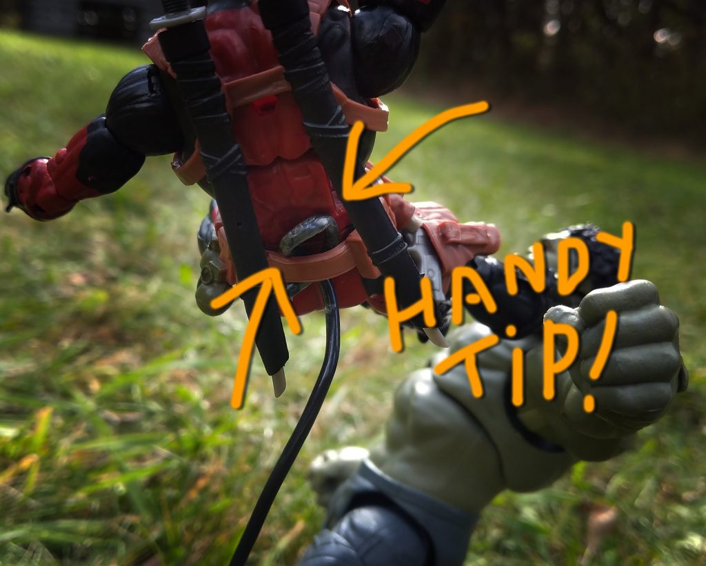
Looping the wire makes for a steadier support for the action figure.
Told you it was handy.
Behind The Camera
All that was left to do in the field was point the camera and shoot. I don’t remember the camera settings, but luckily for you, it is irrelevant anyway (unless you have my exact camera body, lens, and lighting conditions). The important part is I took the shot from a very low position, and I zoomed in, so the compression effect of the longer focal length ensures the cabin stays an appropriate size in the background.
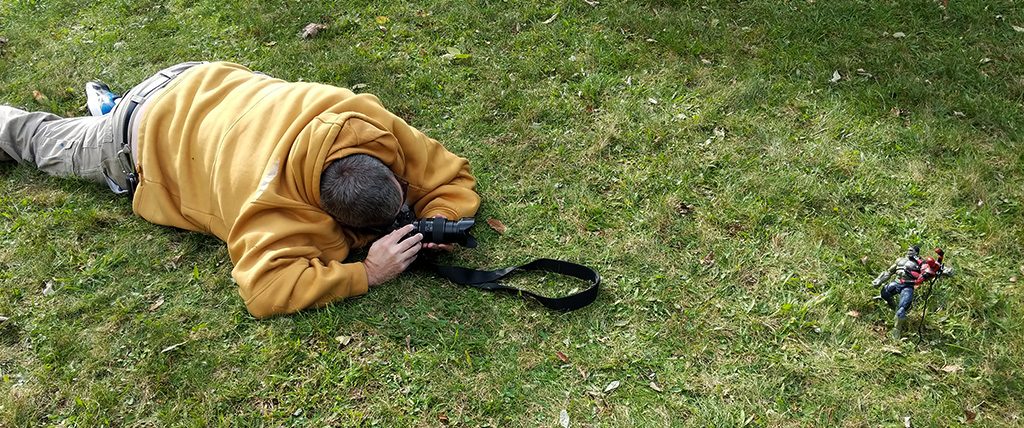
Yours Truly in a crazy action pose of carefully choreographed photography.
After that it is just a matter of exposing properly, and clicking the shutter.
Now we’re off to post-processing!
Behind Photoshop
Before we get going, this is where this post gets highly technical. Not everyone enjoys post processing, and others can’t get enough of it. So if you are not a post-processor you can just read the titles of the next sections and get an idea of my methodology. If you are a Photoshop junkie like myself, you may get some useful nuggets from reading the text that you can use in your own work.
Either way, however, for this wire technique to work you will at least have to remove the wires in post-processing.
Behind The Image Cleanup
The first step is to clean up the image to remove those wires, and get ride of unsightly blemishes.
For this I exclusively used the clone stamp and the spot healing brush. I started by removing the wires from the image. Then I cleaned up some spots on the plastic. I have gotten into the habit of removing the joints from my figures, so I did that step here as well. Again, all with the clone stamp and spot healing brushes.
This is what I ended up with:

The cleaned up image.
Note that I also sharpened the image by using a high-pass filter on a new layer, blended with the overlay blend mode.
Behind 90s Pop Culture References
Expression really helps sell the fake of an image. The Hulk action figure has a generic angry smash face. Since he was being kicked in the jaw I wanted to give him a more specific expression. So introduced him to a blast from the 1990s, aka Smash Mouth. To accomplish this I used the Liquify tool to massage his face into a mid-kick-to-the-jaw expression.
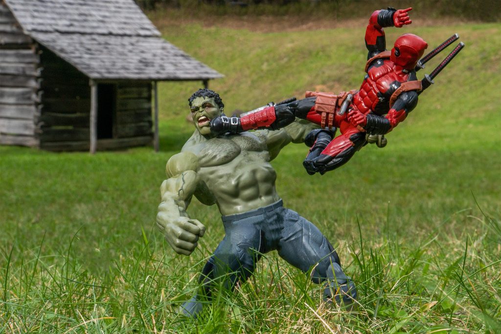
Adding a smash mouth effect with the Liquify tool. Also adding in pop culture references to prove I am hip.
A simple touch, but one that gives the shot more realism. The little details matter.
Behind The Motion
Since Deadpool is in the air mid-dropkick, I wanted to give a subtle sense of movement. I accomplished this by introducing a motion blur.
I made the blur by selecting Deadpool, and putting that selection on its own layer. Then I used the Path Blur filter to generate the motion blur effect. Then I dropped the opacity of the blur layer to match the scene.
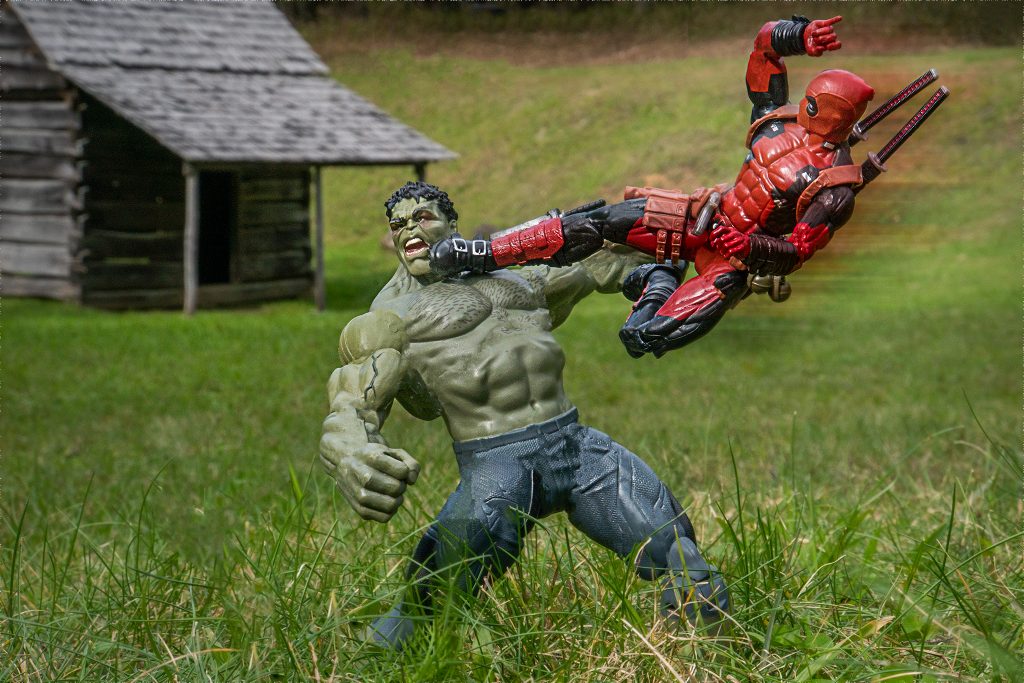
Adding a motion blur effect.
Behind The Dodging and Burning
Next step was to work on the atmosphere of the scene by doing a little dodging and burning. If you are not familiar with the term it basically means selectively lightening (dodging) and darkening (burning) parts of an image. I did this to drop the brightness of the background, as well as to add some shadows to the figures (enhance those muscles).
This was accomplished by adding a couple Brightness/Contrast adjustment layers, and using layer masks to apply the darkening to select parts of the scene. One was to darken the background, and the shadows on Hulk. The other was to add contrast to Hulk and Deadpool.
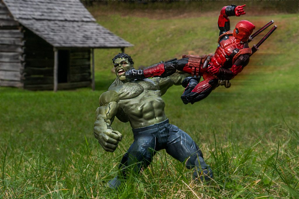
Dodging and Burning, AKA setting the Chrysler on fire.
Behind The Colour Grading
When one is making images one should be true to their vision. My personal vision and style has muted tones, a desaturated look, and a bit of grit to it. This step applies the colour grading to get these muted tones. If your style doesn’t match that, feel free to ignore this step, or salt to taste.
This was done using three types of adjustment layers. First a Color Lookup Table adjustment layer to introduce some orange tones, and lower the blues. Then a Black and White adjustment layer at 50% opacity to desaturate the images. Finally some Hue/Saturation adjustment layers with layer masks to fine tune some color changes to select parts of Deadpool.
Colour grading is a personal taste thing, and optional, unless you are me, then it is totally required.
Behind The Finishing Touches
So this brings us to the finishing moves for the image. First I added a texture layer with overlay blend mode, to add some variations in tones around the scene to give a more dynamic feel to the image. Finally I added a slight vignette to the edges (blank layer, gradient tool with black to darken the edges, and adjust opacity to taste).
The end result is the image we started this post with: Hulk v Deadpool:

Hulk v Deadpool
In Conclusion
So that’s it – my whole process to get from an idea in my head to a finished image. The image ended up looking as I envisioned, which is a nice bonus.
I hope you were able to get some useful tips out of reading about my process that you can use in your own images. If you do use any, or have tips of your own, please tell me about them in the comments below.
Cheers!
[dave]
Want more toy photography goodness? Subscribe to our weekly email round up so that you never miss a post, and find previous episodes of the podcast!


Cool! Thanks for walking us thorugh the process, Dave! I was quite unsure whether to remove the joints or not when I made my first action figure photos and decided against it … But I will rethink that decision now (the good thing being it’s never really too late for that).
Thanks Tobias!
I didn’t used to remove the joints either, but with the Hulk it seemed to make sense, so I did. Then I had to do Deadpool to match.
Ooohhh, so that’s why Hulk has no joints in your photos. I kept seeing photos of the same Hulk doing different stuff, but without joints and I could not figure out how you were doing that. Very clever!
heh 🙂 Now the secrets out, Zee 🙂
I love the term “to massage his face into a mid-kick-to-the-jaw expression”! Brilliant.
Thanks for the glimpse into what goes into creating your amazing action scenes! I’m super impressed with the joint removal. What a task!
Well done mate!
Thanks mate! Glad you enjoyed it 🙂