If you are yet to read parts 1 and 2, it’s probably a good idea to head back to them before continuing. They contain the basic concept of what I was trying to achieve and some design ideas. What I wish to share in part 3 really was the fun bit. Actually receiving and building the designs that were in Stud.io. This is where the MOC made sense and allowed me to play with the photographic potential.
Getting the Parts
This is always exciting and I enjoy sorting out parts into useful lots. This is where I share with you two time saving tips. 1) keep your MOC pieces separate from your bins of chaos [your current Lego supply]. 2) arrange your pieces in colour order and try to group them in easily counted lots [I found most pieces would stack well in groups of 5]. By ordering and stacking the individual pieces you will make it easier to know how many pieces you have, and it will save you time in the possible reordering of more parts. I found that, in my haste to build something physical, I miscalculated the volumes needed and had to reorder twice.
Here I will reiterate a hint I gave in part 1: do not get sidetracked with cool looking pieces that are not in your design. Believe me, it will cost you money. I now have several parapet and door parts that were either inadequate, or surplus to my needs.
Physical Building and Re-design
Once you have the parts, then it is time to click and snap (pieces, not photographs). This is where you find out how good your design skills are. I found that my initial design of 8x8x8 worked out pretty well, but some of my fancier designs were a little lacking. I probably spent the most of my time in this stage. Building, re-designing on the computer, trying out the new design, ordering new parts. This was partly due to my self imposed criteria (see part 1) and partly due to my inexperience with CAD design and MOC building.
A few random thoughts about this process:
- 8x8x8, or eight studs wide, by eight studs long, by eight rows of bricks (or the equivalent in plates) works well for Minifigure scaling and modular building;
- I believe that I made most modules to be a reasonable mix of structural integrity, photographic flexibility, piece/price economy, and appropriate scaling;
- I tried to think of myself as a medieval castle designer that only had access to large plastic bricks and plates (silly, but effective, and I felt my overall design was reasonably true to medieval castle plans);
- I spent way too much money on parts and hope that you will learn some things from my mistakes.
To avoid confusion in the measurements, I will explain the format: a brick has it’s dimensions stated as WxLxH; a plate (with studs) or a tile (without studs) is a third of that height (WxLx0.33H is a close approximation). The first figure is the width in number of studs; the second is the length in the number of studs; the last is the height of a single piece. Therefore an 8x8x8 module is eight studs wide, eight studs long, and eight brick rows high. That roughly equates to 64x64x76mm (approx 2.5×2.5×3″). Out of interest, a 1×1 brick is twenty percent higher than it is in width, or length (not including the stud height). This comes in handy when you are using Studs Not On Top (SNOT) techniques. Generally the measurement of individual parts leaves out the ‘H’ dimension unless the part is more than a single brick high.
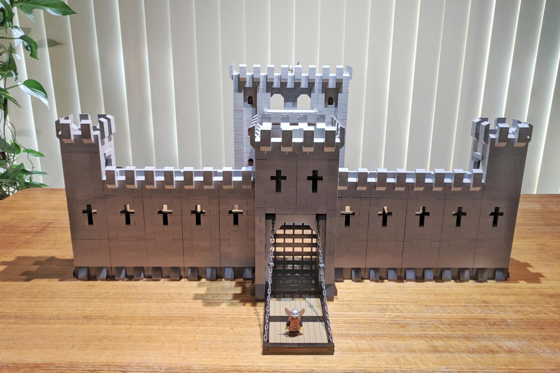
My overall design was made to fit nine 32×32 stud baseplates (around 770mm or a tad over 2′ square) for the castle plan. The centre baseplate holding the Keep (main building) and the eight surrounding baseplates to hold the walls and Barbican (gatehouse). Most pieces were ordered in Light Bluish and Dark Bluish Greys. Some wooden embellishments were added in Reddish Brown, Dark Flesh, and Dark Tan. Black was used for metal hinges, grates, strengthening bands, etc. I had thought about embellishing the masonry with SNOT techniques with tiles, or with different coloured/textured bricks, in a random fashion throughout the builds. I tried them all, but found that they were less photogenic than plain colours and caused distractions in the images.
The module builds were designed to have a pleasing look, but seem like they had a practical purpose. Some of the wall modules have stairs, openings, or loopholes (for the archers). I also designed the modules to accept trapdoors and ladders for the troops to move freely between levels. It was probably unnecessary for the images, but the castle seemed incomplete without them.
The original intention was to include everything that a castle would need, including: stables, kitchen/scullery, troop quarters, smithy, carpenter, well, market, etc. Although there is space for these in the design, I have not included them in my final build. The truth is, that my time, money, and inspiration all dried up. I will possibly never finish the design in Stud.io. I don’t see this as a failing as I never intended to build the whole castle anyway. The whole design would run into thousands of pieces (5,000 in the Keep alone) and a couple of thousand dollars.
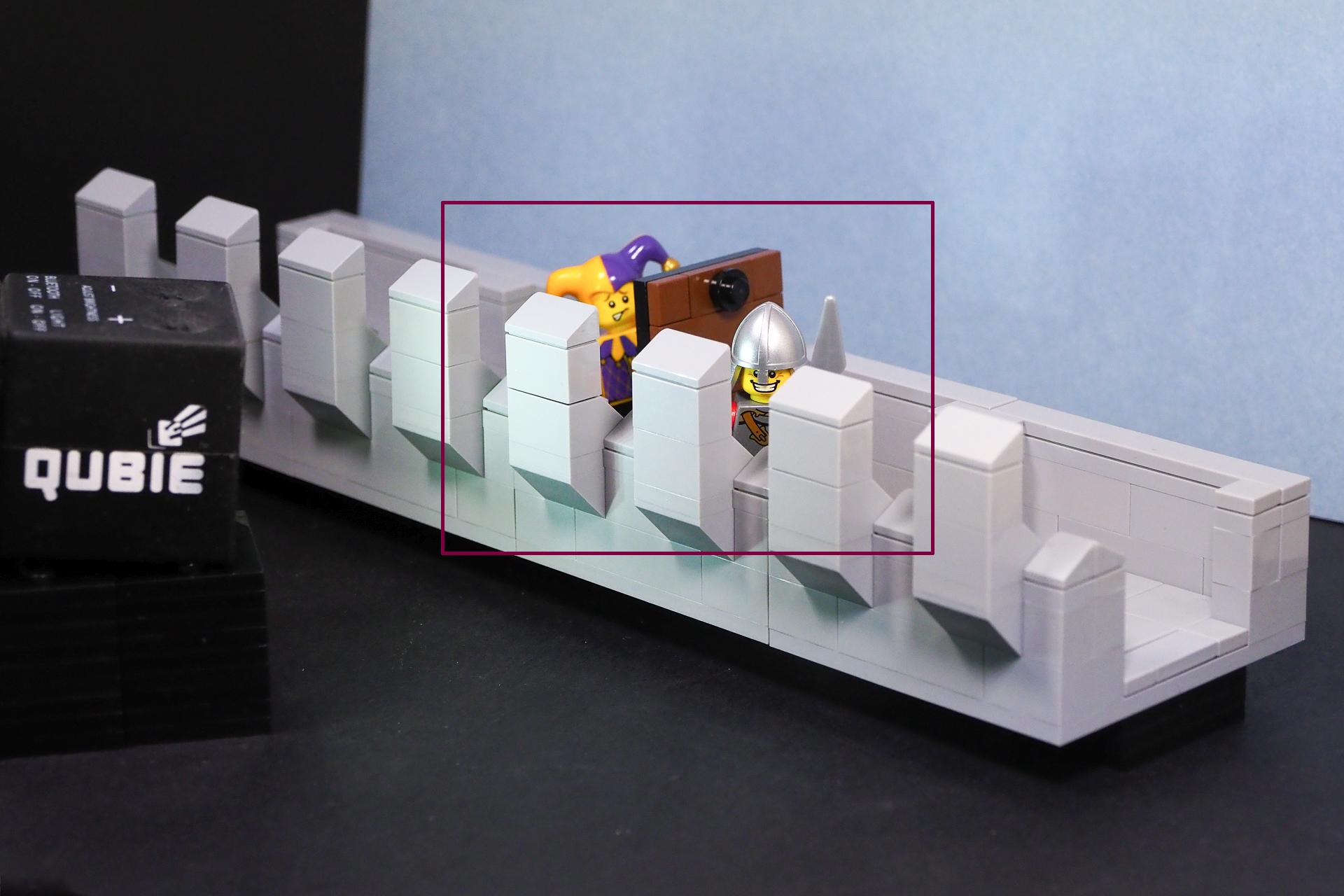
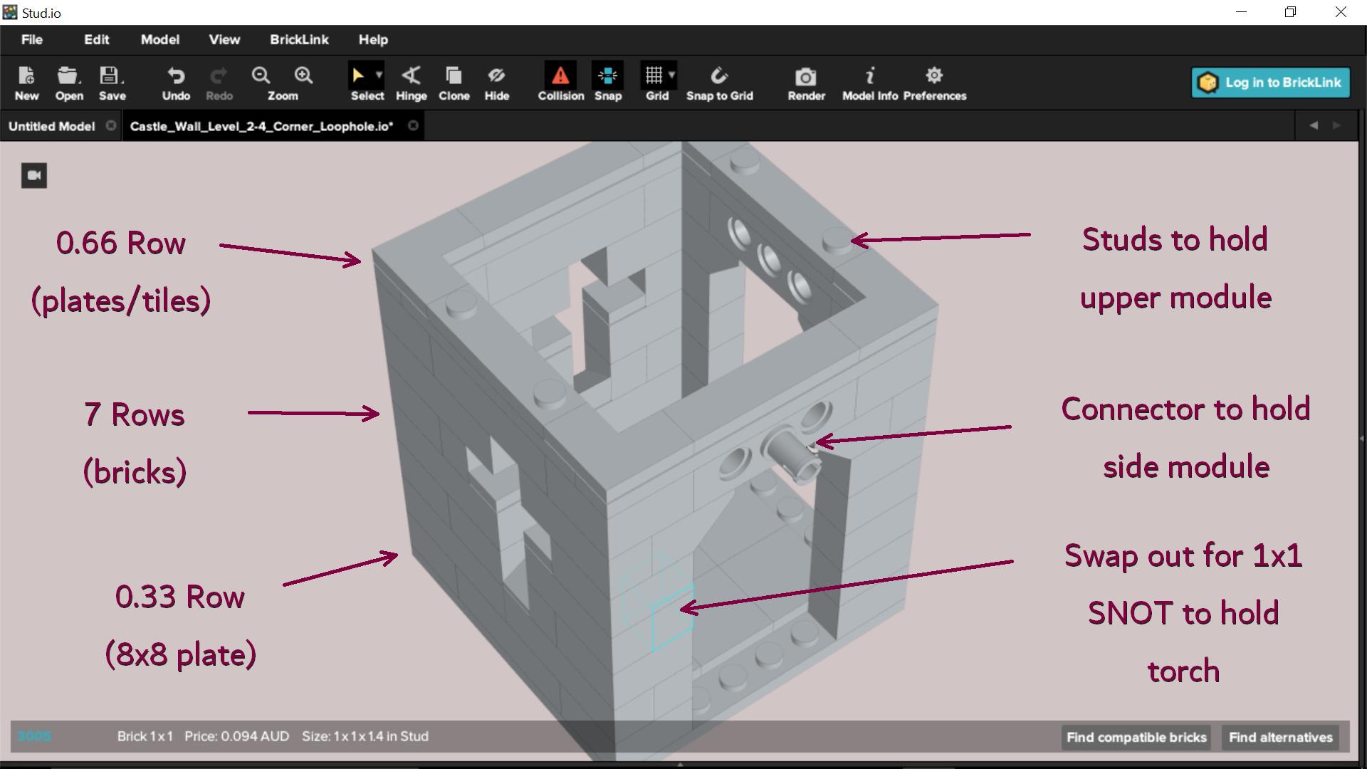
The walls were the easiest to make in a modular style. I feel that the one stud thick brick built modules could be stacked six modules high and still maintain structural integrity. For the sake of economy I decided to make them four levels high on the corners, and three for the walls, including parapets. The crucifix loopholes caused a few problems as the vertical slit is only one stud wide. That means, in an 8×8 arrangement it sits to the left or the right. I tried building the loopholes in the centre with SNOT techniques and plates/tiles. It was centred, but it looked strange with plates and tiles filling out the wall spaces. I decided to stay with the off-centre design and mirror the positions on the left and right sides of the walls. I also reversed the stairs and ladders to point toward the Barbican, believing that castle builders would have kept the approach to these important access points as far away from the main entrance as possible.
The Barbican was made to a 16x16x8 design on the bottom two levels, and 8x8x8 on the third level, and 16x8x5.33 for all parapets. This was to incorporate a working drawbridge and portcullis. It was totally unnecessary for photographic purposes, but I wanted to see if I could do it. I am happy to report that both the drawbridge and portcullis can be raised, or lowered by manual Lego winches.
The lower two levels of the Keep are not modular, with the exception of the four removable pillars and the two staircases at the rear of the throne room. This is because the throne room takes up a 24×32 stud footprint and is sixteen rows high for the sake of grandeur. I wanted to add three levels above the throne room, but that whole time/money/inspiration thing happened. I decided to go with two levels and just the front 8×8 corners, a 8×16 centre section and a double balcony. The royal living quarters were to be behind this. I felt that they were the least interesting of all of the castle areas and left them out of the build. The basement areas in the Keep were omitted due to cost. These were designed to be troop quarters, an armoury, and the kitchen/scullery. There is plenty of photographic potential in these areas, but I felt like they were better left to individual builds, so I filled the basement (except the front walls) with random bricks from the bins of chaos. This measure easily saved me US$60 in parts.
The blank areas between the walls and Keep were designed to house stables, a smithy, carpenter, market, and a well. I see these as ‘add ons’ to the Keep and most would be built with a mixture of Reddish Brown, Dark Flesh, and Dark Tan parts to represent different woods. The smithy was to share a chimney with the kitchen at the back of the Keep and the other areas were to sit around the sides. They may never be built. Partly due to lack of Brown, Flesh, and Tan parts (I have decided not to spend anymore on this creation).
A Photographer’s Perspective
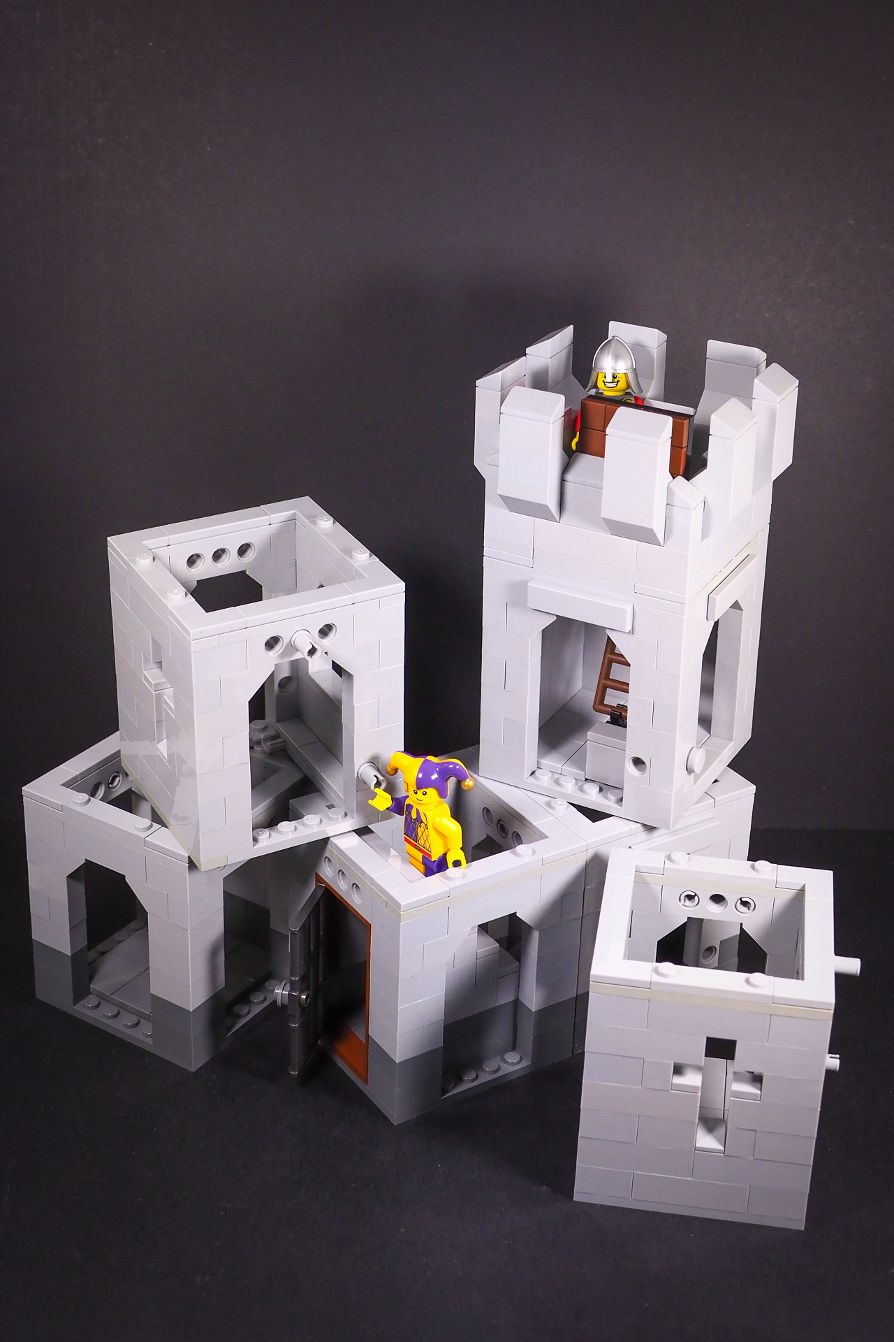
I am pretty happy with the MOC build to suit my photographic needs. Levels, modules, wall subsections, and ceilings can be removed for access by lenses and lights. Modules (esp the walls) are easily arranged to suit different castle plans. The modules and submodules can be quickly and easily built (handy for when you drop them) or swapped out. Not only can you remove them to get access, but you can use them to hide things you don’t want to be seen. The jester in the image below is on an angle because I swapped their legs for a hinge set to about 15 degrees. The parapet hides this lack of limbs.
Two Minifigures can interact in an 8x8x8 module and the camera has anything up to five sides it can choose to shoot from. Long runs within the walls and on the parapets can be shot to incorporate many Minigfigures at once. This also gives a feeling of being inside the castle. The Keep, Barbican and open areas will hold many Minifigures to simulate markets, melees, feasts, coronations, the departure/arrival of mounted troops, etc. Floor tiles can be easily swapped out for plates to allow the Minifigures to stand more easily. A 2×2 corner tile and a 1×1 plate works extremely well in place of a 2×2 tile and will rarely be noticed. Design gates, doors, and trap doors to be reversible and you only need the one submodel to show its most photogenic side either open, or closed. I found that my small doors could not be built this way, due to SNOT techniques requiring an odd number of studs to work. The way around this is to use a mirrored pair. That way they will swap sides when reversed. It sounds complex but makes perfect sense when you have them in your hand.
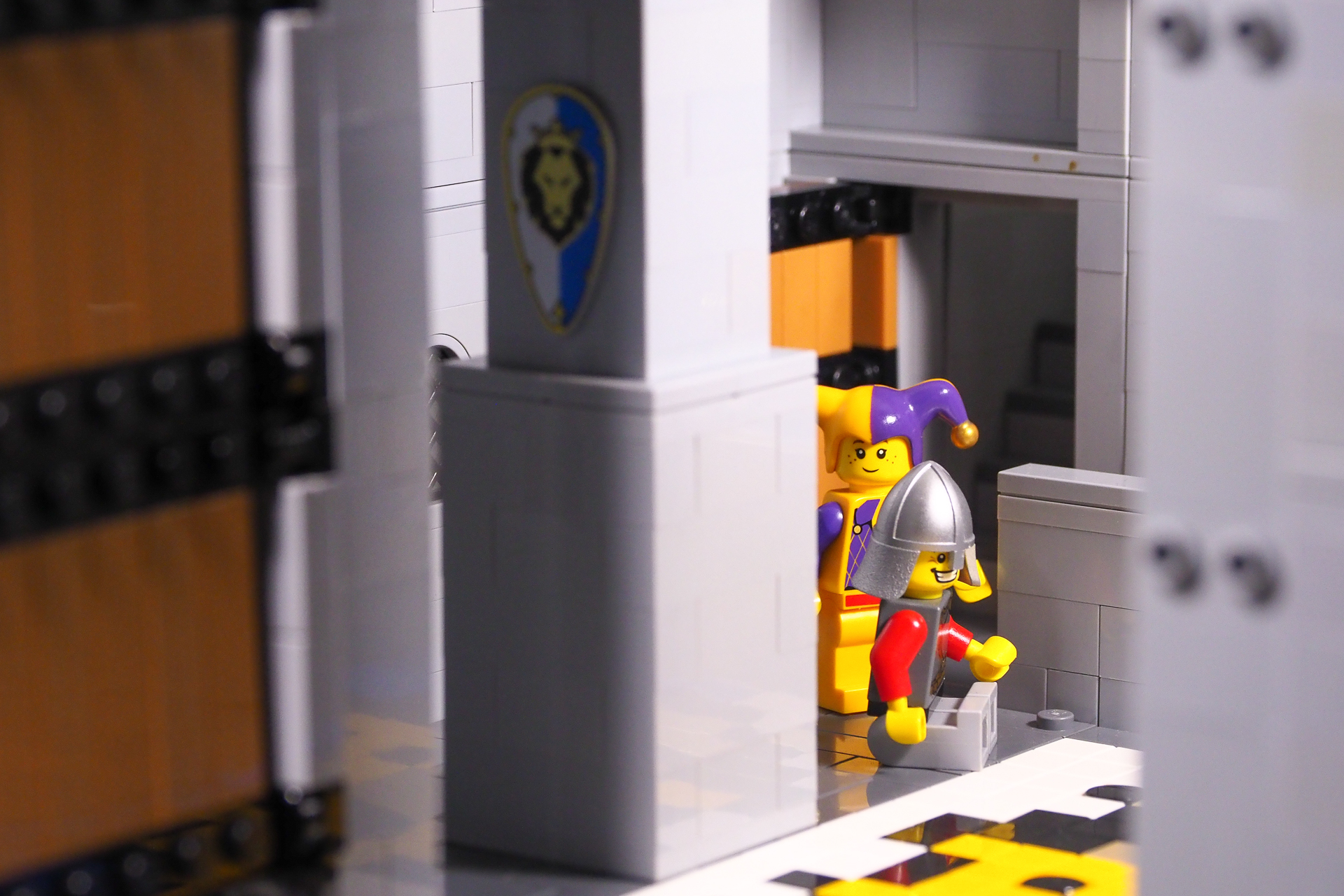
LHS: Reverse doors to save on parts | Centre: use studs to hold Minifigures | RHS: remove sections to gain access
One of the banes of a Lego photographer’s life is reflections, and great slabs of walls and tiled floors only make it worse. All I can offer here is: that with the multiple angles allowed for both camera positions and lighting, it gives us the maximum amount of flexibility to avoid (or minimise) this problem. As you can see in the image above, this is not always possible.
I have designed most of the walls so 1×1, 1×2 ,and 1×4 bricks can be swapped out for SNOT, or Technic bricks, to allow details to be added. weapons racks, burning torches, flags, etc can be added to complement a scene with this idea. Some Technic and modified bricks allow for rear access and can be used to hide wires from mini LEDs. This is an article in itself and I’d suggest you have a look at ramblingbrick.com‘s post on LED lighting to get some idea of what you can achieve in your MOC.
So far my test images have worked well and I look forward to sharing little medieval vignettes with you in the Google+ Toy Photographers community.
I wish all my Lords and Ladies, across the Kingdoms, the finest of adventures, should you choose to build your own Photographer’s MOC.




![AI is ruining toy photography [a personal viewpoint]](https://toyphotographers.com/wp-content/uploads/2026/03/Together-As-One-Ultra-Magnus-revealed-scaled-500x383.jpg)

Great stuff, Tony! Thanks for sharing. Many things you say remind me of building H0 scale sets: I never buy model kits because there seem to be so many more possibilities with cardboard, wood and plastic sticks … and whatever else I can muster.
“Only build areas you wish to photograph” – I could not agree more! Never spend time building things you will not see in the picture! I still find myself doing the opposite though. I also think it is a good idea to design modules; that way, you can keep rearranging your set. And everything can be accessed with a camera at close range (the size of my modules is actually designed to allow access at the closest focus range from all sides that count).
But I am making a short story long. What I actually wanted to say was: I can’t wait to see the photos featuring your castle. Already got a six image narrative in mind?
Thanks Tobias. I am yet to build too much that isn’t plastic, but I know what you mean.
I also know what you mean by attempting to only build so much, but going further. Originally the walls and barbican were to be broken down to build the keep, but I wanted to see what it all looked like together and ordered more bricks.
Open modules allow for the best access and if you keep them simple they give you the most flexibility in rearrangement. It took me some time to get that right!
I have posted a few photos on G+, but I am yet to come up with an interesting story for a six image narrative.
I just read this series and LOVED all three parts! Thanks for taking the time to walk us through your adventures! I too look forward to your pictures.
Thank you Molly. It was an epic adventure.