Building dioramas for toy photography
There are several ways in which we can translate reality into pictures. Photography is one of the more convenient ones. After all, a camera is a machine for making perspective. It saves us the hassle of geometrically transferring three-dimensional space onto a picture plane. It helps us getting decent pictures of things we might not be able to draw or paint or otherwise represent.
As toy photographers, we do not only rely on this simple mechanism. As we arrange our toys to tell a story, we’re already translating reality into pictures. And that’s before we even take the first photo. I’ll focus on this step in my creative process: translating reality into its 1:87 scale stand-in.
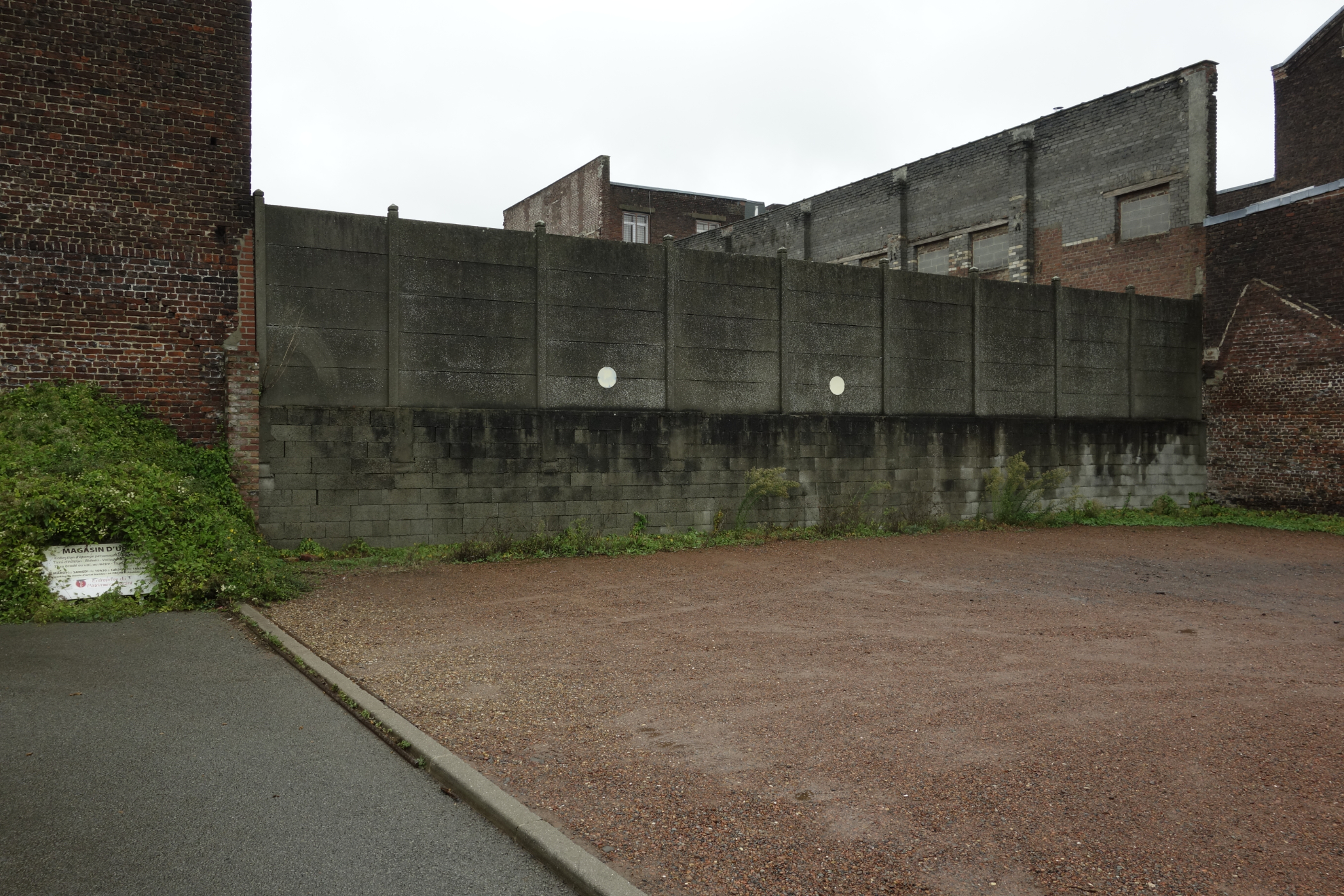
When I look at it this way, there are actually two points of departure. On one hand, I start with the world I know from my own experience or from photos. Say I would like to photograph a scene in front of some sort of factory building. In that case I would first try to remember factories I’ve seen—factories I worked at as a student, factories I visited in Saarbrücken, a warehouse turned museum in Lille. I mostly try to visualize them from memory. However, since I might not have paid attention to details that seem important now, I also dig up photographs—some I took myself, some I find on the internet.
On the other hand, I have a more or less clear idea of the picture I’m intending to make. For example, an abandoned factory.
As a consequence, I go back and forth between the buildings I have seen and the picture-to-be. What details do I need? Where should the light come from? Will I need windows and doors? Will the action take place inside or outside the building? Or both? Where do I need access for the camera lens?
In other words, I need to have a general idea what picture I would like to make. Maybe this general idea can be defined by three dimensions: Meaning, lighting and perspective.
Meaning
The first dimension is, basically, semiotics, or the meaning I want to convey. I might want to show the dodgy end of the street, or present a life in luxury, or just take you to my average neighborhood.
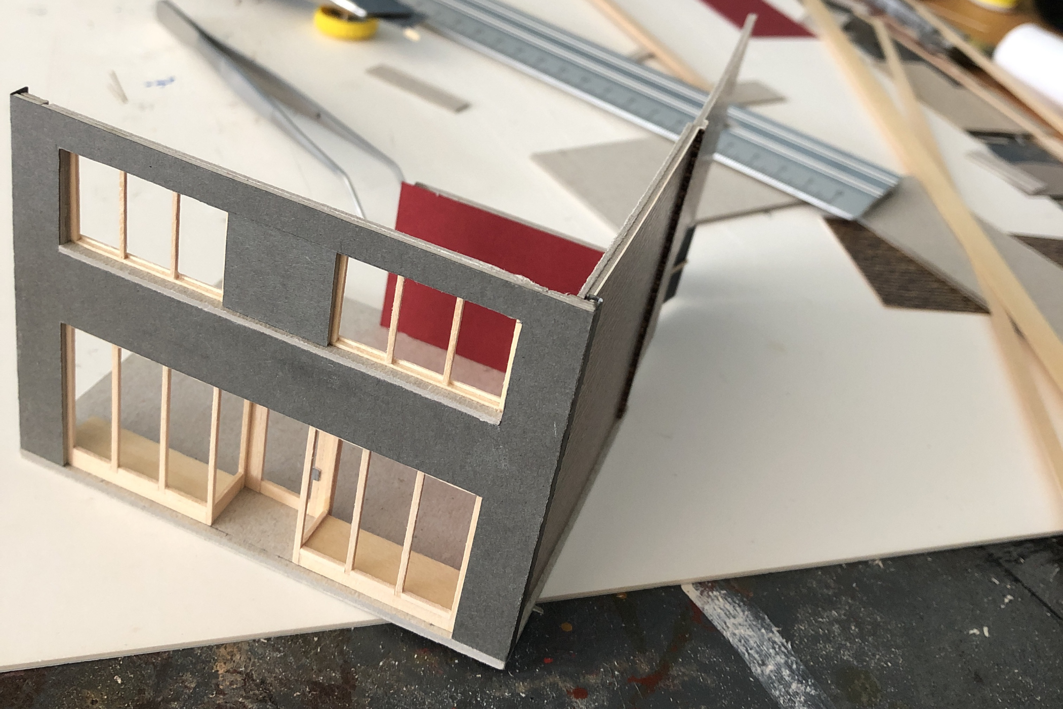
Once I know where I want to take the action, I come up with features and details that convey the atmosphere. That could be a broken window on the back wall or a pool in the garden. The intended meaning may also help me determine my materials. I like wood for wooden floors and window frames, while plastic can be made to look like metal. Cardboard and paper can replace all kinds of surfaces. There are pre-fabricated prints that can stand in for stone or brick walls. Graffiti often works well when printed to scale from a photograph.
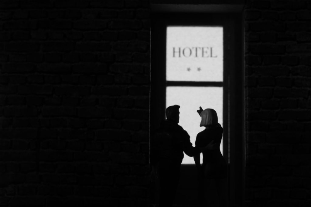
Apart from showing where the action is happening, a building can help to show what is happening. Doors, windows and stairs convey a sense of movement or transition; you can literally pose your characters on a verge. I think that showing these transition points adds a lot to the picture. Emphasizing that someone is standing outside a jam-packed bar might tell its own story. Moreover, showing somebody who’s just walking over a threshold is a great way to connect a before and an after with the moment you’re actually showing. For example, to enter a house implies a person has been outside before and will be inside after.
Plus, a door or window opening onto further space—interior or, looking the other way, exterior; a room or a landscape—adds spatial depth to a picture (now we are already talking about perspective).
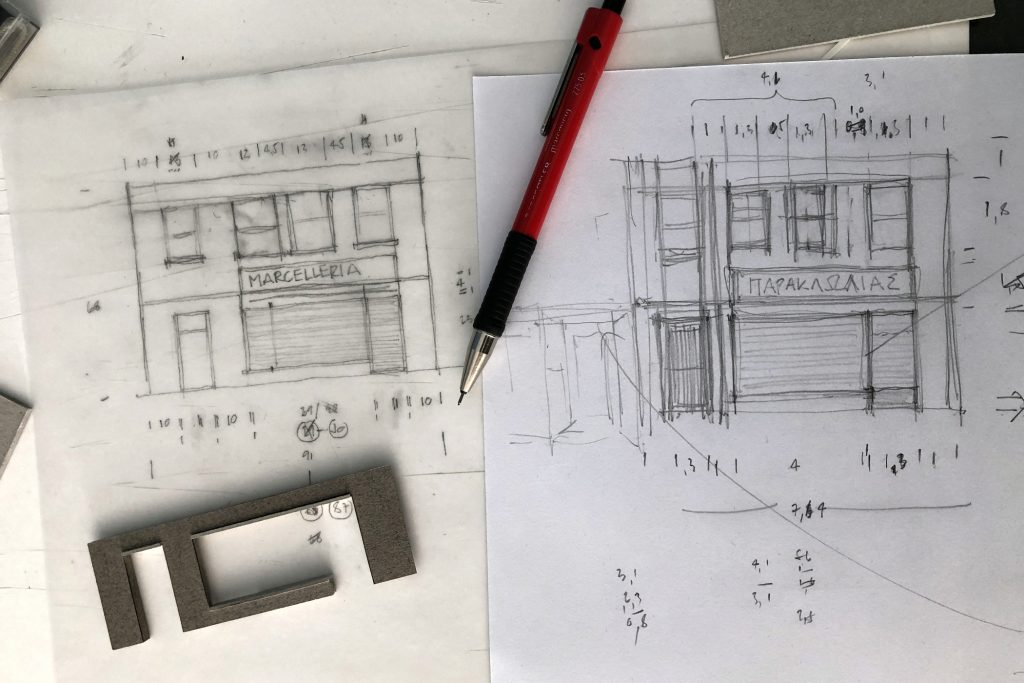
That’s why I put extra effort into planning and building doors and windows; in fact, most of my miniature buildings are ‘built around’ these kinds of openings.
Lighting
So buildings convey meaning. They are also great lighting devices.
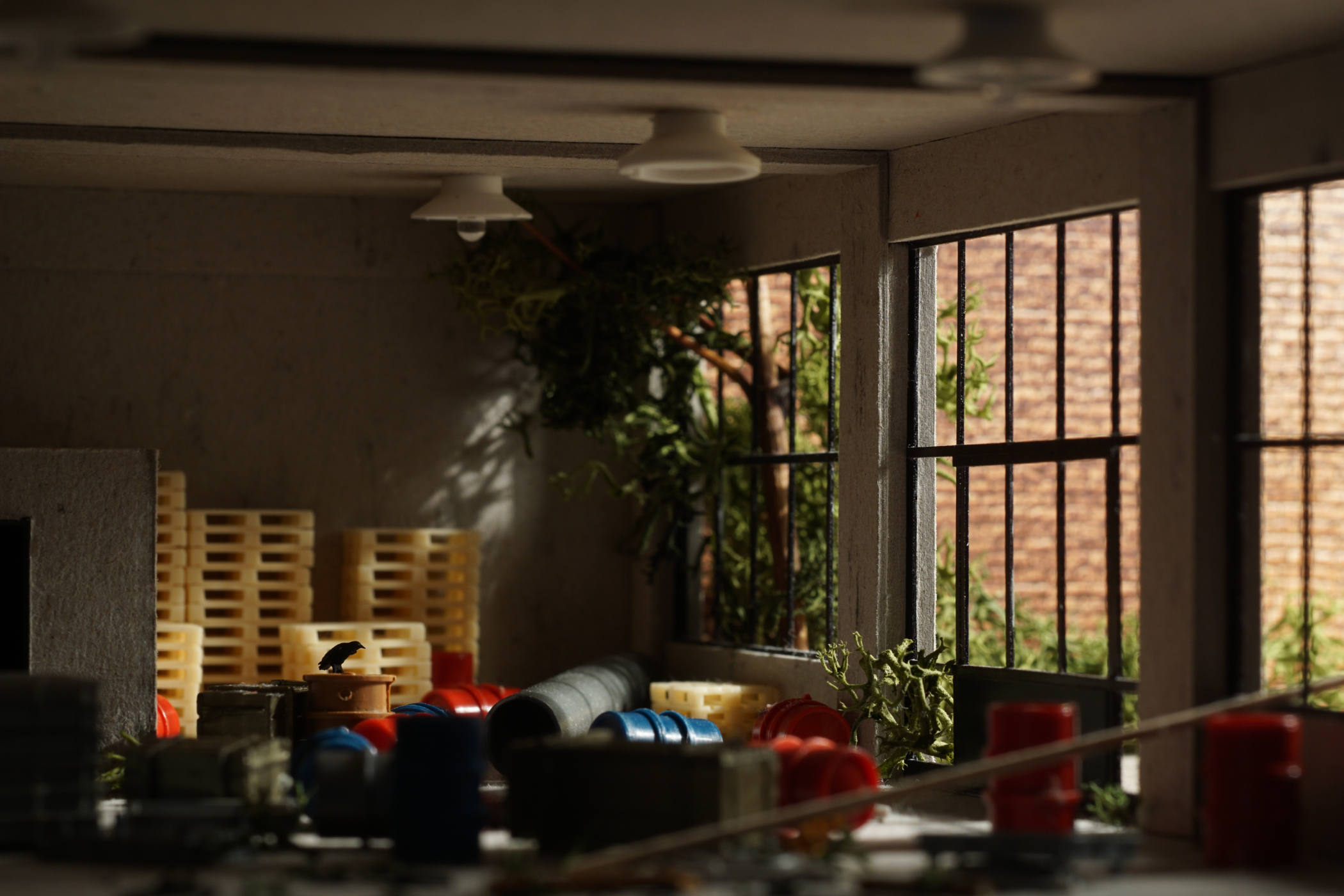
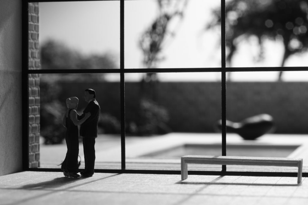
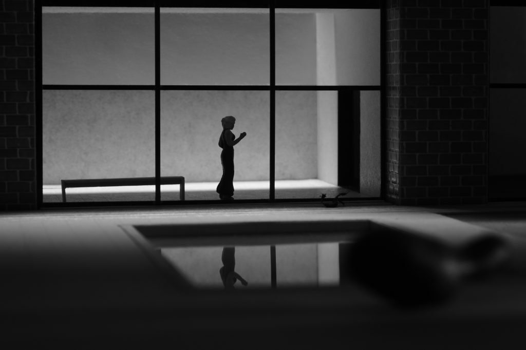
Windows and doors are natural sources of light: The sun shines into a room. Light spills into the darkness through an open door. They can shape the light, defining where it comes from and, more importantly, where it is shed. This also makes them a great tool for composition.
Lamps can be out of sight or in the picture. My choice is often based on the meaning of the picture. In most cases I find that a visible light source does not add much. Sometimes though, a neon light on the ceiling makes the overall atmosphere more tangible (and hence has meaning).
All in all, I think that during the building process it is wise to aim for realism: Where would the light come from if this were a real building? I carefully consider these lights and build them in. It is easier to switch off a lamp or cover a window than to have light from a source you did not bother to build in the first place!
Perspective
Apart from conveying a sense of spatial depth, buildings help me do something I really enjoy. As they are three-dimensional objects, I can photograph them from different angles. If, on the other hand, I photographed a scene against a backdrop picture, my camera position would be defined by the perspective in that backdrop. That’s because any picture showing something in perspective assigns one position to the viewer.)
In a built environment I can approach a house front with my camera, moving in closer and closer. Or I can do the opposite, leaving the house behind. I can also ‘walk past’ the building should I feel the need. As far as camera positions go, a three-dimensional stage set opens all kinds of freedom.
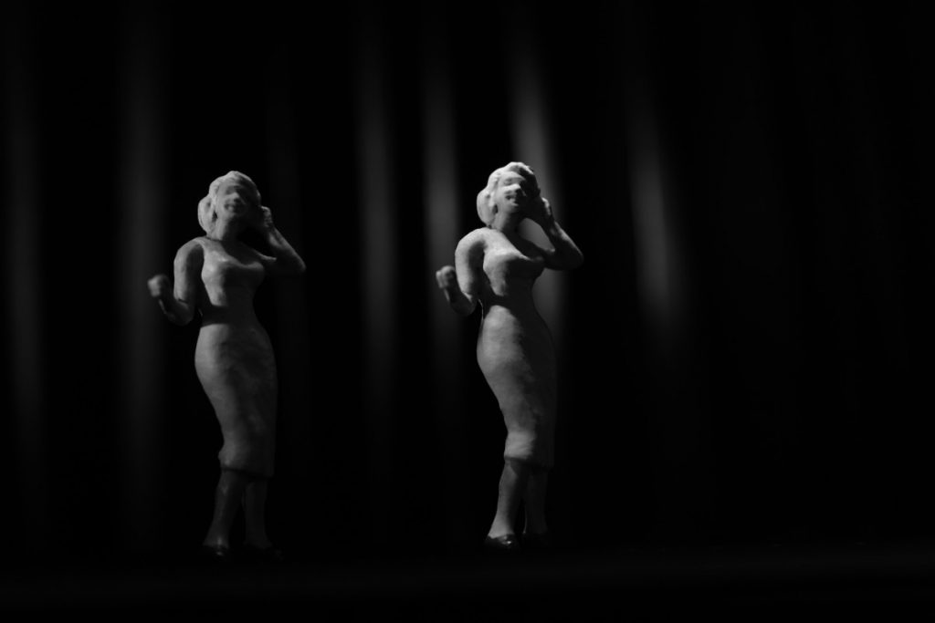
Depending on the elaborateness of my building, I can even use both its interior and its exterior in a series of interconnected pictures. Sometimes I build a set so that it can be used looking into the window and looking out of the window (like the ‘villa’ in this post). Or I build a façade and separate interiors, like the theater in Burlesque Investigations (there’s the front entrance, the stage and a dressing room). The latter method of course requires making sure the size of rooms, doors and windows match.
Hence, as soon as I start thinking about building, I also consider these two questions: Do I just need a front (a façade) or will I take my camera round the corner? Am I satisfied with looking at the outside or do I want to shoot the interior as well?
Abstraction
The way I described it in this post, all planning and building was based on the assumption that I want to arrive at a realistic representation of a scene. But realism is not a given. Due to the small scale, there will always be a certain amount of abstraction—which I actually consider a good thing. Detail can be distracting, and a fair amount of abstraction can give a picture quite a bit of punch.
For this reason I often choose to show less than I actually built. It is usually in that respect that the final result has little to with what I had originally planned.





I am always fascinated by the way you work, Tobias – it’s far more intricate than anything I do but it adds to the ideas in the back of my mind. Thank you!
Thanks, Mary. If it adds to the ideas in the back of your mind, this post served its purpose. I am, in fact, glad about that!
Meaning, lighting and perspective – these are the takeaways for me when setting a diorama scene. I enjoyed reading your article Tobias. Although I’m certainly not at that incredible level of diorama making, it gives me a deeper appreciation of your images. It is no wonder I can get lost exploring your photos as there are so many minute details whether explicitly displayed or suggested in the pre/post shot and in the dark shadows.
…and this from the guy whose dioramas sometimes make me wonder if I can ever achieve something like that! Thanks for your thoughtful comment, Janan! This is great feedback because it makes me see aspects of my pictures that seem to evade me. I always enjoy learning what other people see.