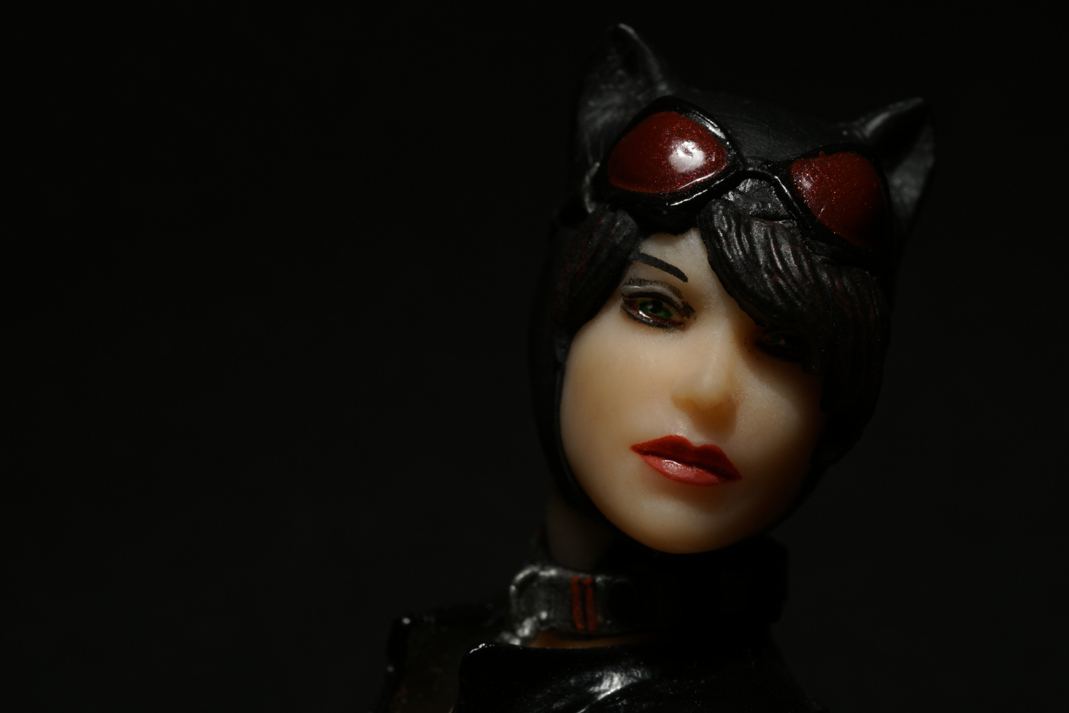
This portrait session with Catwoman just happened. I had set up for something entirely different, and when that picture did not quite work out, I just started toying with this action figure. While trying different poses and arranging the light, I had a couple of thoughts I would like to share with you.
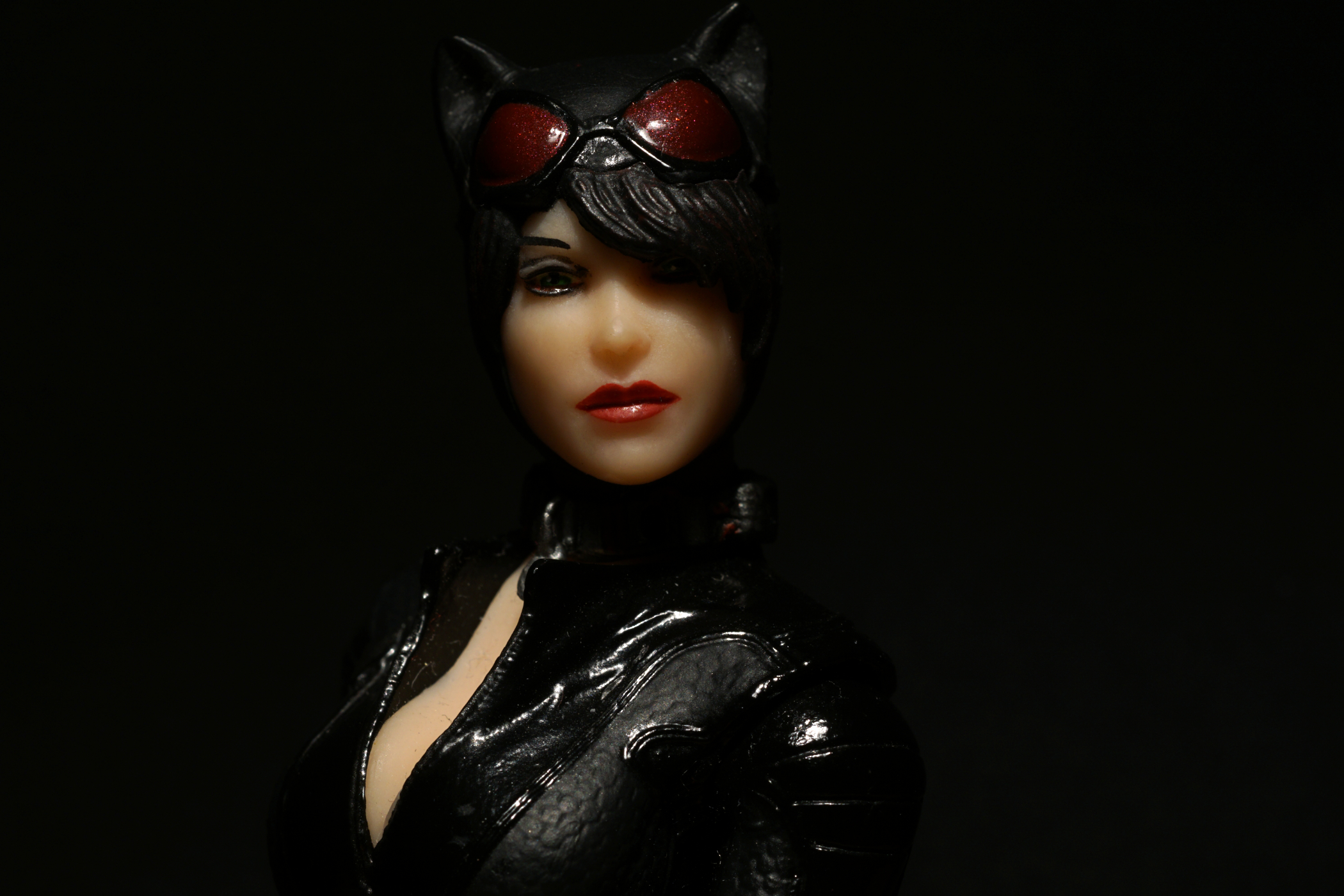
The Figure
Why Catwoman? The first 1/12 scale action figure I got was K-2SO. Shortly after his arrival, I started fooling around with him and a Schleich cat. I liked the cat theme. But I wanted a female companion for him, someone dressed in the same colour he mainly sported. So my search narrowed down to Catwoman pretty quickly. Different universes? I did not bother.
What I thought I needed for my pictures was a well articulated figure, and she should look as realistic as possible; no exaggerated features for me, please! Also, I wanted a figure sporting a neutral facial expression because I think that’s most versatile. After all, I never had in mind to re-enact scenes from the Batman narrative.
The figure from DC Collectibles / DC Entertainment, sculpted by Gentle Giant Studios, offers all that. As for her neutral expression, I actually think it can change within a certain (limited) range. Depending on perspective and lighting, it can be tough, melancholy, or daring. The pictures in this post may not offer anything but a glimpse at that aspect since I had focussed on posing and lighting.
While photographing this figure I found I had to pay attention to some issues:
Her hair can get in the way: While I think her hair adds a lot to her coolness, it almost always casts a shadow on her left eye. Lighting has to account for that. Lighting her left side only you easily drown both her eyes in darkness. So I cast the main light on her right side (her right being the left side of the picture).
The plastic is basically translucent: This tends to show at her nose. Knowing that, just do not shine a light through it.
Paint: As much as I like the fact that this figure appears to be hand painted, paint seems to be everywhere. Click on the picture above to see how it looked before editing. Little spots and pieces of paint everywhere! But it’s nothing that cannot be retouched.
Also, they painted a light reflection into her eyes which almost never sits right, and at times it is barely visible – which I found to be the better option in this case.
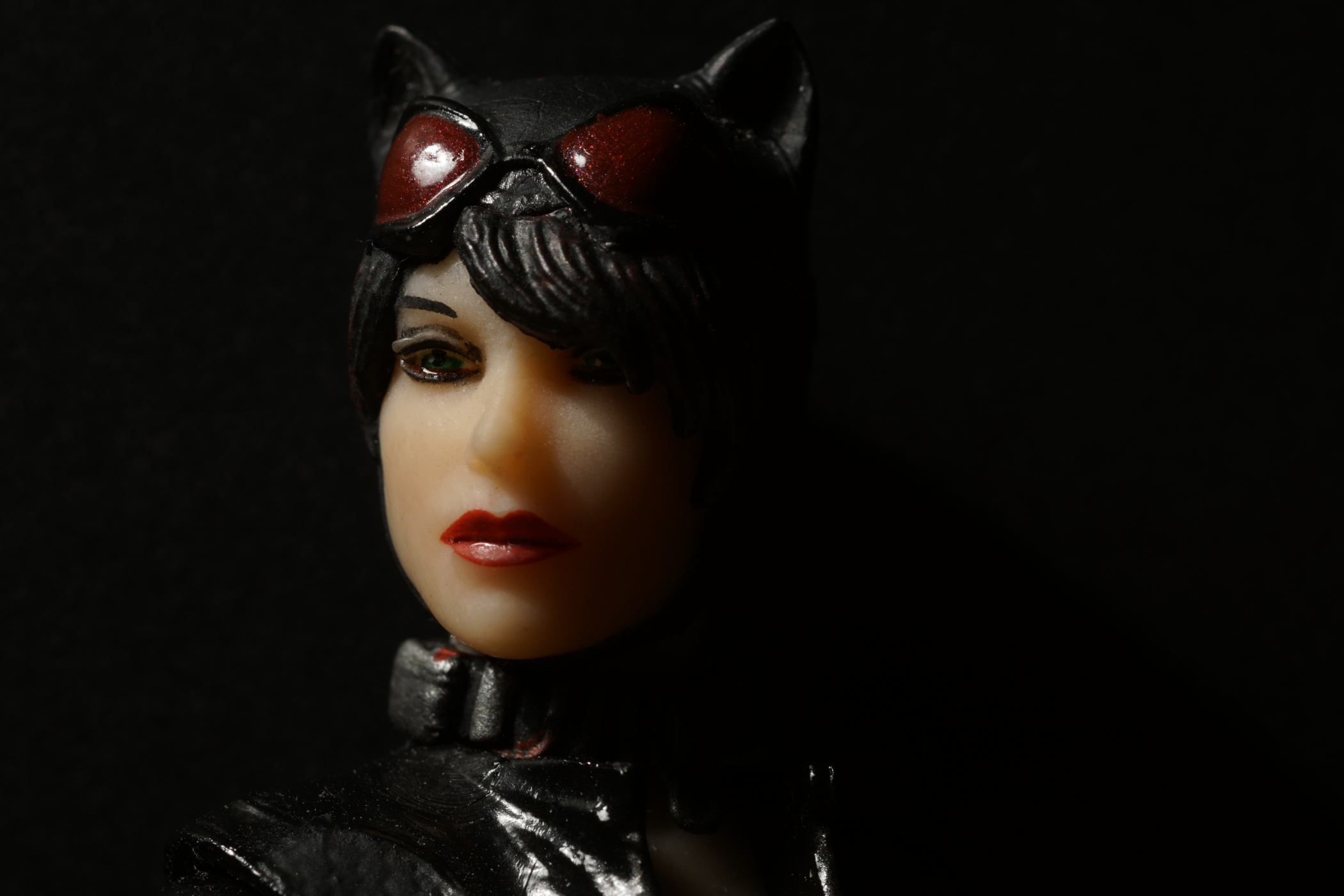
The Pose
I do not remember where I first heard or read this, but it might have been my wife coming back from a professional portrait session and telling me about the photographers advice: Turn you body away from the camera and then just turn your head to look at it. Studying portraits I realized that this almost always works to the subject’s advantage so I tried to take this ‘rule’ to heart when I positioned Catwoman.
I think this works fine with the action figure as well; the way I see it, posing her like this is also good for close up pictures of the face.
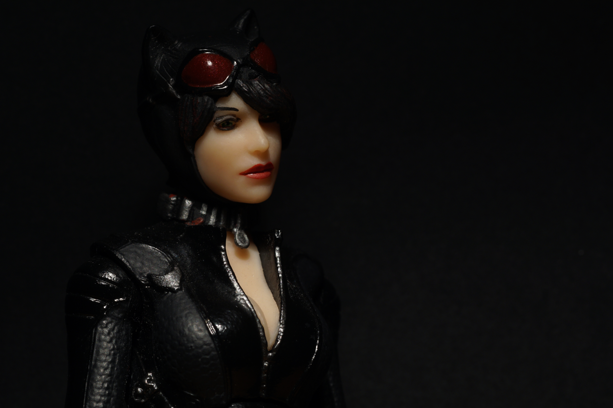
The Light
One thing that always fascinated me was Rembrandt lighting. The basic idea would be lighting one half of the face and letting a triangle of light fall on the other cheek. Wikipedia basically describes this as a setup with two light sources; a one-light setup is described here.
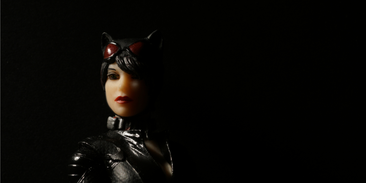
I tried to achieve it with one light. Using my desk lamp, I set the light to illuminate half her face plus a triangle under her left eye. I think you can see it in the two close-ups and in the picture right above this paragraph. I like the way this light setup underlines the shape of her face. Along with the hair falling over her eye, it adds something mysterious.
To sum things up: I always enjoy trying things I learned in other contexts than toy photography, be they recommendations for portraiture or construction ideas for buildings. It’s a good idea to study pictures – from the Dutch Masters to Surrealism and beyond … but that’s another story.




Hi Tobias. Great shots and I loved your detailed narrative. I really enjoy your work!
Thank you, Doug! I am really glad you like it.
Beautiful job! I appreciate hearing what you tried, seeing how it turned out, and the sources of inspiration and knowledge you drew upon. Such a fun figure to explore and get shots of.
Beautiful work on the lighting, Tobias!