My response to our latest photo challenge was a look at my continuing fascination with life and death.
Like Kristina I went down a couple of false starts before I found the right path for this challenge. As many of you know I am a little obsessed with the Chima line of mini figures so I wanted this project to somehow be about them. I’m fascinated by our infinite capacity to anthropomorphize just about anything. Just look at the success of any Pixar movie as proof. My first thought was to contrast real animals with the Chima animals; I wanted to play with the concept of real vs. fake. But I quickly realized how impractical these ideas were given the time constraints of this challenge. The images I saw in my head (a lone feather bathed in the fading light of a setting sun, mud outlining the foot print of a wild animal) were not anything I was going to come up with in the next several weeks. These ideas, while appealing, are on hold for the moment.
My next idea was contrasting details of Lego accessories with images that contain them. This is not too different from what Kristina did, but without the wonderful allegory to support it. Not only am I not a good enough macro photographer to pull this one off, but I didn’t like how the accessories just lie there, lifeless, when I look at them through my lens.
As I was wandering around Magnuson Park last week looking for interesting photo locations based on light, this challenge finally came together for me. If any one has noticed I’m also obsessed with photographing the Lego skeletons. This really came together for me when I put the custom skulls on them created by Crazybricks.com. I like the combination of reality and Lego stylization so much that I keep coming back to them. They are one of my red threads.
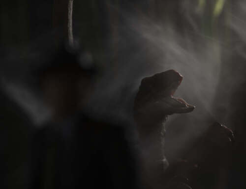
I’m drawn to the skeletons the same way I am drawn to the Chima figures. They represent something fundamental for me and they allow me a way to explore my own unavoidable death while I’m still very much enjoying life. The images I present to you here are a little taste of a series I’m presently pursuing. I want to pair images of Chima characters edited to seem like images from the past, a memory so to speak, while the colorful image of a skeleton, representing the vibrant present.
I’m grateful to this challenge because again it has made me think about my work in new ways. In 2015 I had the experience (and privilege) of presenting my work in a gallery setting. This experience has made me very aware that I need to have some ideas underlying my work. There needs to be a story; the image needs to be exploring a universal truth, or reflecting on the human condition, commenting on the world we live in or reinterpreting some aspect of art history. These are the realities of presenting your work in a gallery setting and talking to potential buyers.
I know this isn’t important to the majority of people who play on social media, but for me, a life long artist, I can’t turn my back on my roots. I’m grateful to these photo challenges, as well as to the inspiration Kristina has given me, that has allowed me to take the next step on this personal road of artistic growth.
Growth and change is a necessary part of being an artist. This can take the shape of trying new techniques like the path that Captain Kaos is on or it can be more subtle like questioning simple things, like the titles of an image as Balakov is doing, pushing the boundaries of still life photography like Kristina or reinterpreting travel photography like Boris. If you’re here reading Stuck in Plastic, I know that like us, you’re on your own path of artistic growth and we’re here to support and inspire you.
Shelly


Dearest Shelly,
I like the way you combine two of your threads, well done. And I like that you have put the picture of the boat in black and white and the skeleton in color it makes a good contrast. For me the second picture “life and death 2” becomes an allegori about Charon in Hades that carries the dead to the other shore. I have one question though and it’s about the filters – why is there a filter on the black and white -picture and not on the one in colors, and why is the b/w picture smaller? What does is represent?
I really like this challenge to it made me look at possibilities that I hadn’t tried before, thank you for that. /kristina
Oh Kristina! You are always so perceptive, asking the hard questions. I fell into the trap of adding a filter and a border to my “life” images to simulate a faded poloroid snap shot. I wanted to emphasize a particular faded snap shot style. But like all filters they tend to distract from the image itself. If I was going to take this series to the next level I would play with the black and white images and find a way to edit them for the same emotional effect with out the distraction of overly clever filters. I should know to keep it simple. But since we are only experimenting and I am trying to stay loose in my approach I let this one stand as is for now; t’s a moment on the path to a more finished series.
Im glad you liked this challenge. I too liked the possibilities it brings to the process. Plus it is a great way to show case work in a gallery situation for multiple reasons. Thank you for always being up for a new challenge and open to the infinite possibilities! xo
I like speedlights because I find it fun working with them. I like that it requires experimentations because you can’t see the result in your viewfinder like you could do with continuous lightning. But one of the difficulties I experienced with toys is that I find it hard to apply what most courses teach.
When I bought my first speedlight I initially planned to go through David Hobby’s 101 but never did it completely because it seems to me it is too focused on portraiture and “human scale” photography. While most of the theory behind it works the same way, I find that applying it to the macro scale of a toy such as a LEGO minifig does not.
For example I hear a lot that the secret behind stunning lightning is light modifiers. But when I see someone explaining the lightning setup behind a great photo I don’t see how to transpose the technique to the scale of our little plastic friends. I guess that there might be more difference, such as simplicity of a minifig body vs. complexity of the human body, but I find speedlights and usual light modifiers too big for them. At least to use speedlights as they are used in human-scale shots.
So I wonder if it’s me who just haven’t experienced enough with my flashes yet, or are there more toy photographers experiencing the same issues? Or maybe in the context of toys it’s just easier to work with small LED lights to create complex lightning setup?
When I looked at your gallery, yesterday, I noticed that there was a lot of pictures of Chima and Skeletons.
In a first moment I loved Chima ones, but then I fell in love with Skeletons photos.
I never see before this type of Skeleton, and I tried to find them.
I’m very lucky, because you have just posted this, haha.
Anyway, I love this series and Robots too.
I hope you will project other beautiful series as these!
Your pictures are so clean and so natural and this is what I love.
Thank you so much of your kind words! Yes I do seem to come back to the same themes over and over again. Im sure I will create a few more robot photos, as well as Chima and the skeletons. It was nice to bring at least two of those threads together. 😀