Negative space is one of the 20+ compositional “rules” that are used to organize information within the photo frame. What is negative space? It’s exactly what you think it is …a large area, with minimal information, that surrounds the subject. This lack of information focuses the viewer’s attention on what is important – the subject.
Every photo is a combination of negative and positive space. The positive space is defined as the subject of your photo while the negative space is the area around it. By creating a large area of negative, or empty space around the subject, this signals to the viewer where their attention should be focused. While good composition creates a visually pleasing image, it can also be used to create an emotional response. It is one of the tools in the photographer’s bag of tricks that helps create a reaction and connection with the audience.
Emotional response
For me, toy photography is more than simply capturing an amazing image of a particular toy. I want to create an emotion response with my viewer. If I can move a viewer emotionally, I can create a connection and hopefully a fan. I find that by using negative space I convey a sense of intimacy, calm, loss, or quiet. In a busy chaotic world, creating images that lean towards minimalism, I offer an oasis of calm a visually chaotic world.
Another advantage of giving my subject some visual space is that I create options for alternative presentations. Now I have room to add text to an image, turn a horizontal into a vertical, or even combine two images together. By composing for negative space, I leave room for future creative edits.
Negative space vs space
I love photographing outdoors. Being able to capture the natural beauty of our world on the macro level keeps me motivated. By leaving space around the subject, this beauty can be a foil to the hard plastic of the subject. But allowing space around a figure, while similar to negative space is not the same as negative space. Below are two images that I hope will show you how space is not the same as negative space.
In the first image Stitch appears to be riding his hoverboard over a natural landscape. He’s clearly in a natural space with plenty of greenery, rocks (?) and bright sun. And while he’s the only subject in the image, he’s surrounded by other shapes and colors. There is plenty of texture and color for the eye to wander over.

In the second image Stitch is skimming over a rocky landscape with nothing but blue sky and a horizon line behind him. In my world this image fits the definition of negative space better because there is nothing for the viewer to focus on other than Stitch. In addition to the simple composition, there are only three main colors being used which simplifies the composition even more. Also the curve of the rock acts as a natural leading line guiding the viewer’s gaze to my adventurous subject. This is an example of how multiple ‘rules’ of composition (negative space, color theory and leading lines) work together to create a dynamic and impactful image.

MeWe challenge
Recently in our MeWe community we hosted a negative space challenge. I’ve gathered a few examples created by community members that show other examples of the use of negative space. As you look at the images try to notice:
- Do you have an emotional response to the image? Did the composition reinforce this response?
- How quickly does your eye land on the subject?
- How is the photographer using negative space and other elements to guide your gaze?
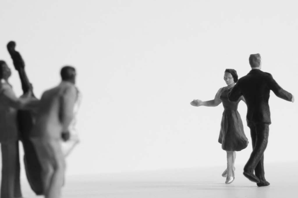
This image by Tobias Schiel uses negative space to separate the dancing figures from the musicians. The musicians in the lower left corner and depth to the image by adding foreground interest. Their gaze also points us in the direction of the main subject. Can you feel the visual tension created across this void? The image’s composition demands our gaze bounce back and forth between the two subjects.

This image of Miles Moralis by Janan Lee has a the full weight of a creative blank canvas weighing down on Miles. Whether you imagine he is creating music or worrying about saving the world, the vast emptiness above him has a profound weight to it. I’m sure the vertical lines of the wall and the vignetting on the top of the frame add to the weight and downward pull of our gaze. Negative space has never felt so heavy.

The passing James Earl Jones led to a flood of tribute images to the man who defined the Darth Vader character. There is plenty of opportunity to frame this primarily black figure in a field of white to make sure the viewer knows where to look. The addition of smoke to diffuse the figure gives a sense of dissolving into the mist. A fitting tribute to a pop culture icon.

Joanne Cowe takes a white on white approach to negative space. By using the texture of snow she breaks up the negative space and grounds the two figures. Because the figure is nestled in an expanse of white, grey and blue, the yellow face pops out of the composition. The primary colors of plastic is one aspect of working with toys that can lead to unexpected challenges.

The above example by Mark Phillips of a stormtrooper’s helmet in wet sand is classic example of a single object surrounded by negative space. We’re given just enough information to tease out a story of the aftermath of a battle. There is very little in the image to distract us from thinking about the soldier who originally wore the helmet and the high costs of war.
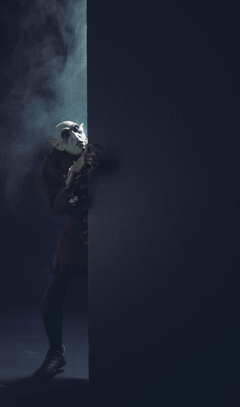
Sunny uses negative space to simplify his composition and accentuate the subject. By obscuring his subject behind a ‘wall’, using a single light and smoke to give that light depth, he creates an image that is all about creating an emotional response. The viewer is forced by the composition’s lack of information to focus on the subjects partially illuminated face. His choice of composition and lighting adds a sense of mystery and horror befitting the subject.
Composing for negative space; conclusion
Composing for negative space is one of many “rules” that can be used to organize information in a photo. Understanding these rules and how they impact the viewers reactions to an image is the first step in creating a memorable image. While I’m focusing on this one rule, composition is almost always used in combination with other photo techniques. Building on each other to create a dynamic and compelling image.
It’s important to understand the rules of composition. Not only as a way to create amazing images. but also as a way to understand images created by other toy photographers. Rather than saying: I like an image. It’s easier to say, I love this image because they way the photographer uses space makes me focus on the subject in a new and interesting way.
And don’t forget that understanding composition through toy photography is your gateway to creating compelling images no matter what subject you choose!
Now it’s your turn to create an image using the composition technique of negative space. Be sure to share your creation in our MeWe community!






Good explanations, Shelly and I love the photos you included.