In the Toy Photographers’ MeWe Community, this month’s challenge is a closer look at composition: “With each post we want to see two images: one of the final photo and an additional photo showing the composition elements. What are the lines that are moving the viewer through your image. Did you use rule of thirds, the golden ratio or dynamic composition? What is the underlying geometry that is holding your image together?” writes Shelly Corbett. For all of us that are a bit left at a loss with this challenge, I read up on the “geometry of design” and then decided to share a couple of insights. So here’s what I learned so far.

The math of beauty
The golden section (a.k.a. golden ratio or Divine Proportion) takes center stage in connection with composition, aesthetics and beauty. We find it in natural objects; it is at work in snail shells, flowers, the proportions of the human body and many more instances. Maybe that‘s why most humans find this proportion appealing and associate it with harmony. We usually perceive the golden section as pleasant.
So, what is the golden section? As far as I understand, the mathematical definition is not quite simple because we are dealing with irrational numbers. The geometrical definition however is quite straightforward: “The Divine Proportion is devised from the division of a line segment into two segments such that the ratio of the whole segment, AB, to the longer part, AC, is the same as the ratio of the longer part, AC, to the shorter part, CB. This gives a ratio of approximately 1.61803 to 1” (Kimberly Elam, Geometry of Design, New York: Princeton Architectural Press, 2011).
Golden section rectangles
Now the golden section can be applied to various forms and objects. As we’re dealing with pictures, let me focus on the rectangle. In order to construct a golden ratio rectangle, start with a square. Then find the half (or midpoint) of its base and diagonally connect the midpoint to one of the corners of the square. This midpoint becomes the radius of an arc that reaches beyond the square. Use the intersection of the square’s extended base line and the arc for the construction of a smaller rectangle. This smaller rectangle and the square become a golden section rectangle (left sketch).
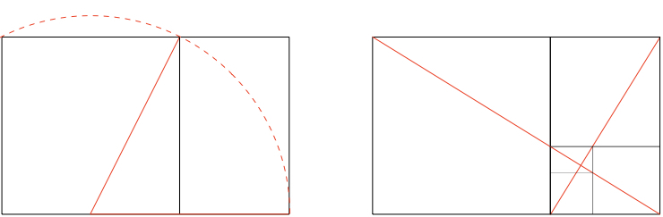
What’s absolutely fascinating is that you can repeat this within the smaller rectangle, always arriving at recurring golden ratios. To do so, take a diagonal of the golden rectangle, then draw a line perpendicular to that diagonal so that this second line ends in one of the rectangle’s remaining corners. Now the two slanted lines (right sketch, red) define further golden rectangles (right sketch, black). This is called a dynamic rectangle, while our standard photo formats (for example, 3 to 2) are static rectangles. The infinite (Fibonacci) repetition does not occur in static rectangles. As a consequence, we apparently see them as less pleasing or interesting.
These rules do not apply to me – or do they?
In the light of all this, the interesting question might be: Does the golden section – or a geometrical analysis based on the construction of a golden section rectangle – apply to compositions we arrived at intuitively? And how might this help us understand composition?
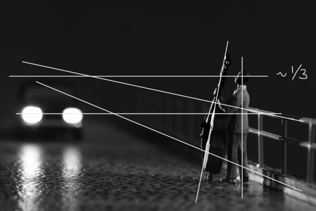
I picked a recent picture of mine which I think “works fine” composition-wise. In this picture, I consciously avoided both the rule of thirds and the golden ratio. I positioned the bass player closer to the right side of the frame than any of those rules would call for. I did this intending to present him as an outsider or, at least, in a rather uncomfortable position. However, I more or less went by the rule of thirds for the vertical position of the musician‘s head.
On the other side of the picture, the position of the car is quite random as well. I just wanted as much distance between the car and the bass man as I could get (within the limits of my ‘stage set’). Now let’s see if the geometric analysis of the picture reveals anything.
First, I just drew the lines I thought were dominating the picture:
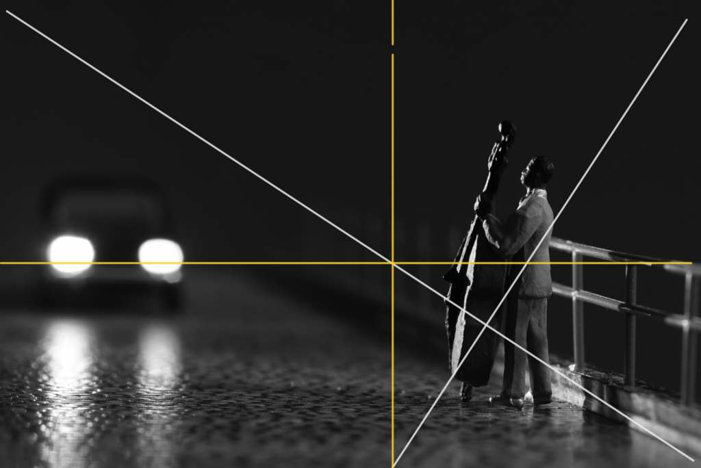
In a second step, I worked with a method derived from the construction of a golden section rectangle. I thought that any recangle can be divided into smaller rectangles according to the above mentioned method. Below, I’ve added the resulting rectangles in yellow. Comparing this to the right sketch from the introduction, you’ll clearly see my photo is not a golden ratio rectangle: The left rectangle isn’t square, and neither is the upper right rectangle. Nonetheless, here’s the first surprise: The car’s headlights are positioned on one of these lines!
Step three: I added more rectangles (in yellow). Then used these lines to throw in an extra set of rectangles (in red): Ha! Could the position of my bass player be less arbitrary than I thought? Looks like that, doesn’t it?
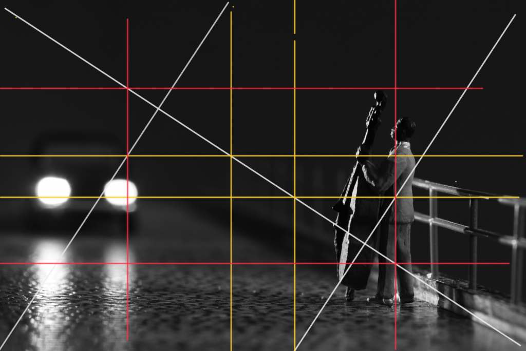
In a fourth step, I added still more rectangles (in blue) just to see where that got me. I think the blue lines do not add any new insights – or maybe, regarding the position of the bass?
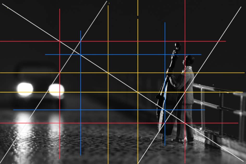
But then again, this is not a dynamic rectangle to begin with, so I think playing with these construction principles is mostly that: playing.
What if? An afterthought
One thing has been bugging me in the days after I wrote this post: I had not overlayed my picture with a golden ratio. I did not want to. Superimposing a golden ratio rectangle on a static 2 to 3 rectangle does not work for me. It just does not feel right because the golden ratio rectangle will either be smaller than my original photo or it will be too wide. Then I could move it around till it somehow fitted … but what insight can we possibly gain from such an excercise? It’s like saying that the rule of thirds is the same as the Divine Proportion – and it’s not!
But what if I cropped my 2 to 3 so that it becomes a golden ratio rectangle? What if I simply go for 1618.03 by 1000 px? Then I could easily overlay the construction with the repeating boxes I showed above:

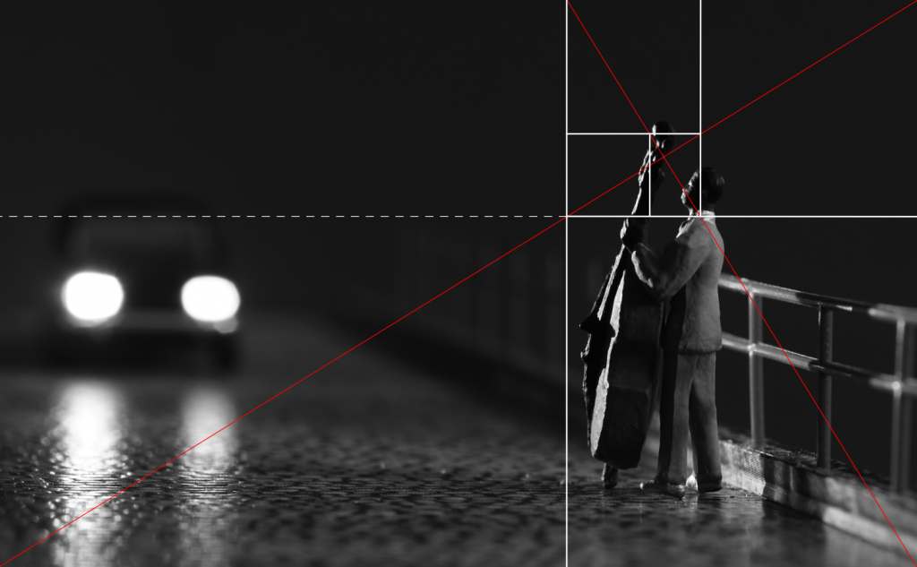
The musician’s position still isn’t as random as I thought, both horizontally and vertically: While his line of sight corresponds with the rule of thirds, his horizontal position is on one of the lines resulting from the construction of the the golden ratio rectangles – something I definitely did not have before my eyes when I made this photo! Now, what about the car?
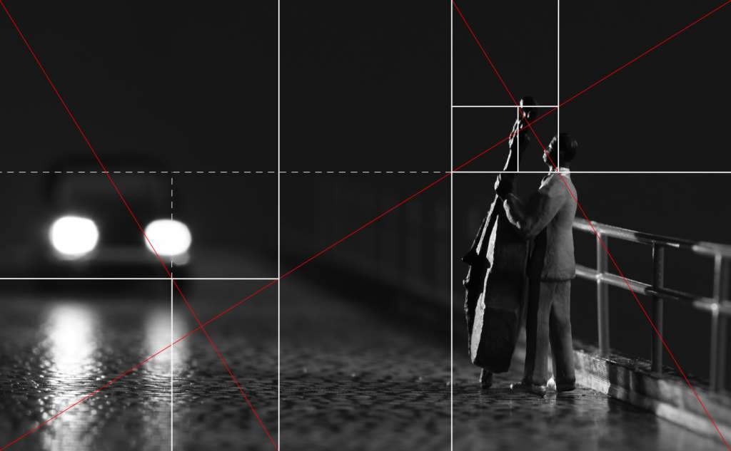
It neatly fits into the grid as well… However, the general insight could be this: The picture’s own proportions matter as much as the position of the subject(s) in the frame. As for harmony and pleasantness, the 3 to 2 ratio is better than 4 to 3, and 1.61803 to 1 is better than 3 to 2. I guess we’ll see if and how this changes the way way I make pictures.
A very insightful post. I’m not a math person and you’ve made it easy to follow. This challenge has definitely got me thinking about how I crop my images. Unfortunately, I’ve been letting “what looks best in Instagram” drive my cropping habits instead of what looks best period overall.