Since I’ve been taking photographs with my anamorphic lens (I promise I’ve got a post coming about that in the future, as I do tend to talk about it all the time) I’ve become much more conscious of my compositions. As toy photographers, most of our shots will likely contain a figure. Whether four bricks tall, 6 inches tall or more. Combining those figures with a 2.66:1 aspect ratio means it’s something of a challenge to frame images. Where I have moved to the wider ratio created by a cinematic lens, it means negative space has without any particular intention become a regular thing in my photography. I now have have very tall, thin subjects to photograph with an even wider canvas. So there ends up being a lot of extra space to consider.
In any image, negative space is the space around the subject. It doesn’t mean that these areas of an image are bad, wrong, dark or dismissive—as in the meaning of the word “negative.” It’s merely the other parts of the image that are not taken up by its primary subject or subjects.
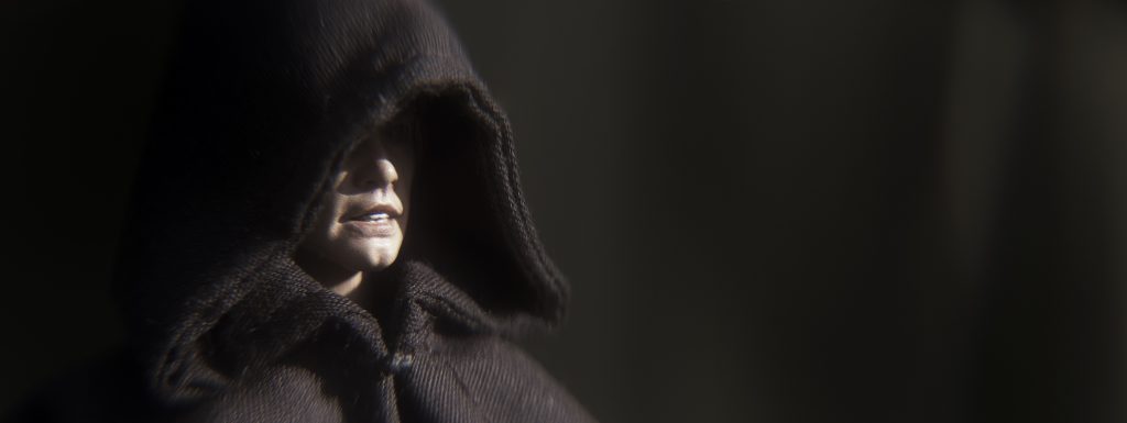
In the close-up photo of Luke Skywalker above, the negative space is very straightforward to understand. It is simply created by the offset nature of his face and the background behind. In a classic cinematic style of a close-up shot (you’ll see this composition a lot in movie or television dialogue scenes), I’ve used the rule of thirds and set Luke to the left of the image. The space left by his shape and silhouette to the right, in this case the background, then becomes negative space in the image.
This doesn’t become the negative space simply because it’s the background, though, which is shown by the fact that there is a second area of negative space in the photo to the left of Luke as the viewer sees it, as his hood cuts across his face. This is the more interesting part of the image for me where the hood of his cloak blends into the background, so both the figure and the background are in fact part of the negative space. It’s about thinking of the photograph as what it now is, a two-dimensional image, letting go of the three-dimensional thing/location/setup that the camera captured in the first place. After all, the viewer will never be able to experience the original setup.
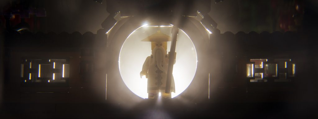
Contrast and minimalist photography can make seeing and deciphering the negative space a much easier task. In this photograph of Master Wu, where I have backlit him walking through the entrance to the Chinese Lantern Garden, you can see various subjects and negative space, but not as you’d expect them.
Consider the words you are reading now or the letters on the page of a book. In a typical format we would be reading black letters on a white page. Then consider how light and our eyes work, the black of the letters absorbs all light whereas the surrounding white of the page reflects it back and into your eyes. In this typical scenario you are actually reading the white shapes and spaces or negative space around the letters and words.
Brining this back to this photograph in particular, I wanted to use the contrast of the light and the dark to create shapes. And I’ll be honest, my intent was to always create the round circle of light with the doorway, but the ornamental windows catching the light on either side was a happy accident. But what is the subject of this photograph? Is it Wu and the wall he is walking through as it was in the physical world? Or is it the light the camera has captured and the shapes it has in turn created with the resulting silhouettes?
Negative space doesn’t always need to be flat, empty or out of focus. It can be busy and full of detail telling different parts of the photograph’s story.
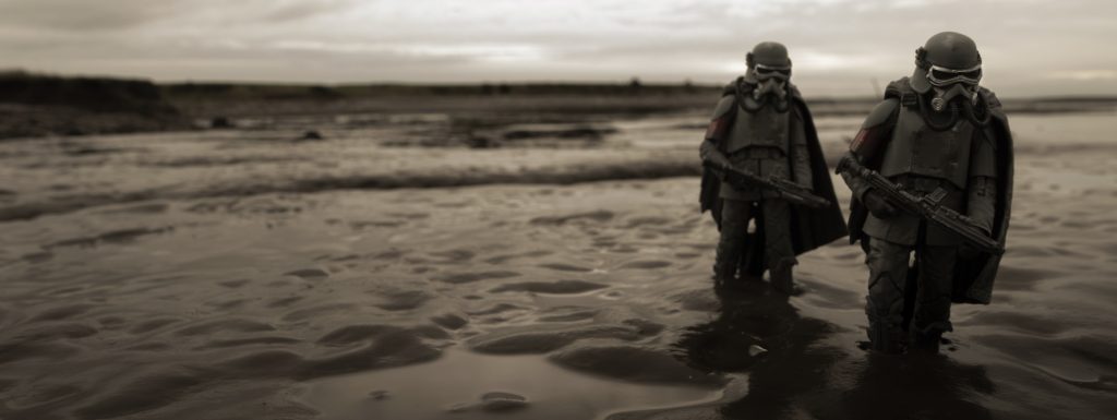
In this photograph, I’ve situated my pair of mudtroopers in the far right third, walking toward the camera and pushing them as far to the edge of the image as possible. Leaving the rest of the space to be background and take up the lefthand side of the image and be behind them as they stand. Here, I wanted to use the landscape to tell what these characters have been through. By having them so close to walking out of the right of the shot. the insinuation is that they must have walked across the “vast” landscape to the left. So by having the landscape stretch out in as extreme a way as possible behind, tells a story of the slog through the mud that these two must have endured.
If the figures are my subject, then the landscape is my negative space. The contrast of the darker figures against the lighter surroundings helps to sell this tension and connection to the viewer’s eye. Selling the story of where these two have come from.
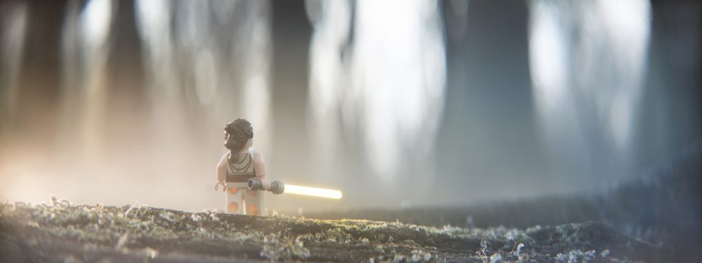
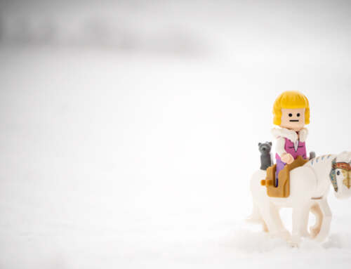
In contrast, this image of Rey tells a story of where she is going as she walks into the photograph. We cannot see much of where she has come from, but much more of what or where she is heading. She cuts a small subject in the larger image. Which helps portray the narrative of her and the vast world around her.
With Rey being so small, the negative space takes up almost all of the photograph. But much is going on in all of that space to tell her story. Reading from left to right, Rey is leaving the warm glow behind her and venturing out in to the cold and darker unknown. This narrative is pushed further by the frost on the ground, and by having a shallow depth of field to give the background the feeling of a spooky or mysterious woodland. The fact that she is a minifigure so her surroundings overbear upon her only increases the sense of dread that she heads towards. But she takes a little bit of that warmth and hope within her trusty lightsaber, so we feel Rey’s strength and positivity as she strikes out on her adventure.
Again, happy accidents, but what I really loved about how this photograph turned out and as I described above, is the connections between the subject and the negative space. I got lucky with the right conditions, had the right figure in my bag and chose the right depth of field to bring the story together. Without the frost it wouldn’t work, without Rey and her yellow lightsaber it wouldn’t work, If I’d blurred out the trees even more it wouldn’t have worked. I’m very happy with how lucky I was that it all came together. And how Rey permeates through the rest of the image.
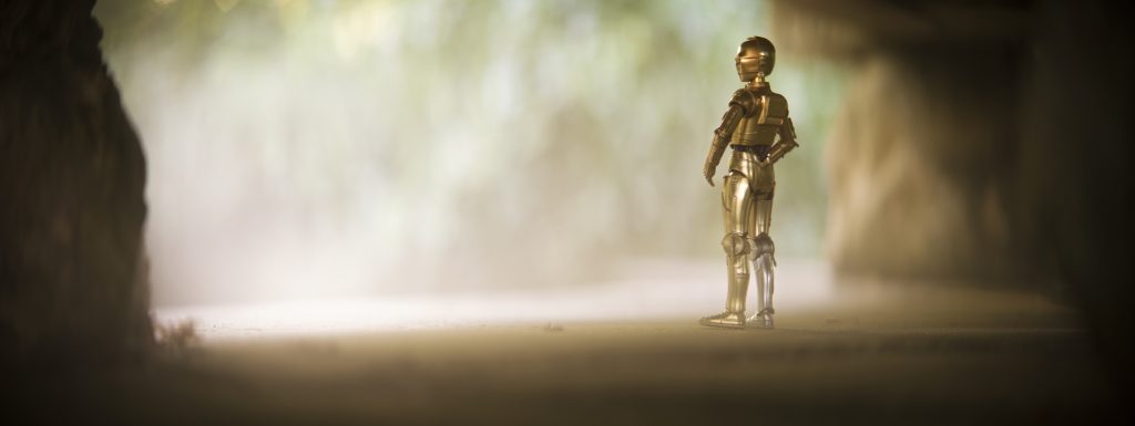
Intention is also so important in the stories we tell in our photographs. In this photograph I had Threepio looking out in a similar way to Rey. But it just doesn’t read the same.
The way the subject and the negative space works is similar, in that it’s quite a wide shot, with a shallow depth of field and a haziness that isolates the smaller subject within. But here, character shifts the story for me. Because we know C3PO is a much more nervous individual than Rey, his isolation in the frame becomes about his demeanour. The darkness of where he comes from is actually safer for him and the light he looks out on becomes scary through his eyes.
It is why I chose the title that I did. If Threepio could let go of his nervousness, a grand adventure awaits him, but given the choice he’ll always choose self preservation because of his fear. I think that is why for me his sacrifice to have his memory wiped in The Rise of Skywalker means so much, Threepio has always loved his friends, but his fear holds him back from heroics. It was finally his moment to put it all on the line for those he loved. And while it was a bit of a cop out on the sacrifice he makes, it was also nice that it was R2 who gets to bring back his best friend in the end. I’m a big softy, really.
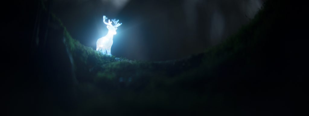
Although I said different earlier in the post, this photograph takes something of a literal approach to the idea of negative space—with a glowing subject making everything else a darker alternative. Because of the contrast, the stag pops out of the image. But it was very important to have enough light for the rest of the image to work as well.
It was a delicate balance of not overexposing the Patronus but getting enough light to set the rest of the scene. There was no other light as the sun had well and truly set, so the lights I had illuminating the LEGO were the only light source and the LEGO itself is the only light the camera could see.
I wanted a lot of negative space and scenery in comparison to the Patronus to match the scenes from the various Harry Potter movies. It was important for me to set it in a physical place. I felt a closer shot would have, while giving a clearer image of the subject, lost the cascading light down the mossy bank. And the Patronus would not have had the same feeling as it appears over the brow of the scenery, and being a thing to look upon in awe.
Again, I guess it comes back to story telling and by pulling back and giving a sense of space I’m much happier with the photograph I ended up with.
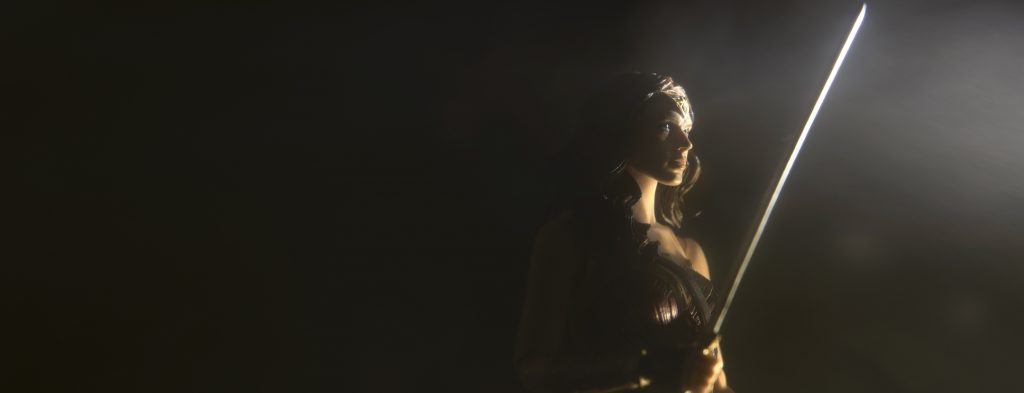
This photograph of Wonder Woman takes a few points that I’ve already covered but mixes up those components in a slightly different way. And it provides an interesting contrast to discuss. I really like creating these very simple setup portraits of my figures and playing with single light sources to create Rembrandt-style images.
In a similar way to the Luke image at the start of this post, the darkness blends into the subject, meaning the figure is both part of the positive and negative space. It’s a fun tension to play with and I find it really helps me to get creative with how I light things and what shapes that then produces in my photographs, using and exploring my figures as the three-dimensional objects that they are.
Unlike the Luke shot, I placed Diana to the right of this image while still using the rule of thirds. The big difference this time though is that she is looking to the short side and out of the image. Where Luke feels like he is engaging and entering the space. Here there is a lot of darkness and foreboding that she is now carrying on her shoulders. It’s why I chose the title “God Killer”—to emphasize that burden upon what in essence should be a good person who has been tasked to kill another.
Thinking about the placement of your subject will unsurprisingly determine where the narrative of the photograph takes the viewer. In this case, while Diana is heading to the light there is a solitude in her situation as she works her way through the darkness of her journey.
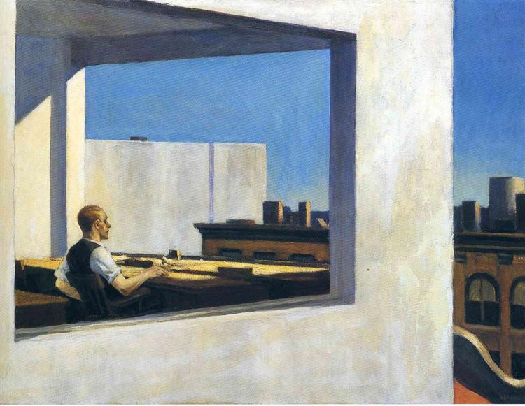
Edward Hopper was famous for painting people in the middle of their city lives. He would usually have lots of negative space around them. His narrative was that while we live closer together in townhouses and apartments than we ever did before, we are farther apart for it, becoming detached from our neighbours and fellow human beings. Through the use of negative space, his paintings were about loneliness.
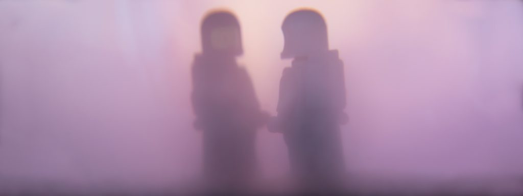
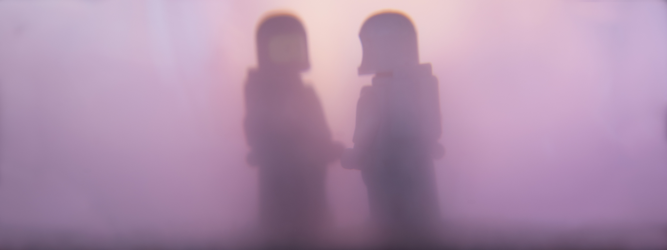
Leaning back into silhouettes. There is an obvious use of negative space going on in this photo. The hazy environment disperses the light while still creating contrast and allowing for the signature shape of the astronauts to define the story. If this was any other minifigures, would it feel so otherworldly and sci-fi, I wonder?
This was not the initial version of this photograph, it evolved quite a bit from my initial setup. In the beginning, the two figures, one black and one white, still looked at one another, but they were much farther apart.
I’ve taken a few photographs like this where I fill a fish tank with Atmosphere Aerosol to create an otherworldly/other-dimensional aesthetic in which my astronauts can play. Usually though, I only have a solitary figure. In this shot I wanted to create the idea of the two “finding” one another. With my original setup, the space was between them making the astronauts feel farther apart physically but also within the narrative of the scene. By reducing the gap between the two and increasing the negative space to the left and to the right, I was able to create a feeling of brining them closer together in the void. By alienating them as a pair, they came closer together.
A question to you
Do you know how you use negative space in your photography? Have you thought of pulling your camera a little farther back, considering the situation you find your subjects in and how reframing them may change the story you are telling? I’d be interested to know what people think and if this was a useful insight into something that tends to sit just under the surface of all of the photographs we take.
I haven’t used negative space in my photography, but have always wanted to give it a go. This was very useful. I tend to like the “cinematic” style of photography. I’m going to give this a try. Thanks for the article.
Thanks Austin. Give it a go, negative space is in every photograph with practice it can be used to tell a variety of stories. I’ve learned a little bit over time, but I find if I keep watching movies I learn so much more. Good luck, let me know how it works for you.
Great article, Tom! I’m a big fan of your “cinematic” style. Reading about the purpose and seeing examples of negative space, was really helpful.
Thanks Sabrina. I really wanted to share the reasons I chose these compositions as well as how I captured them. I find it interesting to think about my cinematic style. It started out as not much more than lots of lens flares, not that there is anything wrong with lens flares. But now I find it so much more about the structure of my photos, including the negative space side of things.
I try to use negative space intentionally, but with mixed results. I probably should keep practicing.
I’ll be honest Joshua, I’ve been trying to take what I consider cinematic photos for a long time and it’s only through practice that I think I’ve got any better. Considering cinematography and compositions in movie shots is what led me to learn more about negative space as I took wider shots. The more I practice the more I learn.