Those who follow my work or writings on this blog will already know a not-so-secret fact about my style: I love Photoshop. I couldn’t do what I do without it. It celebrates with me in victory, comforts me when I am sad, and generally makes my creative world go round. Now that I’ve underscored that little detail, let me segue into something a bit alarming.
A few months ago I was assigned a task as part of the Photography Scavenger Hunt: Take a shot to represent the word “broken”—but it had to be straight out of the camera. No post-processing of any kind. If you’re looking for a “but” here, there isn’t one. No cropping, no cleaning dust spots, no straightening, no brightness/contrast adjustments. Just click the shutter and submit the photo—like some sort of 1800s shutter junkie. To be clear, this left me with a sickening truth…
No Photoshop. F*$%!
Calm down, Dave. Breathe…
Ok, so once the initial panic wore off, I calmly and bravely ran away. After some deep soulful introspection (read: Deadpool movie marathon), I decided to embrace the challenge. I wasn’t the only Scavenger (what we Photography Scavenger Hunt nerds call ourselves) who drank the Adobe Kool-Aid, and therefore had to kick the addiction. I also figured it was a good opportunity to stretch outside my comfort zone and exercise some less-utilized skills.
Odds are I wouldn’t create the exact art I would envision, but it was still a good use of my time, and a challenge. So I jumped in with both feet.
Now, I could have made things *much* easier on myself by picking a very simple subject. Concentrate on a single thing, with a single light source—easy peasy. Nope. I don’t do simple. I like complex, gritty, storytelling images and, dang it, Photoshop handicap or not, I was going to make one of those.
I decided to recreate the art from one of the most iconic comic book covers of all time. The Death of Superman:
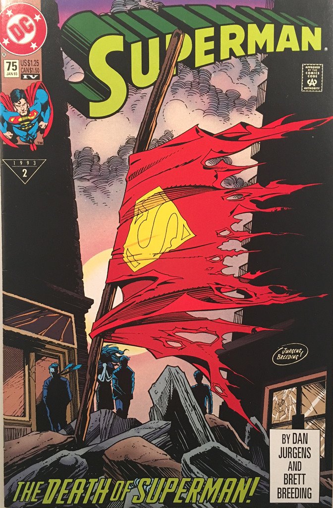
If you recall the word was “broken,” and after a bit of brainstorming, the idea of Superman’s torn cape flying from an impromptu flagpole embedded itself deep into my mind (so deep, in fact, that afterwards I ended up getting a subscription to DC Universe just to reread the comic series).
Of course the problem was that, even with Photoshop, I had nothing in my collection to make this happen. The DC side of my toy box is rather light, and centers mostly on Gotham, not Metropolis. Given I had to do this all in-camera, I had some creative building to do.
To the makerspace!
Makerspaces are Photoshop for the real world
To be clear, I accepted this challenge, but I never agreed to leave my house. So the “makerspace” in question was “whatever I had in my basement.” Which, fortunately, is decently stocked with supplies and tools.
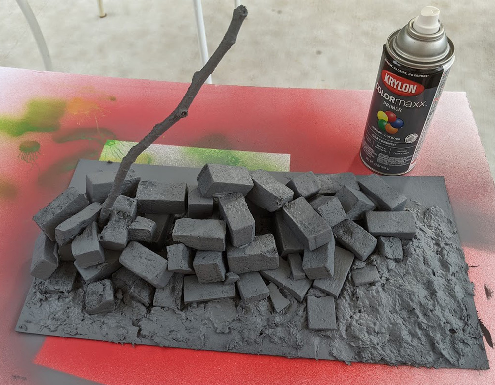
The first step was deciding what to build. I figured, to make things easier on myself, I’d stick to building the cape, pole and rubble pile. I’d shoot the whole thing in front of a sky backdrop.
Now, making bricks is something I’ve done before, so I quickly set about making them out of XPS foam. I put them randomly in a pile to simulate falling from a damaged building, and I created some broken I-beams as well. Finally, I made the makeshift flagpole out of a dead branch from the tree in my front yard. I glued and painted it all.
Now comes the tricky part: making the cape. So far my experience with making things from fabric has been a bit of weathering and drawing on it with a Sharpie to get a worn out flag look. Superman’s cape was going to require more precision. So I went to the source of all things fabric in my house. Enter to this story my wife, the Uber-Quiltress. She suggested fabric markers, and provided me with some yellow fabric to use as a base.
(Note to self: Marrying an Uber-Quiltress was a wise decision—good work, past me!)
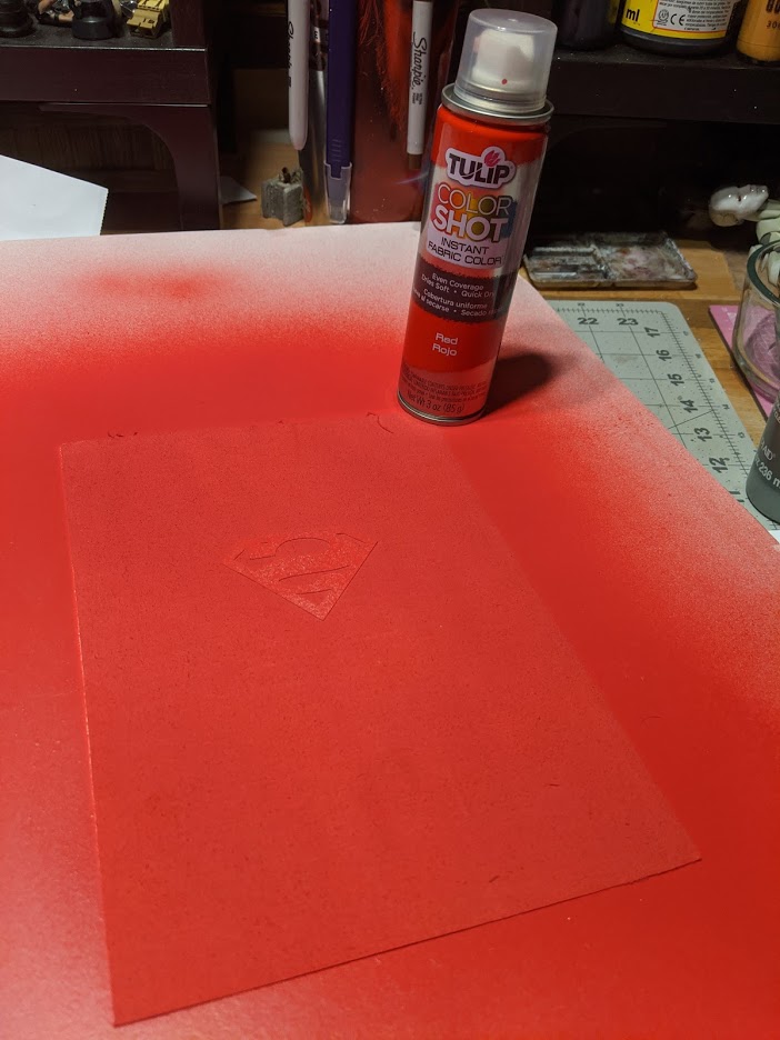
My aim was to colour the yellow fabric with red everywhere there wasn’t a Superman logo. I started by printing said logo on a piece of paper, putting that under the fabric as a template, and using a fabric paint pen device (basically a Sharpie but more fabric-ly magical) and set about colouring in everything that wasn’t a logo.
Turns out, fabric bleeds, like a lot. So what started as awesome super fine edges ended up becoming a blurry mess. Ugh. Defeated, I went back to the Uber-Quiltress for more ideas, and she pointed out that fabric spray paint exists. That is, basically, a spray can that makes fabric different colours. (We live in a truly magical age, don’t we?)
So I printed a Superman logo on card stock, cut it out and glued (with a kids glue stick—the weakest of all the glues), and then sprayed it with the fabric paint.
It looked promising! I peeled off the logo template (hence the reason for using the weakest of glues), and found that it worked perfectly. I turned the cape over, and painted the backside as well. The result looked like this. (exactly like this, because, well, this is a picture of the result I got):
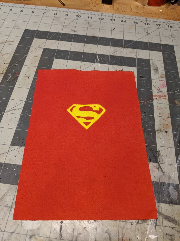
I now had the best looking cape I could ever hope to make. If I had a glass eye, the sight of this cape would have brought a tear to it.
Now to destroy that sucker.
I took a knife and started cutting at it. That was too clean, so I eventually hammered half dozen finishing nails into a bit of wood, and used that to tear the cape to shreds, just like Doomsday did with his claws to Superman on that darkest of fictionally tragic days.
The setup
I mounted the flag on the pole, and put the whole thing in front of a TV which displayed a picture of sky. (Forgive the mess—that room also doubles as my kids’ play area, and they don’t seem to enjoy playing cleanly, and who can blame them?)
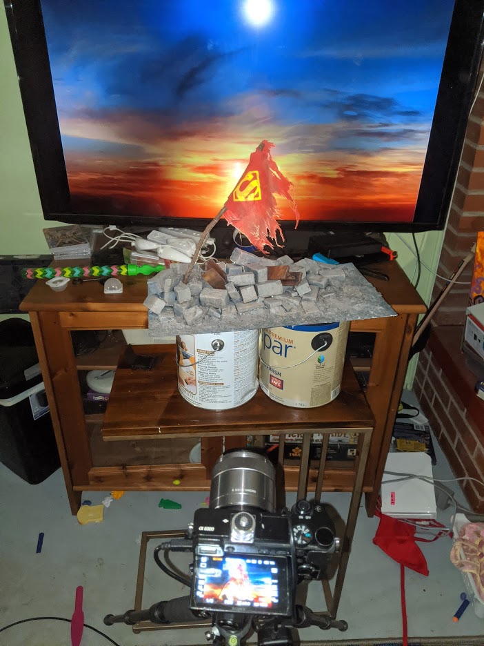
I placed a Lume Cube behind the flag as a backlight. Then I added two more on either side. They reflected nastily in the TV, so I had to place them about 6 feet away on either side of the screen (it only occurred to me after the fact—way too late, and just long enough to make me feel like a raging moron—that I could have simply flagged the lights on the TV side to stop the reflections. Live and learn, Dave. Live and learn).
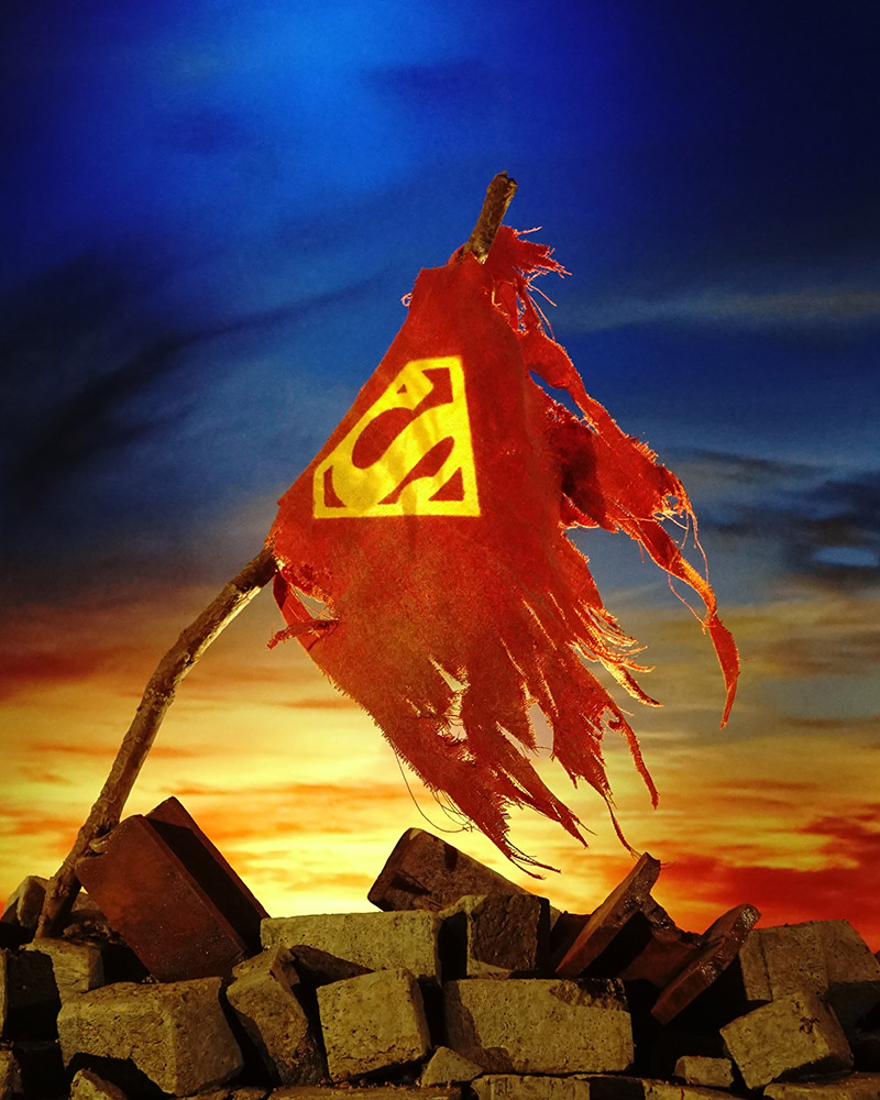
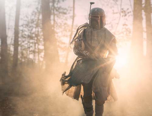
This is the straight-from-camera shot I submitted to the Photography Scavenger Hunt:
We now return to our regularly scheduled program…
So now that I had my in-camera shot done, and I had put all that time into making this kick-ass diorama, I decided to jump back into my old haunts and give it the full-on, supercharged Dave treatment. Time to warm up Photoshop and make the chimichangas.
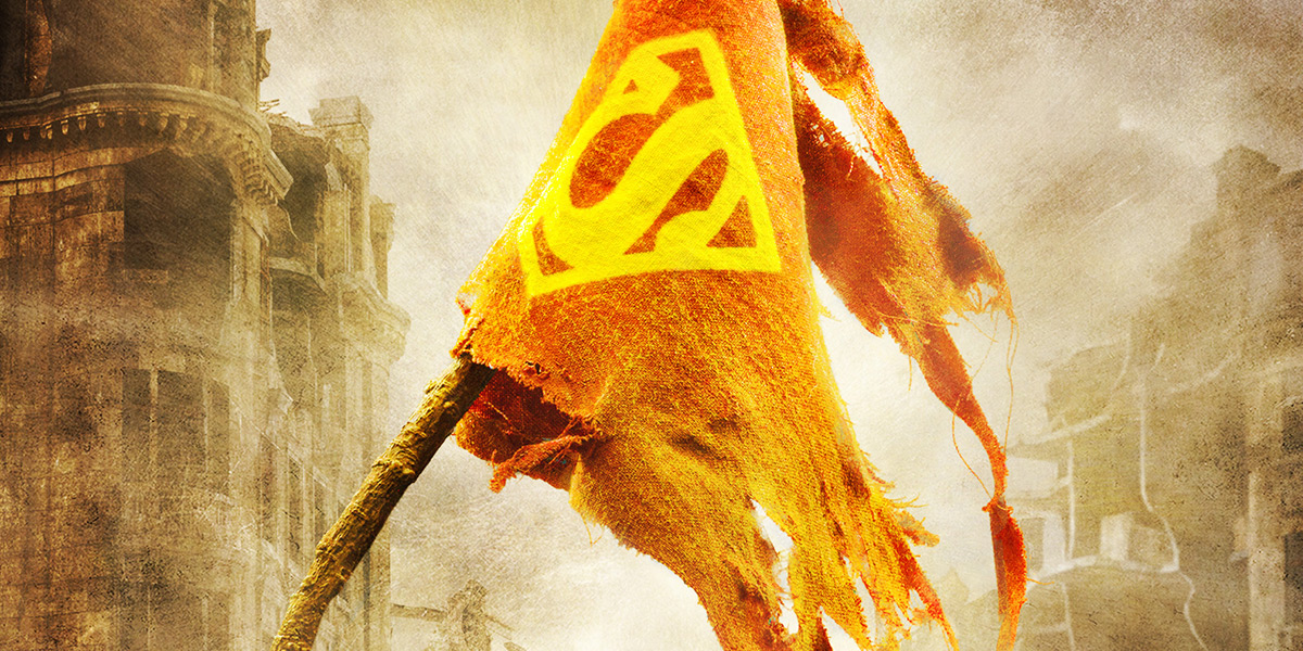
So, step one: This image is way too saturated. I actually got a lot of comments that people liked the colours in the first piece, and that does please me much. However, that was not *my* true vision. (I’m not here to impress the public, I’m here to express my vision. The public’s opinion of that vision is irrelevant). Superman just *died* here, people. This isn’t happy fun colours time. This is dark. This is gritty. Panic is a valid emotion. We’ve left the butter-zone, baby. To put it mildly, we’re fu…doomed. Happy colour palette goes on the chopping block.
Second, the background needs some more life. When Doomsday killed Superman, their fight was so epic it left a trail of carnage and destruction across half the United States, and demolished a large part of Metropolis. There was destruction everywhere. He also died in the middle of town, so I needed a way to set the location and the reality of the situation.
To make all this happen I replaced the sky with something more stormy. I then went to pixelsquid.com and grabbed some ruined building models to function as a background. I also added my signature texturized look, some colour grading and finally a bit of smoke coming from the rubble. All of this is the magic Photoshop has to offer that a camera cannot.
The finished piece looks like this:
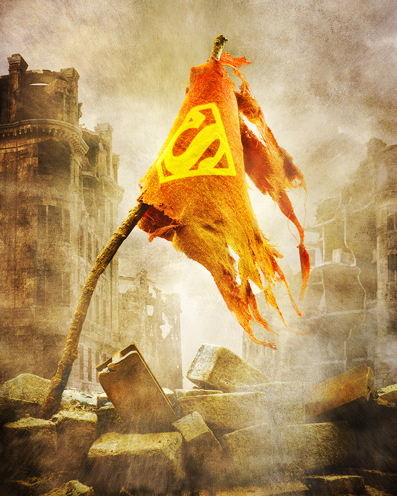
And that is how it looked the day Superman died.
Don’t worry, he comes back…
So this is where I normally wrap up my post with some insightful comment, and a final witty joke, and say, see ya next time. However, I don’t really have a point. I just wanted to share the story.
Despite my initial reservations, it was interesting and insightful to go through the exercise of making an image outside of my comfort zone. I got some more experience ensuring my shot was exposed properly, lit properly, and composed properly before I clicked the shutter. Interestingly, I also learned how to take images in front of a screen (this was the first time I’ve used that particular technique with a TV, and not a monitor). Really none of this stuff is new to me. They were skills I already knew, and knew well. I just didn’t depend on them quite so much until this experience. Photoshop, while an amazing tool that allows me to take my images farther than a camera can, is also a crutch when it comes to everything before the shutter clicks.
This experience also underlined something else I already knew. It is really important for me to capture my vision in my work. I don’t always accomplish it as much as my skills allow, but it is this expression of my vision that drives me, regardless of the techniques used. That is what I have to give to the world.
So whether you prefer the in-camera version, or the photoshopped version (or neither—neither is a perfectly cromulent option), I don’t really mind which. I just know I gave each one my all, and that is the thing that butters my biscuits.
Thanks for hanging out with me. Now go shoot your own scenes, and if you feel brave enough, step outside your comfort zone a bit. You may find it rewarding.
[dave]
Want more toy photography goodness? Subscribe to our weekly email round up so that you never miss a post. You can also listen to episodes of the podcast! You can follow my work at @therealstudiodave.
Dave, i love that shot. Both of them. Last year when i shot film for the first time in a decade i felt the same way. Of course I’m by nature, lighter on PS than you so i wasn’t quite as hard, but…. psychologically, letting go of the editing process was really fulfilling to me. I still take a lot of digital photos and push the heck out of them. But the creative process is very different, in fact it’s backwards. I tried to get people (even if they don’t shoot film) to try a one and done challenge… shoot 24 frames of 24 set ups where you only take one click per set up and then post the hile set unedited and uncropped. Needless to say, no one else jumped on that idea…. but it is a fun excercise. I bet you could get even closer to your original PS vision in camera.
Great article
Thanks Wyjad!
Yeah, as I wrote this post I thought to myself that I could have gotten a bit closer in camera.. Not all the way, but definitely closer. There is also a diminishing set of returns vs the time to do such shots in camera vs doing it in post. It is really a trade off of time, skillset, patience levels, and enjoyment.
The extreme opposite is to do it all in post. It’s a big spectrum, with no clear answers, except what makes sense for the individual making the work.
However, yeah, I totally support the idea of doing an in-camera-only challenge. It does help sharpen the eye, and it helps set one end of the spectrum, and makes it easier to determine how one wants to choose how much is doable in-camera vs in Photoshop.
Thanks for the behind the scenes write up. I’m glad both shots look great and you had fun making them!